
Recommended
More Related Content
What's hot
What's hot (20)
Viewers also liked
Viewers also liked (20)
Similar to Eval text analysis
Similar to Eval text analysis (20)
More from Fran Orton
More from Fran Orton (20)
Recently uploaded
Recently uploaded (20)
Eval text analysis
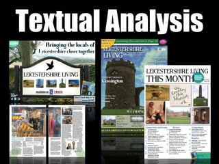
- 3. The tagline in the top right hand corner depicts the purpose of the magazine - the sense of community the tagline offers entices the socially active people living in Leicestershire. The positioning of the text means that it is a likely place a passer by would look. The black font means its easy to see and the drop shadow contributes to the natural house style. Social media logos are in the bottom left hand corner, attracts a digital native audience and allows them to instantaneously look at the magazine’s pages. The position of the corner makes it stand out and the isolation draws people’s eye line to it. The reference to WHSmith and Tescos shows where the magazine is available at. This means that passers by can easily find the magazine in these stores that they would most likely go in on a regular basis. This must stand out as it is another reference to the availability of the magazine The background image creates the rural and isolate idea of countryside living and the people who see the image will relate to these representations. This attraction will be vital when advertising to new people. As this is a billboard poster, the background image reflects the concentration on rural areas. The price reflects the content of the billboard poster and the regional magazine; it shows the audience that this is a premium product and the lifestyle ideologies show that the people enjoy spending money and socialising. The use of green conforms to the house colours and makes the price stand out more. Social media references are in the bottom left hand corner, attracts a digital native audience and allows them to instantaneously look at the magazine’s pages. The position of the corner makes it stand out and the isolation draws people’s eye line to it. Social media references are in the bottom left hand corner, attracts a digital native audience and allows them to instantaneously look at the magazine’s pages. The position of the corner makes it stand out and the isolation draws people’s eye line to it. The iconic bird silhouette used on the village sign has connotations of tranquility and freedom. This is positive
- 5. The two blue shapes that include subscription and free item information benefiting the audience. The colour adds brightness to the page highlighting the direct links with nature and creativity to the formal page The first column of information for content of the magazine is divided into two sections which would be featured in every magazine. This helps the reader locate their preferred pages and to also see what is featured in the magazine The dark blue stands out more than the text in order for the reader to correctly identify the important page references to the page content. This makes it much clearer to read and the bold in the text highlights the important information that relates to that page. The masthead continues to this page and the font is used for this month, this creates cohesion between the magazine pages and other ancillary products. The black and white contrast between the background and the font connotes the formality of the page and entices the reader to a tidy page. The six images featured in the middle of the page link directly to the information in the bottom half of the page. They represent key features of Leicester that readers would want to know and read about. The drop shadow and the segregation to text further create a tidy page. The dotted lines divide the page into three sections - title/masthead, images, and content information. This is very successful as it creates a structure for the page and breaks conventions for a contents page whilst also looking very professional. In the bottom right hand corner, the reference to subscription information means the reader can utilise the information if they wish to and subscribe to the magazine. This means that there is a higher chance of subscription rates as this would be featured there every week. The dateline is a key feature that needs to be carried through to the contents. This follows the conventions of a magazine and means that people can easily reference the magazine issue.
- 6. The first page shows my double page spread in the ‘County, News and Events’ section which means that the article will appeal to those who are more socially active and care about what is happening in their local society. The regular section means that people after the specific information that is featured in the section can easily access it. It is vital to have this information as otherwise no one would have access to e.g., subscription information, meaning I am limiting the magazine’s potential subscriptions. The first column of information for content of the magazine is divided into two sections which would be featured in every magazine. This helps the reader locate their preferred pages and to also see what is featured in the magazine The competition section intrigues the audience into buying the magazine as it is giving them hope that they could win certain prizes and get free items through buying it. This is successful marketing as many readers would want this option to win. The reviews section is very important as it means that the reader can digest information of others and be passively influenced by the magazine to go to certain places and avoid others, or buy certain products over others. This covers a range of different things and variation is needed in this section in order to meet the needs and wants of the audience.
- 8. This double page spread follows the house colours with blue pull quotes and green picture information and introduction. Although from afar the page looks very black and white, close up there are certain parts of colour - e.g. the introductory paragraph, the picture information underneath the images on the second page and the pull quotes. The main image covering half the first page and enters into the other shows the shop floor allowing the reader to see what the boutique has to offer for them, it would be like them being in the shop and buying clothes and by reading the article they are familiarising themselves with the shop which will increase the likelihood of them shopping in the store. The pull quotes are very effective as they allow the reader to skim the text and get an insight of what the article consists of. This means that the reader can actively decide whether to read the article or whether to carry on through the magazine. This is an effective technique as the pull quotes are very enticing and would most likely grasp the attention of the reader. The three images on the right page show more of the shop floor enabling the reader to see more of what the shop contains, including the male section. Also, the image of the owners of the boutique gives them a bigger brand identity and therefore uses the article for marketing The vast text means it would appeal to those who are more sophisticated and interested in new things in their local community. The enjoyment of reading long text reflects the readers income bracket of A/B as they have more money and more time to do their own activities. The green leaves either side of the pages show the strong links with the outdoors even though this article has little to do with it. This shows that the unconventional article heading means that it should appeal to those who like the other articles.