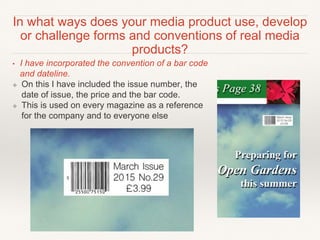
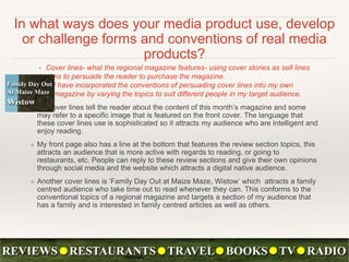
The document discusses the conventions of magazine design elements like front covers, contents pages, and double page spreads. It then analyzes how the student's media product does or does not conform to these conventions. For the front cover, the student explains how their masthead, cover lines, barcode, and large central image all conform to typical magazine conventions. On the contents page, the student organizes sections into columns and includes information on subscriptions as is conventional. For the double page spread, the student includes a standfirst but notes it could be longer, and uses pull quotes and bylines as is typical. The analysis considers both how the product adheres to and challenges real magazine conventions.