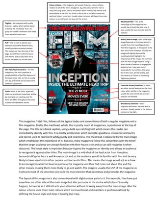
This magazine, Total Film, follows all the typical codes and conventions of both a regular magazine and a
film magazine. Firstly, the masthead, which, like in pretty much all magazines, is positioned at the top of
the page. The title is in block capitals, using a bold eye catching font which means the reader can
immediately identify with this. It is mostly white/silver which connotes goodness, innocence and purity
and can be used to represent safety/purity and cleanliness. The masthead is obscured by the main image
which emphasises the importance of it. But also, many magazines follow this convention with the belief
that the target audience are already familiar with their house style and so can still recognise it when
obscured. The house style is important because it gives the magazine an identity and allows an audience
to recognise it against other titles. The main image is a mid-shot of the lead actor from Inception,
Leonardo diCaprio, he is a well known actor and so the audience would be familiar with him and be very
likely to have seen him in other popular and successful films. This means the image would act as a draw
to encourage his wide fan base to purchase the magazine and thus find more out about this and the
other movies, making them more likely to go and watch. The image is usually the USP of the magazine as
it attracts most of the attention and so is the main element that advertises and promotes the magazine.
The layout of this magazine is also conventional with slight unique parts to it. For example, they have put
coverlines on either side of the main image but also put some in the centre which doesn’t usually
happen, but works as it still attracts your attention without drawing away from the main image. Also the
colour scheme uses three main colours which is conventional and maintains a professional look by
defining the house style and stops it looking too crazy.
Masthead/Title – this is the
name/logo of the magazine and
usually has at least the date near it,
also usually the issue number and the
website.
Main/Central Image – this is the large
image featured on the cover which is
usually from the main/biggest story
from the magazine, in this case it is the
lead actor from inception. Usually this
image will slightly obscure the
masthead which highlights the
importance of the image. It is common
that the main image model is using a
direct mode of address to engage the
audience but I have also found
especially for horror films, the actor,
like in this case, will be looking past
the camera as if there is something
frightening behind.
Film Title/Main Coverline – For film
magazines, the main coverline is
usually the title of the film featured in
the cover story. Like so, this is usually
very big and stands out to attract the
audience’s attention.
Mandatory elements – every
magazine will have a barcode with a
price etc. Usually placed in the bottom
corners or top right.
Tagline – the magazine will usually
feature a tagline which will be above
or below the masthead. This is to
grasp the reader’s attention and make
them want to know more.
Featured stories/coverlines – these
are other stories featured on the front
cover which will be in the magazine,
usually the ones which will be more
popular and likeable.
Colour scheme – the magazine will usually feature a colour scheme
relative to what the film is like/genre. E.g. the colour scheme here is
very cold using blues, silvers and whites which reflects the themes and
atmosphere in the film, but there is also a use of red which contrasts
well and helps it stand out. Usually colour schemes will have three main
colours so as not to get too busy on the screen.
Fonts– most of the fonts, especially
titles and prominent coverlines, will be
big bold and eye catching, but the
fonts will differ throughout the cover
to determine between stories.
Puff – this is used to attract your
attention to another feature story,
usually contains exclusive content.
This stands out from the rest of the
page, but still fits in with the layout
and theme, and usually looks like a
sticker has been put on the cover.

Magazine analysis

  • 1.
    This magazine, TotalFilm, follows all the typical codes and conventions of both a regular magazine and a film magazine. Firstly, the masthead, which, like in pretty much all magazines, is positioned at the top of the page. The title is in block capitals, using a bold eye catching font which means the reader can immediately identify with this. It is mostly white/silver which connotes goodness, innocence and purity and can be used to represent safety/purity and cleanliness. The masthead is obscured by the main image which emphasises the importance of it. But also, many magazines follow this convention with the belief that the target audience are already familiar with their house style and so can still recognise it when obscured. The house style is important because it gives the magazine an identity and allows an audience to recognise it against other titles. The main image is a mid-shot of the lead actor from Inception, Leonardo diCaprio, he is a well known actor and so the audience would be familiar with him and be very likely to have seen him in other popular and successful films. This means the image would act as a draw to encourage his wide fan base to purchase the magazine and thus find more out about this and the other movies, making them more likely to go and watch. The image is usually the USP of the magazine as it attracts most of the attention and so is the main element that advertises and promotes the magazine. The layout of this magazine is also conventional with slight unique parts to it. For example, they have put coverlines on either side of the main image but also put some in the centre which doesn’t usually happen, but works as it still attracts your attention without drawing away from the main image. Also the colour scheme uses three main colours which is conventional and maintains a professional look by defining the house style and stops it looking too crazy. Masthead/Title – this is the name/logo of the magazine and usually has at least the date near it, also usually the issue number and the website. Main/Central Image – this is the large image featured on the cover which is usually from the main/biggest story from the magazine, in this case it is the lead actor from inception. Usually this image will slightly obscure the masthead which highlights the importance of the image. It is common that the main image model is using a direct mode of address to engage the audience but I have also found especially for horror films, the actor, like in this case, will be looking past the camera as if there is something frightening behind. Film Title/Main Coverline – For film magazines, the main coverline is usually the title of the film featured in the cover story. Like so, this is usually very big and stands out to attract the audience’s attention. Mandatory elements – every magazine will have a barcode with a price etc. Usually placed in the bottom corners or top right. Tagline – the magazine will usually feature a tagline which will be above or below the masthead. This is to grasp the reader’s attention and make them want to know more. Featured stories/coverlines – these are other stories featured on the front cover which will be in the magazine, usually the ones which will be more popular and likeable. Colour scheme – the magazine will usually feature a colour scheme relative to what the film is like/genre. E.g. the colour scheme here is very cold using blues, silvers and whites which reflects the themes and atmosphere in the film, but there is also a use of red which contrasts well and helps it stand out. Usually colour schemes will have three main colours so as not to get too busy on the screen. Fonts– most of the fonts, especially titles and prominent coverlines, will be big bold and eye catching, but the fonts will differ throughout the cover to determine between stories. Puff – this is used to attract your attention to another feature story, usually contains exclusive content. This stands out from the rest of the page, but still fits in with the layout and theme, and usually looks like a sticker has been put on the cover.