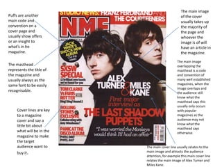
1. Puffs are another
main code and
convention on a
cover page and
usually show offers
or an insight to
what’s in he
magazine.
The masthead
represents the title of
the magazine and
usually always as the
same font to be easily
recognisable.
Cover lines are key
to a magazine
cover and say a
little bit about
what will be in the
magazine to make
the target
audience want to
buy it.
The main image
of the cover
usually takes up
the majority of
the page and
whoever the
image is of will
have an article in
the magazine.
The main image
overlapping the
masthead is a code
and convention of
many well established
magazines, when the
image overlaps and
the audience still
know what the
masthead says this
usually only occurs
with popular
magazines as the
audience may not
know what the
masthead says
otherwise.
The main cover line usually relates to the
main image and attracts the audience
attention, for example this main cover line
relates the main image of Alex Turner and
Miles Kane.
2. The mast head on the front cover clearly stands out
as the title of the front cover, the font and colour of
the title also fit in with the mise en scene of the
cover and therefore creates a colour scheme to fit in
with the genre of the magazine also.
The main image of the
magazine is a
photograph of a famous
pop singer who would is
an idol for the target
audience therefore
represents the genre of
the magazine very well.
There are also some smaller
images on the front cover to
attract the attention of the
target audience, these
images are of famous pop
singers that are either part of
a group or are solo artists,
these are made easily
recognisable to the reader
who they are and the caption
with capital letters makes it
stand out and make the
reader want to see more.
This Kerrang front cover
has a sky line that related
to the main cover line on
the front cover and also as
its yellow against the red
background it stands out
appropriately grabbing the
attention of the audience.
The overlapping of the main image
over the masthead usually only
happens with well known magazines
like Kerrang because many people
know what the Kerrang masthead looks
like and it is easily recognisable
otherwise people would not know
what it says.
There are also puffs included on
the cover that are in the shape of
circles that give an insight into
what is inside of the magazine
and attract the target audience.
3. This is also a masthead that
represents the title of the
magazine and is easily
recognisable to the reader.
Cover lines on the
cover page establish
to the reader what
will be inside this
issue of the magazine
and are there to give
the reader an idea of
what to expect
therefore are key to a
front cover to show
an insight to the issue
and attract the
reader.
Main cover lines usually
give an overall look at
what’s in this issue of the
magazine or sometimes
relate to the main image to
give the reader more
information.
As an effect the main image also
overlaps the logo however still
keeps the logo easily recognisable
to the reader and creates a 3D
effect of the image.
The main image of
the magazine takes
up the majority of
the page and will
usually be someone
relating to the type
of music in the
magazine that can be
recognised by the
target audience.
Puffs are on many magazine covers
and they can be of any shape but
are usually round and inside have
text that is either an offer or
something to do with what’s
included in the magazine, this
encourages people to buy them
when they have an offer in this
circumstance, however in this
circumstance this is issue
information, however states an
important issue therefore grabs the
attention of the audience.