There are two posters for the film "The Perks of Being a Wallflower" that use similar images of the three main characters but with different color schemes and layouts. The title font references typewriters, linking to how the protagonist uses one in the film and conveying the retro, indie nature. Additionally, the green background color matches the original book cover, linking the film to the book for readers. The posters depict the three characters leaning against a wall, hinting at their role as "wallflowers" and suggesting a close bond through an intimate pose.
You could be a professional graphic designer and still make mistakes. There is always the possibility of human error. On the other hand if you’re not a designer, the chances of making some common graphic design mistakes are even higher. Because you don’t know what you don’t know. That’s where this blog comes in. To make your job easier and help you create better designs, we have put together a list of common graphic design mistakes that you need to avoid.
Expert Accessory Dwelling Unit (ADU) Drafting ServicesResDraft
Whether you’re looking to create a guest house, a rental unit, or a private retreat, our experienced team will design a space that complements your existing home and maximizes your investment. We provide personalized, comprehensive expert accessory dwelling unit (ADU)drafting solutions tailored to your needs, ensuring a seamless process from concept to completion.
Hello everyone! I am thrilled to present my latest portfolio on LinkedIn, marking the culmination of my architectural journey thus far. Over the span of five years, I've been fortunate to acquire a wealth of knowledge under the guidance of esteemed professors and industry mentors. From rigorous academic pursuits to practical engagements, each experience has contributed to my growth and refinement as an architecture student. This portfolio not only showcases my projects but also underscores my attention to detail and to innovative architecture as a profession.
White wonder, Work developed by Eva TschoppMansi Shah
White Wonder by Eva Tschopp
A tale about our culture around the use of fertilizers and pesticides visiting small farms around Ahmedabad in Matar and Shilaj.
Can AI do good? at 'offtheCanvas' India HCI preludeAlan Dix
Invited talk at 'offtheCanvas' IndiaHCI prelude, 29th June 2024.
https://www.alandix.com/academic/talks/offtheCanvas-IndiaHCI2024/
The world is being changed fundamentally by AI and we are constantly faced with newspaper headlines about its harmful effects. However, there is also the potential to both ameliorate theses harms and use the new abilities of AI to transform society for the good. Can you make the difference?
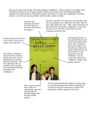
1. There are two posters for the film “The Perks Of Being A Wallflower”- both of which are very similar in the
fact that they both use the same image showing the three main characters just with different positioning
alongside a few different pieces of information and the title being of a varying font. Additionally, the colour
schemes vary in that one is green and black whilst the other is yellow and blue.
The title of the film is of a typewriter font- this links to the
how the protagonist uses a typewriter in the film. Thus, the
font could connote the ‘retro’, ‘indie’ nature of the film as it
links to literature and the past. Additionally, it shows how
the film was set in the 90s as typewriters were still
commonly used in this time.
The background colour is
lime green and that was the
colour of the original book
cover. This is an intuitive
link that the audience can
make that may interest the
readers of the book.We can
also see that its a wall
which links to the title
‘Wallflower’ thus the
actors shown must be the
‘wallflowers’ hinting at the
possible narrative.
We can assume that the three characters are the mains;
we can’t tell much about them which is intriguing for
us but the fact that the teenage girl is leaning on the
young males shoulder suggests a close bond.
This is a quote from the
book which will
automatically attract the
existing book fan
base;thus linking both
the book and film
together.
The three main
characters are used as
the USP which is an
automatic attraction for
the audience.
The poster links to the novel in
a vide variety of ways; this is
another USP of the film.
The audience’s attention is
drawn to the title at the top
and the three main actors at
the bottom due to it being
relatively spaced out. I feel
this is pleasing to the eye
and allows the connection
to be made between the title
and image of the
‘Wallflowers’.