
Recommended
More Related Content
What's hot
What's hot (19)
Viewers also liked
Similar to Magazinecontentsanalyses
Similar to Magazinecontentsanalyses (20)
Recently uploaded
Recently uploaded (20)
Magazinecontentsanalyses
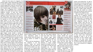
- 1. Unlike the front cover of a magazine, the contents page is about informing the audience on what the magazine contains. Although the contents page doesn’t have the main priority of looking attractive and drawing in the reader; most contents pages still include a variety of images. This Q magazine has 5 numbered images in the middle which relate to what the magazine includes. Q have also included another 2 images around the sides of the magazine; these picture relate to what is being said about them, which gives the reader a visual of what the article or feature might have. For example on of Q’s featured articles was about Queen in the issue, therefor above where they mentioned it they used a photo. Music magazine Contents pages often also put an image of the front cover on there. The biggest photo on the contents page is the featured article on the front of the magazine. This implies there is a hierarchy in the sizes of the images, the largest ones being the most important. Unlike the front covers the contents page images usually include a variety of different backgrounds rather than the typical studio, white background photo. As well as a variety in backgrounds there is equally a variety in models to show the diversity in the magazine of different celebrities attracting a range in audiences. Another theme which is often used in contents pages is that everything on the page is set into columns. For example, there are two columns of text and then all the other photos follow the theme of columns either taking up one or two. This appearance makes everything look very sophisticated and well arranged. The one thing this contents page doesn’t display however, is the extra information, which is usually written onto the photos next to where to number is written. Due to the fact everything in this magazine is set into columns, makes the overall appearance look very sleek and crisp. All the photos are clear, detailed and in a specific place on the page. Although they don’t have boarders; due to the layout from this page due to the header. Overall the simplistic design gives a positive effect on the audience as it shows clearly the information they need and want and has each type of writing under a certain category. Sections which the contents page are split up into are also a key part to the magazine and the overall appearance. Firstly sectioning parts of the page makes the look of the page a lot they are still clearly defined from each other. This means the contents page layout doesn’t look clumsy, gawky or accidental. Because of this specific layout, the readers attention is drawn straight towards the header at the top of the page, the bold red strip overpowers all the other subtle details. This is a useful technique as straight away the readers know what to expect cleaner and professional. To add to that sections are also very useful on a contents page as it helps the reader find out information. For example, on the right hand side of the first page there is a header saying “features”. This helps the reader as it shows them all the featured article that are included in this magazine issue. Not only does Q use the main concepts of a magazine contents page; but they also add their twist onto certain parts. For example they add in self promotion to some of their categorise; instead of just saying “review” they said the “Q review”. This not only has a ring to it but it also makes them appeal more unique to other magazines Q maybe in competition with. Along with self promotion in their sections, Q also have their website very discretely at the bottom of the page to help the audience find where they need to go if they need extra information. Although Q have a lot of self promotion on their contents page; they do not have social media symbols to indicate where people can find Q other than there website. This is very unusual for a magazine company.
- 2. Unlike other contents pages, Billboards doesn’t fit the usual conventions of what a contents page should appear like. For starters the overall layout only takes over 1 page, this is unusual for a magazine as usually a contents page would take up a double page as there is a lot to include. Another way this magazine layout is different to others is that there is extra information down the side of the page. This part of the magazine is something only Billboard offer and reinforces the idea that Billboard are a music genre magazine; notifying the top albums and songs. To add to the idea of their layout being in a certain format Billboard haven’t written their name big and only takes up a small amount of the page. Although it is small due to the noticeable colours it still manages to be seen and made clear. The layout of this page is very distinctive due the page being divided into blocks, the block vary on the type of article, feature or added information it is based on. Unlike other magazines although this one is divided into block the columns are not very clear as some parts are certain widths whilst others are thicker or thinner. Due to the fact there are no clear columns it makes the overall appeal look un- organised. However when you look at the titles of each category it informs the reader about each section to the magazine. This comes in useful as the audience don’t have read the whole page to find out specific information, it is already made clear just by looking at it. The colours that are dominating this page are black, white, grey and blue. This pallet is very common in magazines and is seen as safe, although is still effective. The contrasting colours complement each other making the pictures and headers stand out. As well as that these colours appeal to both male and female audiences of any ages which is a common theme in music magazines. By widening their audience they can sell more magazines and become more successful as a company. This magazine also doesn’t fit the conventions of a usual magazine as there are very few images on there.as Billboard have prioritised their colour scheme above the amount of images they have, informs us that they aim for a higher target audience. To add to that the images themselves suggest that this magazine is aimed at an older audience. The blue lines on the contents page break up the categorise and the different elements to the magazine. These lines make the page look more presentable and clearer, it shows what goes with what. To add to that the fact that Billboard have used the colour blue it makes the lines stand out more. Another technique Billboard use is that they leave a white background to draw the readers attention to the text on the page. However it sometimes also helps the images stand out, for example the women on one knee. Although Billboard is the masthead of the whole magazine the title of this page is simply “contents”, as this title is written in capital letters and is in a black bold font; it connotes solidness and strength towards the magazine. Also the fact that the title is black against a white background and at the top of the page. These contrasts make the masthead stand out more and appear more prominent on this contents page. This magazine contents page also includes a lot of minor details which help is sell and give the company itself (Billboard) self promotion. For example towards the top of the page it says the issue number, this means that the audience know that there are lots more magazines by Billboard that they can go a buy. To add to that at the bottom of the page it states other online applications readers can go to, to find out more information on a particular part of the magazine etc.
- 3. Unlike all the other magazine contents pages I had analysed on this one the Editor had written a note. This can be used as an introduction for the magazine and to intrigue the reader to want to buy or read the magazine. There is nothing particularly special about an editors note it just ties loose ends together and gives the reader a bit more of an incite to the magazine and the editor him/herself. The biggest image on this contents page is the man with a tattoo on his neck, as it is the biggest image it over powers all the others. It also gives the reader an idea that this is the most important picture and what the editors wants them to see first. Due to the fact that this image is a close up, shows that the editors wanted the audience to focus on his facial features and expression. Because of this it make the image feel personal and have meaning to the readers looking at it. To add to all that because of the photo has something to do with the interview, it gives a hint that the article itself is about personal topics and will be down o earth so that the audience feel closer to the celebrity. Although the overall layout of this contents page is very busy and full, it has been set out in a grid-like way so that everything is in a specific place, this keeps the page from looking un-organised. Keerang are very successful with their layout as they use the concept of columns to keep everything in line with each other and not appear as if it has just been thrown onto the page. The majority of the page is images of bands and musicians which indicates they aim towards a younger audience, teens, young adults. The actual part of the magazine page where Kerrang list what is going to be included. They sector each category off and list what is included in that category underneath. This is a good way to display information as it is clear and the audience can easily find what they want and what page its on without reading through the list. This way of displaying information also might help the magazine sell if readers see a lot of interesting stories. This contents page has a very vague colour scheme as the colours used are very muted. However they do use the colour yellow as if it was a highlighter. Everything important on the page Kerrang have typed in yellow with a black box around it. The contrast between the yellow and the black emphasises the yellow to make it stand out more when readers are looking at the page. The colour yellow also connotes happiness and joy. Kerrang use this in hope the readers are drawn to this colour and view it to feel an automatic positive feel about the magazine. This contents page is very unusual to others due to the fact Kerrang’s name is not stated, by briefly looking at this contents page a reader would not be able to tell what magazine this is from. Although their name is on the thumbnail of their front cover; this is minor detail which will not be spotted. The lack of self promotion could limit their readers as they do not label everything. However Kerrang have put an issue number and the date on the headline which adds small detailing. Although this contents page doesn’t include their company name it does include a unique feature which isn’t usually a necessity when creating a contents page. In the top right there is a quote form a featured band. This add on creates the idea of a relationship between the reader and the band, it makes the page appeal to people on a more personal level. Providing a quote is also a good way to hook in readers and get them wanting the magazine.