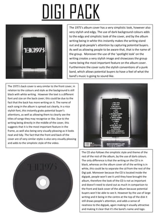
1. DIGI PACK
The 1975’s album cover has a very simplistic look, however also
very stylish and edgy. The use of dark background colours adds
to the edgy and simplistic look of the cover, and by the album
writing being in white this instantly makes the writing stand
out and grab people’s attention by capturing potential buyers.
As well as allowing people to be aware that, that is the name of
the group. Moreover the use of the ‘spotlight look’ on the
writing creates a very stylish image and showcases the group
name being the most important feature on the album cover.
Furthermore the cover suits the stylish conventions of a punk
band, which allows potential buyers to have a feel of what the
band’s music is going to sound like.
The 1975’s back cover is very similar to the front cover, in
relation to the colours and style as the background is still
black with white writing. However the text is a different
font and size on the back cover; this could be due to the
fact that the back has more writing on it. The name of
each song in the album is spread out clearly, in a nice
stylish font, this instantly grabs potential buyer’s
attentions, as well as allowing them to clearly see the
titles of songs they may recognise or like. Due to the
writing being directly in the middle of the cover, this
suggests that it is the most important feature in the
frame, as well also being very visually pleasing as it looks
neat and tidy. The fact that the front and back of the
cover are of very similar styles is also very visually pleasing
and adds to the simplistic style of the video.
The CD also follows the simplistic style and theme of the
rest of the rest of the album, by the use of dark colours.
The only difference is that the writing on the CD is in
black, whereas on the album cover all of the writing is in
white, this could be to separate the cd from the rest of the
Digi pak. Moreover because the CD is located inside the
digipak, people won’t see it until they have brought the
album, therefore the look of the CD is not as important
and doesn’t need to stand out as much in comparison to
the front and back cover of the album because potential
buyers won’t be able to see it. However by the use of large
writing and it being in the centre at the top of the disk it
still draws people’s attention, and adds a sense of
neatness to the digipak, again making it visually attractive
and making it clear that it’s the band’s name and logo.
2. The Green Day’s album cover straight away gives off a
pop/punk vibe due to the graffiti drawn band name and
album title. This is because graffiti is stereotypically
interrelated with the punk genre, as shown by the Sex
Pistols in the 1970’s. In addition the colours of the graffiti
in the background also suggests that it is a pop/punk
album, allowing potential buyers to know what type of
music the album consists off. Furthermore in comparison
to the 1975’s album cover Green Day’s is much more
exaggerated in the fact that there are a lot more
pop/punk elements about it, such as the cross in the letter
r of the title stating danger and rebellious behaviour
which reflects the punk theme and style of the cover.
Whereas the 1975’s theme and style is far more simplistic
however effective still looks effective. Furthermore this
represents the fact that although both the groups are
pop/punk bands, there style of music is different and this
is shown through the presentation of their album cover.
Green Day’s back cover is a similar style to the
front, as the colours are the same and it
continues the graffiti imagery. However the
image on the back is a zoomed out copy of the
photo on the front cover. The reason that the
image is zoomed out is to show that the couple
are standing on top of a car that is on fire. This
instantly relates to the album’s name ‘21st
century breakdown’ by the stereotypical image
on modern society of teenagers being
rebellious. In addition, this also emphasises the
pop/punk theme and allows potential buyers
to have a wider idea of what the band will
sound like and what type of music the album
will consist of. Moreover the band name is also
shown on the back cover as well as the front
which reflects the bands importance and
makes people more aware of who they are.
The disk is a slightly different style in comparison to the front
and back cover, due to the colour theme being different and
the image that is shown on both the front and the back being
different to the one shown on the disk. However the graffiti
imagery is still continued, and the stereotypical image on
modern society of teenagers being rebellious is also shown
on the disk. This is shown through the image that is on the
disk, due to the fact that the images shows a girl with a
bandanna across her mouth, which relates to Banksy’s
flowerpot image of a teenage boy wearing a bandanna
across his mouth throwing some flowers, representing him
as being rebellious and not caring.