
Recommended
More Related Content
What's hot
What's hot (19)
Viewers also liked
Viewers also liked (20)
Similar to The Kooks Digipak Album Design Analysis
Similar to The Kooks Digipak Album Design Analysis (20)
More from amyflint5477
More from amyflint5477 (17)
Recently uploaded
Recently uploaded (20)
The Kooks Digipak Album Design Analysis
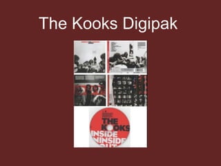
- 2. Front cover The black and white theme alongside red connote wit ha rock and roll type genre something similar to Indie Bands. Although the bands faces aren’t shown so we cant really identify them the yare on the front of this album something indie bands don’t do often. The font is simple implying the band are simplistic and don’t want to follow over the top mainstream conventions. Because the band don’t appear interested in the camera and are focusing on making their music the fact they are on the front still works within this genre. The background is very simplistic and Indie bands tend to move away from busy over the top images.
- 3. Inside BookletMuch like The 1975 inside booklet this features a picture of the band making direct contact with their audiences. This helps present the Indie style of the band as it shows their clothing and expressions, the band look a little awkward and nothing like a typical boy band. The top panel is a copyright notice from the band thanking everybody that helped them. The colour scheme is the same to the front making a connection throughout the album.
- 4. The CD The colour scheme continues onto the CD with a bright red background and black and white font. The font is easy to read in block capitals and the album cleverly uses the middle hole in replacement of an ‘O’. The CD also includes the record labels logo. The wording overlaps the CD making it look intentionally messy linking in with its genre. The CD is the brightest part of the digipak making it memorable and stand out.
- 5. Inside Booklet #2 This booklet shows the album actually being made by the band it follows the conventions of colour throughout with hints of blue in as well. The images are shot on an old fashioned camera making the images look vintage linking with the vintage style Indie bands sometimes present. This booklet includes copyright information so the digipak can not be copied.
- 6. Back Of Album The track listing for the album is small and in the top left hand corner. The font is black making it simple and linking in wit the bands simplistic atmosphere. The monochrome style image of the band can be fond on the back of the album as well adding a sense of consistency throughout the album. The image appear more blurry than that of the front and is taken from the perspective of the drummer giving the audience a look through his eyes making a connection between audience and band. As most album covers this one includes the bar code on the back. The record labels logo can also be seen again alongside other important information such as producers, website details etc.
- 7. Back Of Album The track listing for the album is small and in the top left hand corner. The font is black making it simple and linking in wit the bands simplistic atmosphere. The monochrome style image of the band can be fond on the back of the album as well adding a sense of consistency throughout the album. The image appear more blurry than that of the front and is taken from the perspective of the drummer giving the audience a look through his eyes making a connection between audience and band. As most album covers this one includes the bar code on the back. The record labels logo can also be seen again alongside other important information such as producers, website details etc.