1. FRONT COVER DECONSTRUCTION 1
The banner is in soft yellow dots ,soft blue
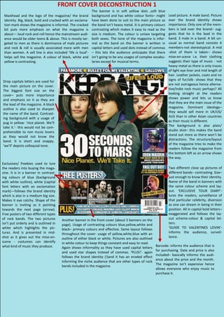
Masthead and the logo of the magazine/ the brand background and has white colour fonts– might Lead picture. A male band. Picture
identity. Big, black, bold and cracked with an exclama- have been done to suit to the main picture as over the brand identity shows
tion mark shows the magazine is informal. The cracked the band isn’t heavy metal. It is primary colours importance. Only one of the mem-
bit puts more emphasis on what the magazine is contrasting which makes it easy to read as the bers is laid over the brand– sug-
about— loud rock and roll hence the mainstream audi- size is medium. The colour is unisex targeting gests that he is the lead in the
ence would be older teens & above. This is mostly tar- both sexes. The tone of the magazine is infor- band. 3 male in a band. A bit un-
geted to men as there is dominance of male pictures mal as the band on the banner is written in usual as normal band consists 4
and rock & roll is usually associated more with men capital letters and used dots instead of commas members-not stereotypical. A mid
than women. A sell line is also included ‘life is loud’- – this lets the audience anticipate that there -shot of them is taken– shows
helps sell the magazine. A colour of black, white and isn’t going to be any usages of complex vocabu- mise-en-scene i.e. their clothing
yellow is contrasting. laries except for musical terms. suggests their type of music - not
heavy metal as there is only traces
of light eye liner and mid length of
hair. Leather jackets, coats and no
Drop capitals letters are used for signs of fur/silk- shows that they
the main picture on the cover. are not outrageous hence alterna-
The biggest font size on the tive/indie rock music perhaps? All
cover– puts more importance looking straight at the readers
and emphasis on it as they are shows power and lets us know
the lead of the magazine. A black that they are the main issue of the
outline is also used to sharpen magazine. Dominant ideology–
the name of the band. Contrast- they would sell more in UK/US/
ing background with a usage of AUS than in other Asian countries
pug in yellow- ‘nice planet. We’ll as their music is different.
take it.’- this would not be com- The background is also plain/
prehensible to non music lovers studio shot– this makes the band
as they would not know the stand out more as there won’t be
band. It is short and snappy. distractions. The structure/layout
‘we’ll’ depicts colloquial tone. of the magazine tries to make the
readers follow the magazine from
the bottom left as an arrow shows
the way.
Exclusives/ freebies used to lure
the readers into buying the maga- Two different close up pictures of
zine. It is in a banner in contrast- different bands– contrasting. Size–
ing colours of blue (background just enough to know their identity.
with white outline), white (capital Name of the band in banners with
font letters with an exclamation the same colour scheme and lay-
mark)—follows the brand identity out. ‘EXCLUSIVE TOUR DIARY’-
which is also in a medium big size. lures the readers, surveillance of
Makes it eye catchy. Shape of the that particular celebrity, diversion
banner is inviting as it pointing as one can dream in being in their
towards the next page (arrow). position. All in capital bold letters–
Free posters of two different types exaggerated and follows the lay-
of rock bands. The two pictures Another banner in the front cover (about 5 banners on the out scheme-colour & capital let-
isn’t put orderly and is outlined in page). Usage of contrasting colours blue,yellow,white and ters.
white which highlights the pic- black– primary colours and effective. Same layout follows ‘GUIDE TO VALENTINES LOVIN’-
tures. And is presented in mid- throughout the cover- usage of yellow,white,blue with an informs the audience, surveil-
shot as it gives out the mise-en- outline of either black or white. Pictures are also outlined lance.
scene - costumes can identify in white colour to keep things constant and easy to read.
what kind of music they produce. Barcode: informs the audience that is
Again shows informality as they have used capital letters
for purchasing. Date and price is also
and used star shapes instead of commas. ‘PLUS!’- again
included– basically informs the audi-
follows the brand identity (!)and it has an eroded effect
ence about the price and the month.
informing the niche audience that are other types of rock
The magazine isn’t expensive hence
bands included in the magazine.
allows everyone who enjoy music to
purchase it.
![Analysing a magazine double page spread[1]](data:image/gif;base64,R0lGODlhAQABAIAAAAAAAP///yH5BAEAAAAALAAAAAABAAEAAAIBRAA7)