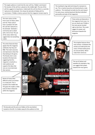
1. The target audience is lured into the main sell-line, ‘Diddy’s commission’.
The masthead is big, bold and showy for everyone to
The location of the sell-line is placed on the middle right. The size of this
see. This is mainly masculine and should attract a male
sell-line suggests its importance. Underneath the sell-line there is a sub-title
audience. The masthead normally has the same layout
‘welcome to the darkside’, this shows the darkside of Diddy with his
for every issue, maintaining brand identity (individual
commission. P-Diddy is clearly a person that this magazine remains loyal to.
personality and style of the magazine).
The main colours of the Three artists are featured on
front cover are black, white the magazine front cover. As
and red. These colours we can clearly see P-Diddy is
have a symbolic link with the main person located
the sub-title ‘welcome to right at the front. This could
the darkside’. Darkside is suggest his power and
commonly seen as black dominance towards the
with a hint of red. The use magazine.
of the colour white may
suggest that not everything
is dark.
The strapline features three
The artists featured show
main articles. In-between the
signals that this magazine
articles are bullet points the
celebrates Hip-Hop and
colour of these bullet points
R&B. Their dark costumes
are red and white. Which
and expressions show that
make them stand out.
they belong to this genre.
The female artist is also
located at the back also
suggesting that this
magazine is mainly for a The use of tattoos and
male audience and Jewellery for example a ring
supports the ideas that can suggest their power
men are more dominate towards the music genre.
than women.
Names of many other
different artists are written
in a small print. This is
located at the middle-left.
This gives the readers a little
taste of what is featured
within the magazine.
The barcode and the price are hidden at the very bottom
located on the left. It is hidden away for the audience to find.
2. The target audience is lured into the main
The magazine colour scheme has remained mostly
image. This is because the male artist is making
the same and this is a good thing as it creates
direct address towards the audience. This
consistency.
could show that this magazine was made for
them and that the audience can learn more
about him exclusively in this magazine.
A quote has been used by the
artist featured on the magazine.
Underneath the artists name the
readers can clearly see the word
The title is in red
‘exclusive’, this makes the
which can represent
audience think that this artist
anger. This could have
has a secret and that he would
a link to the way that
like to share it with us.
the artist is looking at
us. He has a serious
face on him and looks
quite angry.
A little bit of this exclusive
interview can be seen in a
The sell-line, ‘Keri Hilson’ small quote, the main key
suggests that this artist must word that the audience can
have done something see is the word ‘TUPAC’. This
incredible. However once is the only word in the whole
the readers read the sub title quote which is in capital
‘Has been a (very) bad girl’ letters, followed by this are
they get the feeling of three full stops which show
something dirty and fishy. that the rest of the interview
The use of the word ‘very’ is can be revealed within this
in brackets this could be magazine. This will persuade
making a statement and readers to buy the magazine
must be very important. The in order to read on.
location of the sell-line is
placed on the bottom-left.
The size of this sell-line
suggests its importance.
The colours used in this
magazine front cover are
blue, red and white. The
colour blue is used for the
background and has a
The barcode is yet again hidden away for the
symbolic link to what the
audience to find. It is hidden in the same place on
artist is wearing as well as
the bottom-left this creates consistency.
his cap, which are all dark
blue. Blue is a colour of
innocence and it can also
represent forgiveness.