Web & Social Media Analytics Previous Year Question Paper.pdf
contents page deconstruction 1
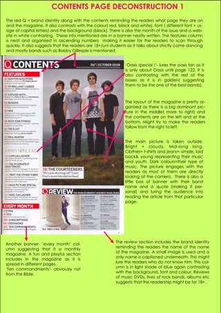
1. CONTENTS PAGE DECONSTRUCTION 1
The red Q = brand identity along with the contents reminding the readers what page they are on
and the magazine. It also contrasts with the colour( red, black and white), font ( different font + us-
age of capital letters) and the background (black). There is also the month of the issue and a web-
site in white contrasting. These info mentioned are in a banner neatly written. The features column
is neat and organised in ascending numbers making it easier for the readers to scan through
quickly. It also suggests that the readers are 18+/uni students as it talks about strictly come dancing
and mostly bands such as Bobby Gillespie is mentioned.
‘Oasis special !’- lures the oasis fan as it
is only about Oasis until page 122. It is
also contrasting with the rest of the
boxes as it is in golden( suggesting
them to be the one of the best bands).
The layout of the magazine is pretty or-
ganized as there is a big dominant pic-
ture in the middle( more to right) and
the contents are on the left and at the
bottom. Might try to make the readers
follow from the right to left.
The main picture is taken outside.
Bright + cloudy. Mid-long long.
Clothes= t-shirts and jeans= simple, laid
back& young representing their music
and youth. Dark colours=their type of
music. The picture engages with the
readers as most of them are directly
looking at the camera. There is also a
little box of banner with their band
name and a quote (making it per-
sonal) and luring the audience into
reading the article from that particular
page.
The review section includes the brand identity
Another banner- ‘every month’ col-
reminding the readers the name of the name
umn suggesting that it a monthly
of the magazine. A small image is used and a
magazine. A fun and playful section
only name is captioned underneath. This might
includes in the magazine as it is
lure the readers who do not know him. This col-
spread in different pages.
umn is in light shade of blue again contrasting
‘Ten commandments’- obviously not
with the background, font and colour. Reviews
from the Bible.
of music DVDs, lives of rock bands, albums etc
suggests that the readership might be for 18+ .