Russian Call Girl South End Park - Call 8250192130 Rs-3500 with A/C Room Cash...
Q mag 2
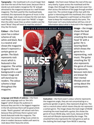
1. Typography – the masthead is of a much larger font Layout – the front cover follows the root of the eye
size than the rest of the front cover, because then it very clearly, it goes across the masthead and the
stands out and readers recognise the ‘Q’ and get image, then through the image and main cover line
attracted to the magazine because its a well known then across the bottom of the page through another
magazine. The font used for the masthead looks cover line. The central image of the man with the
smashed, this represents the genre of music in the guitar is interacting with the masthead, this is done
central image, rock music is known for the rock stars because the magazine is well known so they don’t
mad lifestyle. The main cover line ‘MUSE’ is larger have to keep the masthead exactly the same. The
then the other cover lines so when readers see the front cover isn’t very cluttered but still has a lot of
word ‘Muse’ they will want to read the article if information about what is featured in the magazine.
they like the band.
Image – the image
Colour – the front shows the lead
cover has a colour singer of Muse
scheme of red, smashing the mast
white and black. Red head ‘Q’ with a
is a neutral and guitar. He is
shows the magazine wearing black
doesn’t represent a which shows the
certain genre or genre he is
gender. The black representing, rock
represents rock music. The guitar
music which is smashing the ‘Q’
featured in the also represents
magazine. The white the genre of music
Q against the red he represents,
background is a well because rock stars
known image and are known for
will stand out to their mental
readers. The colour lifestyle and not
scheme is kept caring about the
throughout the consequences.
magazine.
Language and Mode of address – the front Evaluation – the front cover’s colour scheme represents
cover uses language such as ‘the UK’s the magazines angle, they are not concentrating on a
biggest’ which draws the audience in particular gender or genre, they represent all genres. The
because they see this is the biggest magazine red is a neutral colour which means they do not represent
in the UK and know there will be good article a certain genre. The image shows the lead singer of MUSE
inside. ‘Rock’s greatest’ will attract rock fans smashing the mast head with a guitar, this shows the
because they will know there is great rock genre of music MUSE play, rock music, because of the
bands featured inside the magazine. The rock and roll lifestyle represented by the image. The
front cover has names of big music artists to smashed font also represents the rock genre as well as
draw in readers because readers will want to the clothing the lead singer from MUSE is wearing.
read about their favourite artists.
2. Typography – the font for the Q is the same as used on the Layout – the contents page vaguely follows the
Q magazine front cover mast head, this is a well known font root of the eye, it goes across the main title ,
and the Q is well known in the music world. The main title ‘Q through the central image and across the
Contents’ is larger than the rest of the font, this lets the bottom page definitions. The page isn’t cluttered
readers know this is the page where they can find
but has a lot of information on it which is good
information about the magazine. The main cover line ‘Oasis
for a contents page. The image dominates the
special’ is larger than the other font so that it attracts the
readers eye, also it is in an alternative font which matches page and that means the image is the first thing
the style of music the cover line features. readers see when they open the magazine.
Colour – the Image – the
contents page image is of a
follows the same band, they are all
colour scheme as wearing a black
the front cover, the piece of clothing,
red, white and black
this may
signifies the
magazine doesn’t
represent the
concentrate on a genre of music
certain genre or they are in. Its a
gender. Red is a long shot showing
neutral colour and all the band
represents all types members and
of genres. Gold font there clothing,
is used for the ‘Oasis the clothing they
Special to show it is are wearing looks
exclusive and is very like they could be
important. in an indie band.
Language - the Mode of address –
contents page uses on the Q review
quotes to pull you the article has such
in, “he’s just words as ‘the
showing off” this is a worlds biggest and
quote about The best music guide’
Courteeners and this attracts
draws readers who readers because
want to know about they know this
The Courteeners. All magazine has the
the page titles are in best music guide.
capitals to make Also the magazine
them stand out uses the words ‘20
more to the reader. Evaluation – this contents page follows the same colour scheme Greatest Oasis
And exclamation as the front cover of Q magazine, the red, white and black show tracks’ which draws
mark is used after the magazine is neutral and doesn’t concentrate on a certain in readers who like
‘Oasis Special!’ this genre or gender. Words such as ‘20 greatest’ and ‘world’s Oasis.
biggest’ draw in the readers because they know this magazine
makes it stand out
has the best music information. The image is of a band and
to the audience and
shows them wearing black which may represent the genre of
makes them want to music they are in. Also the clothing they are wearing may
read it. represent the genre of music they are in,