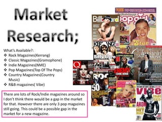
1. What’s Available?:
Rock Magazines(Kerrang)
Classic Magazines(Gramophone)
Indie Magazines(NME)
Pop Magazines(Top Of The Pops)
Country Magazines(Country
Music)
R&B magazines( Vibe)
There are lots of Rock/Indie magazines around so
I don’t think there would be a gap in the market
for that. However there are only 3 pop magazines
still going. This could be a possible gap in the
market for a new magazine.
2. You can tell by
the way the main
‘Green Day Exclusive’ is a teaser dominant image
The main colour which would appeal to fans of is dressed that it
scheme is red the band. Hinting to which is a rock
, white, black and genre it is. magazine. He has
blue. This is quite a tattoos covering
dark colour scheme his arms which
and is common in would appeal to
all of NME the target
magazines audience for this
especially the red magazine.
title of the name of
the magazine. The anchorage is
about an
The font is very bold and interview with
square, shows that it is not a Billie Joe. This
girly magazine as it is very in would appeal to
your face, and not flowing. The bar code is in the people who like
corner of the magazine that particular
Hidden away, shows artist.
that it’s not important.
3. The title of the magazine is
in pink. This shows That it
The colour scheme of is aimed at a more female
the magazine is audience as that is it’s
pink, white and dominant colour. The font
purple. This again Is is also spirally and flowing
very girly showing which is much more of a
that it is aimed at a girly font.
female audience.
The language used on the
The main dominant front of the magazine is
image is of Tulisa. This very informal words such
would appeal to a as ‘OMG’ and ‘Blimey!’
younger audience as she This shows that is aimed
is a judge on X-Factor. So at a younger audience
it involves entertainment As the language is simple
and music. She is dressed and informal.
very girly with lots of
makeup and a sparkly It shows a bubble of a young male singer. This
dress on. would appeal to a younger audience as they
may be fans of the band and this teaser may
convince the audience to read it.
4. The main dominant
image is a typical
The colour scheme rapper, gangster artist.
of this magazine is This suits the magazine
white ,dark red and genre as these artists are
black. This shows typical artists of the
that the magazine is genre. This image would
not very girly as the appeal to the target
colours are very audience as they are R&B
dark. artists.
The articles are
about Eminem and
Yelawolf so this
would appeal to
the target of the The barcode is in the
audience of the corner of the front
magazine. Also cover, this makes it
includes Jay Z and hidden away and
Kanye West inconspicuous.
5. The freebies appeal to the target
The title of the audience, because they are
magazine ‘Kerrang’ is offering posters of artists that
smashed and feature in the magazine, which
fractured. This gives a appeals to the audience.
the impression that the
magazine is loud and The main headline is about
rocky as the title the ‘return of linkin park’
couldn’t take the this would appeal to the
music. target audience of the
magazine. The title is very
in your face as it is in
The main dominant
bright yellow and in the
image is of a man
middle of the page.
screaming covered in
tattoos. This shows the
audience the type of The colour scheme of
magazine it is by his the front cover is
actions as they may red, yellow, white and
The barcode again is in the
recognize him from a black. This suggests it
bottom corner of the page
band they listen to. suits the music as it is
hidden away and discreet.
dark and moody.