3. The masthead Front Cover Analysis The Header
Extra ‘16 page autumn tour
Bold colour, stands out, special’ to draw the reader in
takes up a large
proportion of the front The cover lines
cover Mentions other bands
that would appeal to
Use of flasher
target audience, chatty
Giving something extra language used to keep it
to the target audience informal
to encourage them to The main image
buy the magazine
Canted angle, unusual indie
Background feel that fits in with the
magazine. Dominates cover
Graffiti background, and observes the rule of
alternative feel that fits thirds.
in with the magazine
The main cover line
Rule of thirds/Left third
Reminding the reader who the
Gives a more professional main person on the front
feel. Left third used for a cover is, big to draw the
quote from Dizzee Rascal, readers in as he might appeal
eyes immediately drawn to to them
that
The footer Barcode/issue/price/date
Mentions other similar So its sellable and can tell the
bands/artists that would reader when the next issue is
appeal to target audience out
4. TARGET AUDIENCE OF THIS MAGAZINE
Target audience Profile
(possibly add image)
Methods used to attract target
Musical audience are:
interests/favourite
•Chatty/informal language
artists etc: Interested in
gigs and festivals, indie •Bright colours and bold fonts
genre of music such as
•Bands/artists mentioned are
Kasabian and Maximo
the ones the target audience
Park (On the cover)
would like
Gender Male
•’16 page autumn tour special’
Age 17-30 appealing to their likes
Social class (how much
money do they have
available?) Disposable
incomes, middle class
How much does
magazine cost?
£2.20
5. STRETCH AND CHALLENGE
ACTIVITY-
USE THE HYPERLINK FOR DIRECT ACCESS TO NME
http://www.nme.com/magazine
Who publishes the
magazine? – how
many sales does it
make?
Published by IPC
media, costs £2.20
What genre/type of magazine is it? What is the
typical content?
NME is a Indie magazine which includes various
How NME started, how has artists/bands such as Oasis, The Vaccines, Two
it changed and why? Door Cinema Club, Florence and the Machine etc.
NME was first published in It usually includes gig/album reviews and
March 1952 as a music interviews with artists
newspaper but changed to Detailed analysis of NME target audience?
a magazine in the 80’s to Males aged 17-30 interested in music and
keep up with trends. In music cultures with hobbies such as going
1996 a NME went online to to music festivals. They would most likely
keep up with technology be students.
and is now the most
popular music site.
8. The Header
The masthead
Front Cover Analysis ‘Exclusive on-set report’ sounds
Bold colour, 4 letter words but appealing to the buyer as they
takes up the whole width of the can only get the report here.
page. Takes up one quarter of About a film – linked to the
the whole cover music and entertain theme of
Running colour the magazine. ‘exclusive on-set
report’ in pink and ‘Notorious’
Colour throughout the magazine (The name of the film) in blue to
cover – black, pink and blue. All make them both stand out, but
together this makes it a uni-sex also because it is the magazine
cover that appeal to men and house colours.
women, it runs throughout so you
can identify the magazine The cover lines
Background
Only a small amount of cell
Plain grey background, lines to give the magazine
gives it a minimalistic cover a minimalistic look.
feel and makes Kanye Names other artists and
West and cell lines stand films in the RnB/hip-hop
out scene to appeal to readers
(Britney Spears, Smokey
Rule of thirds/Left third Robinson, The Dream etc.)
Looks more appealing and The main image
professional, leaves room for
important cell lines about Medium close up of Kanye West
Kanye West (The man on the with stern look on his face
cover) showing that his music isn’t all
The main cover line
happy and is fairly serious.
In big bold letters ‘Kanye West’ to educate the reader who’s on the Dominates cover and observes
cover and a quote of his ‘I am rap’ to give you a insight into what the rule of thirds.
will be in the magazine for the reader to want to read on.
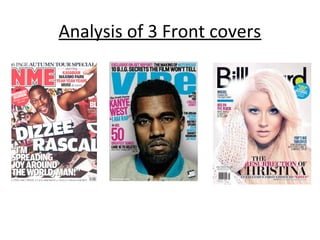
9. Analysis of magazine front covers
Cover 3. Billboard magazine
Christina Aguilera edition
10. The masthead
Front Cover Analysis Use of flasher
Bold font and black stands out
Giving something extra to the
from the white background,
target audience to encourage
partially hidden by main image,
them to buy the magazine, in
but because it is such an well
blue to stand out from the plain
known magazine, we still know it
background, also part of the
is called Billboard. ‘D’ filled in
writing is in the lime green that
with green to give it a modern
is in the masthead so the
and young approach.
colours are in accord.
Background The cover lines
Plain white to let the cell lines Talks about other bands to show
and main image stand out. Also the reader and sneak preview of
has a young and fresh approach what’s inside the magazine and
like the masthead other RnB artists the target
audience would be interested in.
Barcode/issue/price/date All in the same font to remain
So its sellable and can tell the professional and appealing to the
reader when the next issue is out eye
(educating the reader) located in The main image
the bottom left hand corner
where you’d expect it to be Christina Aguilera dominates the
cover by taking up at least ¾ of the
(conforming to stereotypes of
page and staying central. She has a
magazines)
flawless look and wearing a white
The main cover line jumper, her hair is white/blonde
Reminding the reader who she is ‘Christina’ this appears to be an issue when she fitting in with the white background
made her comeback and so by using the word ‘Resurrection’ (which has which almost looks angelic with the
connotations of Jesus and the Bible) appears to be angel-like which fits in with the light shining behind her head on
mise-en-scene: the light behind her head is almost like a halo and makes her seem the left.
innocent