
Recommended
More Related Content
What's hot
What's hot (20)
Viewers also liked
Similar to Magazine Contents Page Analysis
Similar to Magazine Contents Page Analysis (20)
More from chloegilmour
Recently uploaded
Recently uploaded (20)
Magazine Contents Page Analysis
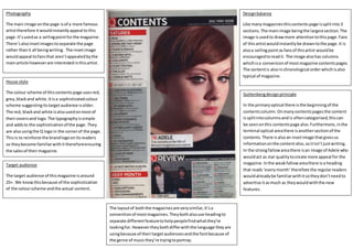
- 1. House style The colour scheme of thiscontentspage usesred, grey,blackand white.Itisa sophisticatedcolour scheme suggestingitstargetaudience isolder. The red, blackand white isalsousedonmostof theircoversand logo. The typographyissimple and addsto the sophisticationof the page. They are alsousingthe Q logo in the cornerof the page. Thisis to reinforce the brandlogoonitsreaders so theybecome familiarwithit thereforeensuring the salesof theirmagazine. Photography The main image onthe page isof a more famous artisttherefore itwouldinstantlyappeal to this page.It’susedas a sellingpointforthe magazine. There’salsoinsetimagestoseparate the page rather thanit all beingwriting. The insetimage wouldappeal tofansthat aren’tappealedbythe mainarticle howeverare interestedinthisartist. Designbalance Like manymagazinesthiscontentspage issplitinto3 sections.The mainimage beingthe largestsection.The image isusedto drawmore attentiontothispage.Fans of thisartistwouldinstantlybe drawntothe page.It is alsoa sellingpointasfansof thisartist wouldbe encouragedtoreadit. The image alsohas columns whichisa conversionof mostmagazine contentspages. The contentis alsoinchronological orderwhichisalso typical of magazine. Target audience The target audience of thismagazine isaround 25+. We knowthisbecause of the sophistication of the colourscheme andthe actual content. Guttenbergdesignprinciple In the primaryoptical there isthe beginningof the contentscolumn. Onmanycontentspagesthe content issplitintocolumnsandis oftencategorised,thiscan be seenonthis contentspage also.Furthermore,inthe terminal optical areathere isanothersectionof the contents. There isalsoan insetimage thatgivesus informationonthe contentalso,soitisn’t justwriting. In the strongfallowareathere isan image of Adele who wouldact as star qualitytocreate more appeal for the magazine.Inthe weakfallowareathere isa heading that reads‘everymonth’ therefore the regularreaders wouldalreadybe familiarwithitsotheydon’tneedto advertise itasmuch as theywouldwiththe new features. The layoutof boththe magazinesare verysimilar,it’sa conventionof mostmagazines.Theybothalsouse headingto separate differentfeaturetohelppeoplefindwhatthey’re lookingfor.Howevertheybothdifferwiththe language theyare usingbecause of theirtargetaudiencesandthe fontbecause of the genre of musicthey’re tryingtoportray.
- 2. House style The colour scheme usedisyellowand black.Itis consistentthroughoutthe wholepage makingit appearmore professional.The colourredisalso usedthroughoutthe page howeveritisused less.Thiswouldtherefore highlightkey informationandwill standoutmore againstthe page. The typographyof the words‘KERRANG! CONTENTS’isalsoseenonthe frontcover whichreinforcesthe logosothe audience become more familiarwithit. Photography The image is usedasan advertisingpoint.For people whoonlyglance pastthispage wouldbe more drawn to itthan theyusuallywouldbe. The image covershalf the page.There is also use of insetimagesonthe page of membersof otherbandsso it drawsmore attention. Designbalance The magazine isin3 mainsections. The main image isthe thingthat woulddrawmost people tothe page therefore isthe largestthin g on it.The contentisina columnformwhichis typical formost magazines. Target audience The general audience of thismagazine ranges fromaround 14-25. The informal language used insome of the contentstitleslinktothis.If the magazine wasaimedatan olderaudience then thislanguage wouldn’thave beenused. Guttenbergdesignprinciple In the primaryoptical areawe see the main image forthispage.This image linkstoa competitionadvertisement.Inthe terminal area there isanotheradvertisementfora subscriptiontothe magazine which wouldhelp to ensure theysell theirmagazineswithregular sales. Inthe strong fallowareathere isthe contentsstartingpointandcontinuesdownthe page in numerical order.Lastlyinthe weak fallowareathere isan editorial letter.Thisisa conventionof manymagazine contentspages. Thismagazine isproducedweeklytherefore will have lessinformationasthere wouldbe in a magazine thatis producedmonthly. Therefore theywouldn’tbe able tofill the page withthe contentso the editor’s letterisputin place.