Automating Business Process via MuleSoft Composer | Bangalore MuleSoft Meetup...
Evaluation - Question 1
1. Q1. In what ways does your media product use, develop or
challenge forms and conventions of real media products
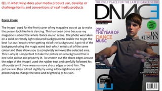
Cover image
The image I used for the front cover of my magazine was et up to make
the person look like he is dancing. This has been done because my
magazine is about the whole ‘dance music’ scene. The photo was taken
on a solid extremely light coloured background to enable me to get the
best ‘cut out’ results when getting rid of the background. I got rid of the
background using the magic wand tool which selects all of the same
colour and then allows you to completely removed the selected area.
This is why it is important to take the picture on a background that is
one solid colour and properly lit. To smooth out the sharp edges around
the edge of the image I used the rubber tool and carefully followed his
silhouette until there were no more sharp edges around him. The
picture was then edited slightly by using adobe lightroom and
photoshop to change the tone and brightness of his skin.
2. Masthead
I chose the name ‘DANCE’ for my magazine because I wanted a simple and easy to remember name. I feel that larger names for magazines start to look
messy when designing the masthead so I chose a short one that was relevant to my magazine. I don’t know exactly what the font size is for the masthead
because whilst I was designing the letters, I had changed the font into a smart object which allowed me to manipulate the different anchor points of each
letter. Moving the anchor points in the letters allows you to re-shape the letters and create your own unique typeface like I have done. The ‘A’ and the ‘N’
have been changed the most. I started re-shaping the ‘N’ as it is the main focal point in the title. The most obvious change that has been made to the ‘N’ is
that is has been reflected which makes it stand out more. I changed the curves in the ‘N’ and have mostly straightened them out to make it look more
striking and dominant. I then moved onto manipulating the ‘A’. I copied the basic right hand side of the ‘N’ which makes the text flow better as it all looks
similar and is more aesthetically pleasing. The dotted red line that cuts through the ‘N’ shows the mirror line between the ‘A’ and one half of the ‘N’ which
again makes the whole masthead flow better. The D and C also mirror each other. I mirrored the E aswell to enable me to join it to the C. These two
letters are used as the logo for the magazine when they are rotated like this.
The colour scheme of the masthead is simple yet effective, with the fading letters going towards the E and then the bright contrasting blue. I have used
only 2 colours to keep it simple and only the opacity has been changed to create the lighter and darker shades. This simple colour scheme strongly
follows the usual codes and conventions of a dance magazines colour scheme.
3. I have used a 3 colour colour scheme for my coverlines. The colours used are; Purple, Orange and Blue the
reasons for choosing these colours are because in my audience research they came out as the most popular
between males and females. Not only do these colours suit the bright colour scheme of a dance magazine but
they are the most people so more people will be attracted to this magazine.
The font i used for my coverlines is consistent throughout other than the 2 highlighted text pieces. The font is
called Myriad Pro and the size of it ranges from 16pt to 20pt. The reason for having a very slight difference in size
for the font is so that you can position and place the more important words in better places and make them
stand out more. I chose to make very concise and short coverlines which follow the normal codes and
conventions of music magazines. Coverlines are made to be very short and precise so the reader can quickly
gain information on what is inside the magazine and whether they want to buy it!
My magazine has all the same features and
codes and conventions as mixmag, an
extremely successful dance magazine that is
published monthly.
4. The colour scheme of the contents page is mainly dark colours with bright or light colours
applied as a gradient. This brighter colour contrasts and makes the page look a lot more
professional. If a background fill colour is used in a professional magazine it will vary rarely
be one solid colour as that makes it look unprofessional, even if it is only a vary slight
gradient.
The 3 boxes where the text is placed were drawn using the pen tool in Adobe illustrator.
The pen tool allows you to create any shape you want and is a vector graphic which means
the quality of the drawing will be the highest possible, which is what needed when sending
a piece to be printed at a high resolution.
The titles above each section of the contents page have been made larger so it is easier to
find what you are looking for in the magazine and makes it quicker. After the page(s)
name/section I have put in a smaller font some more inside information into whats on the
pages. This again makes the viewing of the magazine more pleasurable as you know whats
going to be in the article before you read it.
All the photographs on the contents page have been taken by me and relate to the dance
music scene. There aren't any set columns in this contents page, however the text does all
sit in a downwards line which makes it look neat. This goes against the codes and
conventions of a contents page however I feel that it works well and makes the green
square on the right hand side stand out and look professional.
I have put the magazines logo on the contents page as well so people see the logo more
often and will then remember it next time they are looking to buy a magazine.
5. On the left is my dance
magazines contents
page and on the right is
one taken from Djmag.
My contents page has a
main column with the
most important
information on it. The
audience immediately
gets drawn to this
column so therefore it is
important to put the
most important
information in there.
Headings
Pictures relating to
dance music
Web address
Page numbers
Minimalistic yet
effective colour scheme.
6. The double page spread bellow is taken from Djmag. Nearly all dance music double
page spreads will have some form of main image on them with an article or
questionnaire relating to the image. Nearly all professional magazines have a drop
cap at the start of the new paragraph, this separates the start of the article of from
the rest and makes it look professional.
Columns are used in magazines to make it more pleasurable and easy to read instead
of following long lines that spread across an A4 page.
Mixmags double page spread has their logo on so
the more times people see it the more chance
there is of them remembering it which is why I
have put my logo on my double page spread. I have
also included a blackberry scanning code to
incorporate the social media sites into my
magazine.