Personal Project
Evaluation
Louis Dodds-Rodgers
Production Process Evaluation
Research
• Some strengths of my research include researching Bethesda games such
as fallout and Skyrim and studying the game cases simplicity and careful
placements of logos, symbols etc. I also studied cyberpunk 2077 and took
ideas from the neon ‘cyberpunk’ genre which helped me to develop my
finishing product.
• Some weaknesses of my research could have being to be more precise
with my placements of text and the colour layout to get some more
complimentary colours which would bring out the simplicity in my design,
to better this I could replace some of the colours and either brighten them
or darken them this would give my product are more finished and polished
look it would also help stick to my research of Bethesda game cases as
they usually contain dim lighting and simple designing.
Planning
• The strengths of my planning were knowing what a certain age target
market enjoy and what draws them in. Another strength is finding out
what designs are well selling and what information is also contained on
the front of a game, my planning helped my product as I could tailer my
game to the target audiences needs and make a game cover which draws
in more customers who may have played similar games and enjoyed them.
A weakness of my planning is not working out what to design on the back
of my game case, this helped me to think quick on my feet and so I
designed a back cover which could have been improved with more heavy
information such as the size of the game, the story and the compatibility
this would have made my cover more immersive and informational for the
market.
Time Management
• I could’ve used my time management a lot better I didn’t manage to
complete my full project on time, my product could have definitely have
been improved with additional time. If I were given some more time to
produce my work I would’ve spent more time working on my PowerPoints
and work at home rather than researching and developing my final
product this would have insured I got a better overall grading and my
evaluation could have been completed with more accurate information as
I would’ve been able to spend more time on my end product.
Technical Qualities
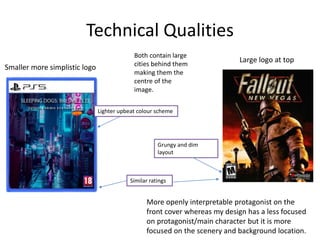
Lighter upbeat colour scheme
Grungy and dim
layout
Similar ratings
Large logo at top
Smaller more simplistic logo
More openly interpretable protagonist on the
front cover whereas my design has a less focused
on protagonist/main character but it is more
focused on the scenery and background location.
Both contain large
cities behind them
making them the
centre of the
image.
Aesthetic Qualities
I would say my work does look good as it is simplistic, eye catching and involves a very
stretched palette of neon colours, I also think it was creative as there is a backstory behind
the first game and the fans of the genre and first game would be excited to see a release of
this especially set in somewhere so large and full of light and beautiful atmospheres. Some
aspects of my games visuals would include the rain in the background mixing with the neon
signs strung up throughout the city as it polishes of the cyberpunk themed aesthetic. If I
had to improve something about my finished visuals it would be neatening corners and
making sure all my images are high resolution as the back cover is less detailed due to the
crop I made of a character on the back, I would improve this by using a soft eraser on the
edges and make sure when I use the lasso tool to cut the image with a fair amount of space
so I can erase where needed to give it a smoother look. The strengths from the aesthetic
qualities of my design includes the fact it looks sleek and modern meaning the correct
target audience will be interested in purchasing it.
Audience Appeal
I have appealed to my target audience as I have aged my game for over 18s only.
I have also stuck to a simplistic design which my target audience will like as they
like Bethesda made games and their game cases feature simplicity and a bold set
of colours. Some specific parts that appealed to my audience would be the fact
its set in a different scene than other games giving it a broader potential fan
base and the use of bright neon colours to depict an image of a cyber punk
themed scene.
Peer
Feedback
Feedback 1
• What did you like about the product?
• What improvements could have been made to
the product?
Feedback 2
• What did you like about the product?
• What improvements could have been made to
the product?
Feedback 3
• What did you like about the product?
• What improvements could have been made to
the product?
Peer Feedback Summary
• What do you agree with from your peer
feedback?
• What do you disagree with from your peer
feedback?
Peer Feedback Summary

7. evaluation

  • 1.
  • 2.
  • 3.
    Research • Some strengthsof my research include researching Bethesda games such as fallout and Skyrim and studying the game cases simplicity and careful placements of logos, symbols etc. I also studied cyberpunk 2077 and took ideas from the neon ‘cyberpunk’ genre which helped me to develop my finishing product. • Some weaknesses of my research could have being to be more precise with my placements of text and the colour layout to get some more complimentary colours which would bring out the simplicity in my design, to better this I could replace some of the colours and either brighten them or darken them this would give my product are more finished and polished look it would also help stick to my research of Bethesda game cases as they usually contain dim lighting and simple designing.
  • 4.
    Planning • The strengthsof my planning were knowing what a certain age target market enjoy and what draws them in. Another strength is finding out what designs are well selling and what information is also contained on the front of a game, my planning helped my product as I could tailer my game to the target audiences needs and make a game cover which draws in more customers who may have played similar games and enjoyed them. A weakness of my planning is not working out what to design on the back of my game case, this helped me to think quick on my feet and so I designed a back cover which could have been improved with more heavy information such as the size of the game, the story and the compatibility this would have made my cover more immersive and informational for the market.
  • 5.
    Time Management • Icould’ve used my time management a lot better I didn’t manage to complete my full project on time, my product could have definitely have been improved with additional time. If I were given some more time to produce my work I would’ve spent more time working on my PowerPoints and work at home rather than researching and developing my final product this would have insured I got a better overall grading and my evaluation could have been completed with more accurate information as I would’ve been able to spend more time on my end product.
  • 6.
    Technical Qualities Lighter upbeatcolour scheme Grungy and dim layout Similar ratings Large logo at top Smaller more simplistic logo More openly interpretable protagonist on the front cover whereas my design has a less focused on protagonist/main character but it is more focused on the scenery and background location. Both contain large cities behind them making them the centre of the image.
  • 7.
    Aesthetic Qualities I wouldsay my work does look good as it is simplistic, eye catching and involves a very stretched palette of neon colours, I also think it was creative as there is a backstory behind the first game and the fans of the genre and first game would be excited to see a release of this especially set in somewhere so large and full of light and beautiful atmospheres. Some aspects of my games visuals would include the rain in the background mixing with the neon signs strung up throughout the city as it polishes of the cyberpunk themed aesthetic. If I had to improve something about my finished visuals it would be neatening corners and making sure all my images are high resolution as the back cover is less detailed due to the crop I made of a character on the back, I would improve this by using a soft eraser on the edges and make sure when I use the lasso tool to cut the image with a fair amount of space so I can erase where needed to give it a smoother look. The strengths from the aesthetic qualities of my design includes the fact it looks sleek and modern meaning the correct target audience will be interested in purchasing it.
  • 8.
    Audience Appeal I haveappealed to my target audience as I have aged my game for over 18s only. I have also stuck to a simplistic design which my target audience will like as they like Bethesda made games and their game cases feature simplicity and a bold set of colours. Some specific parts that appealed to my audience would be the fact its set in a different scene than other games giving it a broader potential fan base and the use of bright neon colours to depict an image of a cyber punk themed scene.
  • 9.
  • 10.
    Feedback 1 • Whatdid you like about the product? • What improvements could have been made to the product?
  • 11.
    Feedback 2 • Whatdid you like about the product? • What improvements could have been made to the product?
  • 12.
    Feedback 3 • Whatdid you like about the product? • What improvements could have been made to the product?
  • 13.
    Peer Feedback Summary •What do you agree with from your peer feedback? • What do you disagree with from your peer feedback?
  • 14.

Editor's Notes

  • #4 What were the strengths of your research? How did your research help your product? What were the weaknesses of your research? What could you have done better/improve? What effect would this have had on your product?
  • #5 What were the strengths of your planning? How did your planning help your product? What were the weaknesses of your planning? What could you have done better/improve? What effect would this have had on your product?
  • #6 Did you manage your time well? Did you complete your project on time or would your products have improved with additional time? What would you have done if you had more time to produce your work?
  • #7 Compare your work to similar existing products and discuss the similarities and differences Put your final piece(s) in the centre of a page alongside an existing product Use text boxes and arrows
  • #8 Does your work look good? Was it creative? What aspects of your game’s visuals do you like? What would you improve? How would you improve it? Discuss the strengths and weaknesses Put your final piece(s) in the centre of a page and analyse them Use text boxes and arrows
  • #9 How have you appealed to your target audience? What specific bits of content would appeal to your target audience. Refer to your findings from your questionnaire. Put your final piece(s) in the centre of a page and analyse them Use text boxes and arrows
  • #15 What changes would you make to your product based upon your peer feedback and why?