The Most Attractive Hyderabad Call Girls Kothapet 𖠋 9332606886 𖠋 Will You Mis...
Contents 1
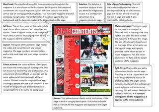
1. Mast head: The mast head is used to show consistency throughout the
magazine. It is also shown on the front cover as it is part of the codes and
conventions of a typical magazine. It uses the same colours, font and a
similar size on every page that it is placed. This makes the magazine branded
and easily recognisable. The border makes it stand out against the red
background and the large size makes it the biggest text on the page,
therefore the most important.
Title of page/ subheading: This tells
the reader what page they are on
and anyone looking for the contents
page will be able to find it easily as
the text is large and bold. It also
matches the colour scheme.
Main page image: The main image
on the page is an image of a
featured band in the magazine. Any
fans of this band will want to read
the magazine if they see this image.
The size of it shows its importance
on the page. Often artists who use
the biggest image are trying to
promote a new album or tour in
music magazines. This will create
excitement for fans and the target
audience of the magazine.
Puff: This puff is used to give extra
information about a certain page
featuring an article. It goes with the
main image therefore it could be
anchorage text. The bright yellow
colour contrasts with the red making it
stand out more and become eye
catching. This will make it likely for the
reader to notice it. It is a unique
selling point for the magazine as it
appeals to the niche audience.
Dateline: The dateline is
important because it tells
you when the magazine is
issued. It is an important
convention for a
magazine contents page.
Banner: This yellow banner stands out at the bottom of the
page as well as using up dead space. It includes an article
that is relevant for the magazine and appeals to the target
audience.
Sell lines: The sell lines used on this page include
new info on album releases, ‘vs’, interviews and
quotes. These all appeal to the niche audience of
music fans as well as encouraging them to buy
the magazine to find out more.
Layout: The layout of this contents page follows
the codes and conventions of any typical
magazine. The page numbers along on side as
well as the mast head and main image complete
the cover.
Colour scheme: the colour scheme of this page
will match the other pages of the magazine. This
will make it all look formal and professional. The
colours red, white and black are used as well as
some yellow which contrasts with all these
colours. This will make the magazine look eye-catching
so people will pick it off the shelf. It also
makes the magazine look branded and easily
recognisable if it is the same for every issue.