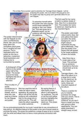
1. This is Katy Perry’s poster used to advertise her Teenage Dream Digipak. I will be
analysing this poster, she is an artist in the pop genre and
her poster may help my group and I generate ideas for our
own Digipak.
The poster uses bright
colours (pink, blue, red
and yellow) that stand
out within the white
background. Use of
bright colours
represents the pop
genre effectively. They
give the poster a fun
aspect that will appeal
to her target audience
of teens and adults.
The font used for her name
is bold in a darker shade of
blue. Also it’s in a decorative
font. This enables her name
to stand out, meaning she is
the important figure.
To advertise herself within
the poster she uses popular
social media websites for
people to ‘like’ and ‘follow’
her. This also gives her a
relatable aspect, as her
audience will most likely use
the platforms.
The poster interconnects
with her Digipak as she
uses a confectionary
theme. Her use of nude
body within the
candyfloss cloud gives
her a ‘naughty but nice’
persona. This is
replicated within her
poster as she has a
seductive, mysterious
facial expression and
makeup but is
surrounded by sweets.
A photograph of the
artist is in the centre
upper half of the
poster. The border
around her body
highlights that she is
the centre of
attention.
Katy Perry has a
crown atop of her
head. This portrays
her as someone
important or that you
should look up to as
role model.
This is a play on
words.
Confectionary is
synonym for
sweets, which is
what she, has
used as a theme
for her Digipak
and poster.
She has used this text to
make her album seem
appealing. By saying the
album has all the hits the
audience will understand
that it’s the songs she is
well known for. This will
make the album appealing
to a wider audience.
By saying there is 3
new tracks on the
album it will appeal to
her audience. The use
of red font and yellow
text box highlights the
text and makes it
stand out. This draws
in attention.
There is a section for
you to instantly
purchase her songs
onto your phone. This is
appealing to the
audience, as you don’t
have to waste your time
with going to other
applications. You can
easily download it
straight away via text.
Teenage dream – the
title of the album is in
a large font in order
for it to stand out. Its
also in blue like her
name, these are
important aspects of
the album.
On my promotional poster for my music I would like to use conventions of
katy perry’s. An effective feature of the poster is the use of social media to
promote the song. This gives the audience a range of ways to be in contact
with the artist and allows them to have a more personal connection with
them.