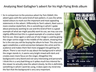
1. So in comparison to the previous advert by Tom Oddell, this
advert goes with the same kind of text pattern, it uses the white
styled colours to mark out the important and most appealing
statements in the advert. Differently to Tom’s advert, Noel uses a
more creative styled font, this is something in which I spoke
about previously wanting to use and this kind of font is a good
example of what we might possibly want to use, we may use one
slightly different but this is a good example of a creative styled
font to use. Once again a solid use of star image is used by giving
the singer centre stage in the middle of the advert, showing that
he is the one you will be buying the album to hear. This also once
again establishes a solid connection between the artist and his
audience and makes them feel more engaged into getting the
album. There is not much to say about the background in which
the singer stands in, it seems very bright mixed with dark and
creates even more focus on the singer. Altogether the
background is very bland and not very interesting and personally
I think this is a very bad thing as it spikes much less interest for
the viewer to actually view the advert closely. So this is definitely
something in which I wont be using, it does open my mind into
the fact that the background is very very important.