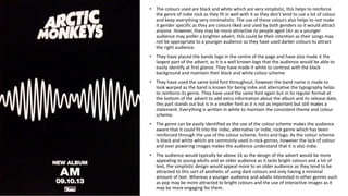
1. • The colours used are black and white which are very simplistic, this helps to reinforce
the genre of indie rock as they fit in well with it as they don’t tend to use a lot of colour
and keep everything very minimalistic. The use of these colours also helps to not make
it gender specific as they are colours liked and used by both genders so it would attract
anyone. However, they may be more attractive to people aged 16+ as a younger
audience may prefer a brighter advert, this could be their intention as their songs may
not be appropriate to a younger audience so they have used darker colours to attract
the right audience.
• They have placed the bands logo in the centre of the page and have also made it the
largest part of the advert, as it is a well known logo that the audience would be able to
easily identify at first glance. They have made it white to contrast with the black
background and maintain their black and white colour scheme.
• They have used the same bold font throughout, however the band name is made to
look warped as the band is known for being indie and alternative the typography helps
to reinforce its genre. They have used the same font again but in its regular format at
the bottom of the advert to add extra information about the album and its release date,
this part stands out but is in a smaller font as it is not as important but still makes a
statement. Everything is written in white to maintain the consistent theme and colour
scheme.
• The genre can be easily identified as the use of the colour scheme makes the audience
aware that it could fit into the indie, alternative or indie, rock genre which has been
reinforced through the use of the colour scheme, fonts and logo. As the colour scheme
is black and white which are commonly used in rock genres, however the lack of colour
and over powering images makes the audience understand that it is also indie.
• The audience would typically be above 16 as the design of the advert would be more
appealing to young adults and an older audience as it lacks bright colours and a lot of
text, the simplistic design would appeal more to an older audience as they tend to be
attracted to this sort of aesthetic of using dark colours and only having a minimal
amount of text. Whereas a younger audience and adults interested in other genres such
as pop may be more attracted to bright colours and the use of interactive images as it
may be more engaging for them.
2. • The main image is of Lana Del Rey herself, as this would automatically be intriguing to those
people who are interested in her music or know of her. The image is taken from a low angle, to
show her looking down into the camera, this positioning gives her dominance and makes the
audience feel that she is in control. She is also looking straight into the camera which reinforces
the ideas of power but is also interacting to the audience as they can make eye contact with her.
The image appears to have been taken outside using natural light as the background appears
natural. The lighting is also very bright and seems natural using the sun and maybe additional
lighting. It also appears that she is facing the sun so the audience are able to clearly see her. The
image also has a vintage look to it which she is known for doing in her images and music video as
it helps to differentiate her from a lot of current artists as well as attract a young audience as the
old vintage style has become a very big trend.
• The main colour scheme consists of a sky blue and white. The white font has been used in
contrast with the blue sky background, and the blue font has been used in contrast with her white
shirt, which helps to link everything together. The blue connotes calmness, confidence and trust,
and the white connotes purity, innocence and goodness. These colours may have been used to
reflect the album and songs within it as Lana Del Rey is known for her truthful and calm songs and
persona.
• The font used for her name and the album name are the same thin bold font, the font is bold yet
also remains feminine which helps to emphasise the look of power and strength that the main
image captures. Her name is the largest piece of text on the page as it would attract people
towards the advert as she is well known therefore having her name written at the top of the
advert would attract them to look at the details of the advert. The alum details are written in the
same light blue colour but they have used a cursive font.
• They have included the release date which is important for the readers to know as fans would
want to be the first to buy it, it can also help inform readers who are unaware that she has an
album that is coming out soon or has come out. They also included the titles of her most popular
songs that were previously released, the songs are very popular and so it would attract an
audience of people who may have had a interest in those specific songs to go and buy the full
album.
• The genre that the advert represents is indie pop, dream pop and baroque pop. She is already well
known for doing this genre so the advert helps to reinforce her music genre. It is easy to identify
the indie aspects of the advert as the image and style of the image is vintage which fits in to the
indie genre well. Also the colour scheme used, the colours are washed so it adds to the retro
vintage look that she is known for.
• The audience are likely to be females aged between 16 and 25 as they would have an interest in
keeping up to date as Lana Del Rey’s look follows the trends of vintage/retro looks. However men
may be interested in the album as the image may attract them to purchase the album.
• At the bottom they have included her website which would help people find more information
and as the website contains extra images and about pages. They have also placed the Amazon
website at the bottom right as they may be in partnership so they would have the album available
first. Her record company logo has been placed at the bottom right and is very small to not draw
attention away from the main image.
3. • This advert includes two main images, this is not a typical convention for adverts as they usually tend to
have one main image. The two images are quite different to one another as the top image shows Lady
Gaga as edgy and bold which is what people usually expect, as she is wearing a wig and she is covering
part of her face to emphasise her eyes as she is looking into the camera. The second image shows her
look more natural as her look is not as intense as she has a large flower accessory which is more neutral
and she is looking down which shows her being more feminine. These two contrasting images may be
used to show that she has more sides to her than what people see and the media presents. Both images
are in black and white, however the first image has more contrast to differentiate between the
background and her blonde/white wig and her intense eyes. The second image is more grey toned which
is to show that she can be more neutral and minimal. At the bottom of the advert they have included the
two album cover options as they have made different versions for the audience to pick.
• The main colour used for the advert is grey and white, as the majority of the background is in grey and
the text is in white. The use of these colours is different as her genre is electro pop and dance pop,
however the advert makes the audience think that genre being represented is pop as dance pop and
electro pop use more bright colours and flashy images. The use of black and white helps to go with her
new persona where she wants it to be more personal and show her other side so the use of these neutral
colours helps to reinforce that instead of using bright and bold colours and being out their which is what
people usually expect.
• The advert also has a lot of text which is not to common as they usually tend to focus on the main image
and have a few album details. The most eye catching piece of text is her name ‘Lady Gaga’ which is
written in a very large font in the centre of the page to draw the readers attention in, it is also overlapping
the image and so is more important than the image. The font is simple and bold, it is written in white to
contrast against the grey. Under her name they have placed the album name in a slightly smaller font size
to make the audience aware that it is not as relevant as her name. Below the album name they have
added what songs are included and shown the most popular ones as this would get the viewers attention
and may make them more inclined to buy the album. The last piece of text is at the bottom of the page,
this tells the audience that it is available at a range of places though it is not specific. They have included
a pull quote, ‘’The defining pop star of 2009’’- Rolling Stone, this would attract people as Rolling Stone is a
very well known magazine so their positive opinion may make people want to buy the album.
• The audience that this advert is aimed at would be females in their 20’s as it has a more mature look to it
so they may be more interested in listening and purchasing it. Men would typically not be interested as
the advert has a more feminine appeal to it and so they may not want to purchase it. Typically people
who are fans of Lady Gaga would purchase the album regardless of age and gender as they usually like
her music and her so regardless of genre and mise-en-scene they would want to have the album.