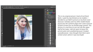
1. This is my original picture I took of my friend
Netti, I used my two friends as my models. I
decided to use Netti’s picture as my front cover
because I already used my other model Hazels
picture for the contents page and I used a picture
of both of them for my double page spread. This
picture is a mid shot as you can see the upper
half of her body. I did not want to leave this
picture plain and unedited because it looked
unprofessional, I also thought that there were
certain area’s where it was too bright
2. Too edit my image I used the tools that were
provided by photo shop that were on the right
hand side bar. By using these I was able to change
the contrast of the picture and change the
brightness of the picture, by doing this I was able
to enhance certain areas to make them lighter
and darker, for example, with the hair, I was able
to make the blonde highlights brighter.
3. Again using the tools that photo shop provided, I
was able to turn the picture in black and white. I
really liked this idea because it I wanted my front
cover to look like Billboards cover with Meghan
Trainor. By doing this I was able to make my
magazine look sophisticated and professional.
4. Unfortunately there were a couple of tool that
weren’t helpful. Sometimes it would ruin my
picture but I was able to reverse the effects and
then the image would return to its natural state.
This made me realise that not all of the tools that
where provided would always be helpful, from
this I have learnt which icons would benefit my
picture
5. Once I was happy with the way my imaged
looked, I then had to consider what information I
should include for the contents of the magazine
and I also had to decide on a title for my
magazine. As my magazine is based on mainly
pop music, I went with the name Lollipop for my
magazine as it contained the word pop in it
(maybe not the best name). Photoshop again
was able to provide me with the tools I needed
for making my master head, including changing
the colour of the text. By also using this
technique I was able to create sub headings for
my magazine. This was effective as it held the key
information on what my magazine contained.
6. This is the end result of my magazine, I have
included more sub texts to the front cover and I
have also included a date, price and a fake
website for the magazine company. This was to
shows how most magazines have become more
modernised. I am happy with the overall look of
the front cover as it has some of the qualities of a
real magazine.