Russian⚡ Call Girls In Sector 39 Noida✨8375860717⚡Escorts Service
Photo shop (masthead)
1.
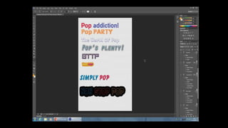
2. My first option, ‘Pop addiction’. ‘Pop’ is
inserted with in the Masthead because it
straight away highlights my genre of
magazine. ‘addicted’, a strong powerful
word to express what pop does to one
who experiences it. Once you have read
this magazine purely on pop, you shall
love the genre, and never want to stop
reading ‘Pop addiction’ magazines.
As portrayed, the two words are in
different colours to highlight the
importance of each of them. Labelling
pop in a pink colour is important so that
the viewer knows what genre of
magazine this is. ‘Addiction’ was inserted
to provide the implication that the genre
and this magazine as a whole is so
intriguing, everyone will love it.
3. My second option ‘Pop PARTY’, this mast head
holds great potential as a masthead for my
magazine due to its, font, colour, and size. It
holds great elements of bubbliness and
enthusiasm. These elements are key on the
front of a pop magazine cover and especially in
the masthead. With the masthead being the
first insert on the cover for the viewer to read,
it gives off immediate exiting and happy vibe.
‘Pop PARTY’ is alliteration therefore gives off
an easy yet affective read, a role off the
tongue like sentence. potentially persuading
the viewer to consider buying it.
The noun ‘PARTY’, suggests that this magazine
is fun/thrilling/exciting like a party. This is
inserted because when read, ones automatic
thoughts are of these themes. This is a huge
pull factor put in place rather tactically in
order to persuade reader to buy the magazine.
4. The world of pop was the third Masthead I
created on Photoshop which is differs from the
other mastheads options. However it is still very
much a plausible option to consider. ‘The world of
Pop’, once again I have inserted pop with in this
mast head to present to the viewers exactly what
this magazine specifies in. This Masthead is a little
longer than my other creations, yet all words
holds specific and key reason as to why they are
existent. Such as, ‘world’ purifies the fact that
although this magazine has a pop genre focus.. It
includes everybody's interests. For instances,
interviews with many artist a related to this style
of music, images of instruments and artists,
detailed DPS’s etc…
The forms of editing I have inserted with in this
piece of text is, a bluey purple like colour, bubble
writing, and capital letters giving off a beautiful
presentation and framing the important words.
5. Fourthly, ‘pop’s Plenty’ was designed as a viable option for my
masthead for my magazine. A viewer craves an easy read yet
an enjoyable read so what better way to start off my magazine
experience by adding a quick, snappy, catchy masthead
involving alliteration. What is implied by this statement, is that
my magazine holds everything great or little to do with the pop
genre. Artist, big hits, images and so much more. Immediately
it targets pop fans due to ‘pop’ being the first word a viewer
will read when viewing the cover. ‘Plenty’ doesn’t just
compliment pop due to the alliteration, it indicates that one
can never get enough of the pop genre therefore by purchasing
this magazine, you shall experience everything to do with pop.
For the presentation of this masthead, I have included some
interesting and unique word art. To make the masthead more
visible to citizens, it holds a rather bland main colour of
turquoise then has a strong bald black outer layering the
letters. The explanation mark is also new in this design because
what better way to catch the audiences attention other than
adding punctuation which portrays the importance of this head
line.
6. ‘OTTP’ was an idea presented in my direction by the
magazine make ‘Q’. I used this as inspiration and
figured that maybe letter/s that stand for something
maybe a bit more appealing to viewers. ‘OTTP’ stands
for over the top pop. There are so many reasons as to
why this I a strong option for my magazine’s masthead.
For example, Rhyme springs out towards the end of this
title with ‘top’ and ‘Pop’, this portrays a huge amount
of rhythm when spoken therefore encourages the
reader to perhaps consider purchasing this magazine.
Once again, the bald outer layering of the letters was
found most affective because this masthead is a lot
shorter that my other designs therefore I felt it needed
to gain some further strength to become more visible.
Also due to the plain light purple inner colour to the
lettering, it was in severe need of spicing up a little.
Hence the choice of font as well, the dot in the centre
of the ‘O’ allows the mast head to be more fit to be
seen.
7. ‘Teen pop’ is extremely different to my other designs,
it has smaller text for example however, has no less
importance. This Masthead is going to be positioned in
the top left corner of the cover page but due to the
colour it appears very visible. I have inserted ‘pop’ to
state and clarify what this magazine is about and ‘teen’
frames my target audience. Stereo typically, Pop is
loved, admired and listened to by the younger
generation therefore I found it key to include a target
audience. The colours also complimentary to the
target audience because the bright yellow and pink
text printed onto the light orange background portrays
a cheerful and exciteful theme. What pop loving
teenager would view this and think twice about
purchasing the magazine?
8. ‘SIMPLY POP’ is a great idea for a masthead, the
design is large, in capitals so it is made more visible,
colourful to back up the idea of an exciting, fun, pop
genre. The size also is a big contributor to the
effectiveness, this Masthead creation shall be
situated across the entire page at the top of the
cover so that it is read firstly. Again, ‘Pop’ is
mentioned to rapidly skip to the point of this
magazine. But ‘SIMPLY’ holds a greater reason for its
being. Who doesn’t want a simple life? By
purchasing this magazine not only shall you receive
the best pop experience filled with education, fun
facts, articles, detail, interviews, images and so on…
One shall experience it all simply.
9. My final design was ‘NON STOP POP’, after
coming up with this plausible option, I believe this
is one of my strongest due to the Rhyme involved.
Once spoken, it roles off the tongue bringing an
instant pleasure. Also, the style linked with the
colour is highly affective. On the dark background,
the different colour words release a highlighted
affect to portray importance to each individual
word. There is not one colour that does not go
well with the dark shade of black. Also, with this
sort of style, it is eye catching due to the strong
colours especially because this Mast head is
designed to run straight across the top of the
page.
The bubble writing with the bubble back ground
releases a fun, child like theme which helps
portray the genre Pop in its true form.