❤Personal Whatsapp Number Keylong Call Girls 8617697112 💦✅.
Graphic visual media language
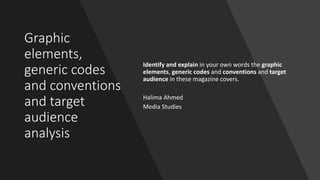
1. Graphic
elements,
generic codes
and conventions
and target
audience
analysis
Identify and explain in your own words the graphic
elements, generic codes and conventions and target
audience in these magazine covers.
Halima Ahmed
Media Studies
2. Starter
Looking at your chosen magazine cover, answer these questions:
• How many graphic elements can you spot?
• How has been the masthead designed (choice of font types, composition, colour? Is it a
conventional one? Is it conventional for this specific genre?
• What is the headline/main cover line (image/cover line)?
• What other cover lines are included?
• What is the composition of the text and images? Think of size of text and position of images.
• What are the main two colours in the image?
• What are the main two colours in the text?
• What are the codes and conventions of that particular genre.
4. MASTHEAD: This is the name of the brand, done in a
vibrant green colour, which matches the magazine’s
colour scheme, with a large size of a serif-styled font,
which is conventionally located at the top of the
magazine. This style of font shows a variety of thickness,
which gives the magazine a sense of elegance. The font
has been placed in front of the model, which makes it
stand out more as well as the bright colour.
COVER LINES: these cover lines tell the reader
more about what they will read inside this
magazine regarding beauty and fashion, and
celebrities.
FONT TYPES: For the Masthead and the
Main Cover Line, a big serif-styled font has
been used to stand out from the rest of the
text on the magazine. Everything else has
been written smaller in a sans serif font.
COLOUR SCHEME: the colour scheme of this magazine
is mainly green and white. The colour, green, tends to
symbolise growth, freshness and energy as well as
being associated with money and success, which may
have been chosen to reflect the model’s “life-changing
year”. In addition, the colour, white, is known to
represent hope and a new/successful beginning.
MAIN COVER LINE: this gives the reader more
of an idea of what the magazine is about. The
size of this serif-styled font is the second
biggest, after the masthead, and has been done
in white to make it stand out more.
MAIN IMAGE: the main image is a picture of Karlie
Kloss, who appeals to a female target audience and is a
successful American fashion model, dressed in green,
which matches the colour scheme of this magazine.
This picture of a model immediately suggests that this
magazine covers topics about beauty and fashion as
well as celebrity gossip.
DATELINE: this shows that this is £3.99 and was
published in August.
EXAMPLE 1: GRAPHIC ELEMENTS
THE TARGET AUDIENCE: This magazine appeals
to a young adult female (16-40 years old) niche
audience as it appeals to those with
interests in beauty and fashion.
5. EXAMPLE 2: GRAPHIC ELEMENTS
MASTHEAD: This is the name of the brand, done in a
large sized, serif-styled font, which is conventionally
located at the top of the magazine. This style of font
shows a variety of thickness, which gives the magazine a
sense of elegance. The font has been placed behind the
model, which makes the model stand out more,
however, the bright orange colour makes the masthead
stand out from the rest of the text.
DATELINE: this shows that this magazine is
published for March 2020 for £4.80, which is
slightly more expensive, which may reflect its
higher status.
COLOUR SCHEME: the colour scheme of this magazine
is mainly beige with elements of orange, black and
white. The colour, beige, is a warmer tone of white,
which symbolises tranquillity and elegance. Orange is
known to represent energy and enthusiasm, creativity
and success, which may have been chosen to reflect
how Emily Blunt “Hits the heights in Brooklyn”. In
addition, the colour, white, is known to represent hope
and a new/successful beginning, whereas black
symbolises mystery and power.
MAIN IMAGE: the main image is a picture of Emily
Blunt, who appeals to a female target audience and
is a successful British-American actress, dressed in
beige and black, which matches the colour scheme
of this magazine. This picture of an actress
immediately suggests that this magazine covers
topics about celebrities and fashion.
MAIN COVER LINE: this gives the reader more
of an idea of what the magazine is about. The
size of this serif-styled font is the second
biggest, after the masthead, and has been done
in orange to match the masthead and to make
the text stand out more.COVER LINES: these cover lines tell the reader
more about what they will read inside this
magazine regarding celebrities and fashion.
THE TARGET AUDIENCE: This magazine appeals
to middle class, sophisticated female adult (25-
40 years old) niche audience as it appeals to
those with interests in beauty and fashion,
celebrities and success.
FONT TYPES: For the Masthead and the Main Cover Line,
a vibrant orange, big serif-styled font has been used to
stand out from the rest of the text on the magazine.
Everything else has been written smaller in a sans serif
font in either black or white.
BARCODE: functional element; to allow the
item to be scanned in shops.
6. EXAMPLE 3: GRAPHIC ELEMENTS
MASTHEAD: This is the name of the brand, done in a vibrant red-
coloured box with a white, large-sized, sans serif-styled font, which
is conventionally located at the top of the magazine. However, this
has been placed in the top-left hand corner, rather than top and
centre; this has been done in accordance to how we read (in
England, top to bottom and left to right). In addition, this style of
font is bold and wide, which makes the masthead stand out more.
Furthermore, the audience is given the impression that this
magazine is more informal because they use a greeting, “Hello!” as
the name of the magazine as well as using a sans-serif font, which
doesn’t show much elegance. The font has been placed behind the
Queen, which makes the Queen stand out more, which could reflect
her importance and status.
COLOUR SCHEME: it is quite difficult to identify the exact
colour scheme for this magazine as it uses many different
images, which has different colours, to interest its audience
by offering these different stories. However, I would say that
the colour scheme of this magazine is mainly blue and green,
which are the colours used in what the Queen and Kate are
wearing. For example, the Queen is dressed in royal blue,
which may reflect her royal status. Whereas, Kate is dressed
in green, which symbolises growth and safety. She is dressed
in emerald green, which could reflect her power and high
status. The font is white, which is a colour that is known to
convey clarity and simplicity. Whereas, the two additional
images at the bottom of the magazine go well with each other
as they both have a colour scheme of light colours, like blue
and purple.
MAIN IMAGE: the main image is a picture of the Queen,
who appeals to a mass audience and is dressed in royal
blue, which may reflect her royal status. This picture of
the Queen immediately suggests that this magazine
covers topics about the Royal Family as well as other
celebrity gossip.
MAIN COVER LINE: this gives the reader more of an idea of
what the magazine is about. The size of this sans serif-styled
font is the second biggest, after the masthead, and has been
done in a wider bold font to make it stand out more.
COVER LINES: these cover lines tell the reader
more about what they will read inside this
magazine regarding the Royal Family and other
celebrity gossip.
THE TARGET AUDIENCE: This magazine appeals
to a mass audience, usually women, (15-40
years old).
FONT TYPES: For the Masthead and the Main Cover Line, a
white, wide and big, sans serif-styled font has been used to
stand out from the rest of the text on the magazine.
Everything else has been written smaller, still in a white, sans-
serif font.
BARCODE: functional element; to allow the item
to be scanned in shops.
DATELINE: this shows that this magazine is published for
February 2020 for £2.30, which is slightly less expensive,
which may reflect how it is available for everyone to
read as it appeals to mass audiences.
OTHER IMAGES: other images have been used
in the magazine in order to appeal to its
audience further by using these other pictures
to illustrate, rather than just telling, what other
stories, regarding famous celebrities, are
included in this magazine. These images
accompanies the cover lines.
8. Key Words: Definitions
Conventions: The repetition and reinforcement of normative
values. A set of characteristics, common to different media
texts, that define a genre.
Genre: A certain type or kind, style or category.
Codes: A system of symbols used to represent something. In
graphic language, these codes usually operate at a symbolic
level of representation (signs and symbols-connotations)
9. CONVENTION: The masthead, which is conventionally
located at the top of the magazine, has been placed in
front of the model, which makes it stand out more as
well as the bright colour, which goes with the colour
scheme of the magazine, which is green, black and
white.
CONVENTION: For the Masthead and the Main Cover
Line, a big serif-styled font has been used to stand out
from the rest of the text on the magazine. Everything
else has been written smaller in a sans serif font.
CONVENTION: the main image is a picture of Karlie
Kloss, who appeals to a female target audience and is a
successful American fashion model, dressed in green,
which matches the colour scheme of this magazine. This
picture of a model immediately suggests that this
magazine covers topics about beauty and fashion as
well as celebrity gossip. What the person is known for is
very important for a magazine as it needs to meet the
conventions of that specific kind of magazine. For
example, if a magazine had a picture of an activist or
politician on it, the magazine would appeal to audiences
interested in politics. However, this magazine appeals to
a young adult female (16-40 years old) niche audience
as it appeals to those with interests in beauty and
fashion.
CODE: the colour scheme of this magazine is mainly
green and white. The colour, green, tends to
symbolise growth, freshness and energy as well as
being associated with money and success, which may
have been chosen to reflect the model’s “life-
changing year”. In addition, the colour, white, is
known to represent hope and a new/successful
beginning. Furthermore, the white background makes
the model stand out more; the white contrasts with
the green colour as well as matching the white text
used in the cover and some of her jewellery, which
complements the look of these accessories.
FASHION & BEAUTY
CODE: the colour of the model's
necklace and blue badge blends with her eyes,
which complements her beauty. In addition, the
red badge also blends with the model's lips, which
complements her beauty further. The colours used in
this magazine are quite earthy; the brown and
green may convey nature, whereas the
blue could reflect the sky and water. As well as this,
the model isn't wearing much makeup, which could
suggest that this magazine is trying to show an
appreciation for natural beauty, which is being
reinforced by the use of natural, earthy colours.
10. CONVENTION: The masthead has been placed behind the
model, which makes the model stand out more and is
conventionally located at the top of the magazine.
CONVENTION: For the Masthead and the Main Cover Line,
a vibrant orange, big serif-styled font has been used to
stand out from the rest of the text on the magazine.
Everything else has been written smaller in a sans serif font
in either black or white.
CONVENTION: the main image is a picture of Emily Blunt,
who appeals to a female target audience and is a
successful British-American actress, dressed in beige and
black, which matches the colour scheme of this magazine.
This picture of an actress immediately suggests that this
magazine covers topics about celebrities and
fashion. What the person is known for is very important
for a magazine as it needs to meet the conventions of that
specific kind of magazine. For example, if a magazine had a
picture of an activist or politician on it, the magazine
would appeal to audiences interested in politics. However,
this magazine appeals to middle class, sophisticated
female adult (25-40 years old) niche audience as
it appeals to those with interests in beauty and fashion,
celebrities and success.
FASHION & BEAUTY
CODE: the colour scheme of this magazine is mainly
beige with elements of orange, black and white. The
colour, beige, is a warmer tone of white, which
symbolises tranquillity and elegance. The bright orange
represents energy and enthusiasm, creativity and
success, which may have been chosen to reflect how
Emily Blunt “Hits the heights in Brooklyn”. In addition,
the colour, white, is known to represent hope and a
new/successful beginning, whereas black symbolises
mystery and power.
CODE: the colour of the design on the model's top
blends with her eyes, which complements her beauty
more. In addition, the black blazer contrasts with the
beige colour, but goes well with the dark part of the
fireplace in the background and the black text used in
the cover. A blazer is formal and has connotations of
business and authority, so this could convey more of a
sense of elegance and power. This sense of power is
reinforced by the main cover line, “POWER & PASSION”,
which has been done in a bright, vivid orange colour to
reflect a sense of passion and creativity.
CODE: The material, a beige tulle, shown in what the
model seems to be wearing emphasises the elegance of
the magazine as it seems to look slightly old-fashioned
as it preserves a sense of tradition (tulle is a material
that is used for veils, dresses like wedding gowns, and
ballet tutus etc), while still being a modern magazine.
CODE: the beige background blends with what the model is
wearing; the colour of her clothes matches the colour of
the background used in the cover. The black font contrasts
well with the light beige colour, whereas the white blends
with the beige, which makes the black stand out more than
the white does.
11. CONVENTION: the main image is a picture of the Queen,
who appeals to a mass audience and is dressed in royal
blue, which may reflect her royal status. This picture of
the Queen immediately suggests that this magazine
covers topics about the Royal Family as well as other
celebrity gossip. For example, if a magazine had a picture
of an activist or politician on it, the magazine would
appeal to audiences interested in politics. However, this
magazine is clearly about celebrities and appeals to
a mass audience, usually women, (15-40 years old).
CONVENTION: the masthead is done in a vibrant red-
coloured box with a white, large-sized, sans serif-styled
font, which is conventionally located at the top-left hand
corner, rather than top and centre; this has been done in
accordance to how we read (in England, top to bottom
and left to right). In addition, this style of font is bold and
wide, which makes the masthead stand out more.
CELEBRITY GOSSIP
CONVENTION: For the Masthead and the Main Cover
Line, a white, wide and big, sans serif-styled font has
been used to stand out from the rest of the text on the
magazine. Everything else has been written smaller, still
in a white, sans-serif font.
CODE: it is quite difficult to identify the exact colour
scheme for this magazine as it uses many different
images, which has different colours, to interest its
audience by offering these different stories. However, I
would say that the colour scheme of this magazine is
mainly blue and green, which are the colours used in
what the Queen and Kate are wearing. For example, the
Queen is dressed in royal blue, which may reflect her
royal status. Whereas, Kate is dressed in green, which
symbolises growth and safety. She is dressed in emerald
green, which could reflect her power and high status.
The font is white, which is a colour that is known to
convey clarity and simplicity, which may reflect how the
magazine tries to inform and entertain its audience with
clarity and simplicity.
CODE: the audience is given the impression that this
magazine is more informal because they use a greeting,
“Hello!” as the name of the magazine as well as using a
sans-serif font, which doesn’t show much elegance. The
masthead has been placed behind the Queen, which
makes the Queen stand out more, which could reflect
her importance and status.
CODE: The Queen matches her outfit with a royal blue
hat. The Queen is also wearing a pearl necklace and
earrings, which emphasises her wealth and importance.
The pearls have a slight yellow tint to it, which
complements the Queen’s skin tone. As well as this, the
blue colour also blends well with her eye colour, which
compliments her beauty more, However, Kate matches
her outfit with a silver and green earring, which looks
very similar to the design of her outfit. This green colour
also blends well with her eyes, which compliments
beauty more. The green also goes well with the
background of the picture of the Queen. Whereas, the
two additional images at the bottom of the magazine go
well with each other as they both have a colour scheme
of light colours, like blue and purple.
14. The Socio-Economic Model
A
Senior managers of large-scale organisations
, bankers, lawyers, doctors (very well paid
professionals)
B Middle management, teachers, liberal
professionals (fairly well paid professionals)
C1 (White collar workers) Office supervisors,
junior managers, nurses, bank clerks,…
C2 Skilled (blue collar) workers and trades
persons, such as electricians, plumbers,...
D
Semi-skilled and unskilled
manual workers, such as retailers, drivers,
waiters,...
E Unemployed, students, pensioners, casual
workers.
The Standard Occupational
Classification categorises
people in terms of their
occupation or income.
One common way of
describing audiences is to
use a letter code to show
their income bracket.
15. Psychographic Profiling
Mainstreamers The largest group. Concerned with stability and security. Mainly
consumes well-recognised brands and mainstream texts.
Traditionalists Those who believe in traditional ways.
Aspirers Seeking to improve themselves. Tend to define themselves by high
status brand names, absorbing the ideologies of the products as
their own and believing that their status is established by this
conspicuous consumption.
Succeeders People who feel secure and in control, generally in positions of
power. Consumes brands which reinforce their feelings of control
and power.
Reformers Idealists who actively consume eco-friendly products and buy
brands which are environmentally supportive and healthy. Caring
and responsible ideology.
Individualists Highly media-literate, expects high-production advertising and
buys product image, requiring high-profile, sophisticated
campaigns.
16. Target audience
Gender: Female
Race: White
Age: 16-40
Geo-demographics: USA, UK and other English speaking countries.
Interests/Attitudes and beliefs: Beauty/Fashion
Socio-economics: Groups D and E.
Psychographic profile: Aspirers.
Conclusions/Justification:
Vogue is an American women's fashion magazine, first published in 1892, and is
one of the most popular fashion magazines in the market.
This magazine seems to target at an young adult, female, primarily white,
English speaking audience of aspirers, who aspire to be more trendy and
fashionable etc, who are also in the socio-economic groups D and E, which
include students, retailers etc.
This magazine appeals to a young adult female (16-40 years old) niche audience
as it appeals to those with interests in beauty and fashion.
17. EXAMPLE 1: TARGET AUDIENCE ANALYSIS
Age
Socio
economic
http://www.harpersbazaarmediakit.com/r5/showkiosk.asp?listing_id=5180841&category_id=78493
Psychographic
18. Target audience
Gender: Female
Race: White
Age: 25-40
Geo-demographics: USA, UK and other English speaking countries.
Interests/Attitudes and beliefs: Beauty/Fashion
Socio-economics: Groups A and B.
Psychographic profile: Succeeders and individualists.
Conclusions/Justification:
Harper's Bazaar is an American women's fashion magazine, first published in 1867, and is
one of the most well established and exclusive fashion magazines in the market. As its
website states: “Sophisticated, elegant and provocative, Harper's Bazaar is the fashion
resource for women who are the first to buy the best, from casual to couture”.
According to the data provided in the audience statistics, this magazine is clearly targeted at
an adult, female, primarily white, English speaking audience of succeeders and aspirers in
the socio-economic groups A and B.
This magazine appeals to middle class, sophisticated female adult (25-40 years
old) niche audience as it appeals to those with interests in beauty and fashion,
celebrities and success.
19. Target audience
Gender: Female
Race: White
Age: 15-40
Geo-demographics: UK
Interests/Attitudes and beliefs: Celebrities and news, tips and trends.
Socio-economics: Groups D and E.
Psychographic profile: Mainstreamers and some aspirers; magazine includes tips and
life hacks etc.
Conclusions/Justification:
Hello! is a weekly magazine specialising in celebrity news and stories. This
magazine was first published in the United Kingdom in 1988. It is the United
Kingdom local edition of ¡Hola!, the Spanish weekly magazine.
This magazine seems to target at an adult, female, primarily white, English
speaking audience of mainstreamers in the socio-economic groups D and E.
This magazine is mainly about celebrities and appeals to a mass audience,
usually women between 15 and 40 years old. However, this magazine may also
appeal to aspirers, who aspire to live an easier life with tips and life hacks as
well as keeping up with the trends etc.