SlideShare a Scribd company logo
1 of 5
Questions 1) In what ways does your media product use, develop or challenge forms and conventions of real media products? These are two of the magazines that I used at the beginning of my research. Both of these magazine’s have inspired me and have influenced my magazine through the colours, fonts, barcode and pictures. The genre of my magazine is Pop and that is clear through the bright colours and it attracts my target audience's eye when they look for a magazine. Also this is a typical media convention as it appeals directly to my audience. The reason I have used bright colours such as Pink, Yellow and Red is because those are the colour's that people represent with Pop. I have included a barcode because you find barcodes on magazines and I have used a barcode as it makes my front cover look more professional. The colours of pink, yellow and orange have all influenced my magazine as they are the colours of pop magazines and a young audience ranging between 13-18 which is the target audience I choice.
The image dominates my from cover and by my band using direct address which is another typical convention of a magazine front cover. Also, through this direct address it entices the audience in as the models are looking right at them and the audience are intrigued as to why they are on the front cover.  The first part shows that my magazine's genre is Pop and its hybrid genre is Gossip through the second part of the title 'goss'. Also, another typical convention of magazines is the fact that the image on the front cover is the main article inside the magazine. My image on the front cover is the band who has been interviewed in my magazine. I have also used a strap line at the bottom of my front cover to show the extra things that are in my magazine. I am happy I have used this convention as it attracts my audience.  I have used a big title on my front cover and it is only one word, I don't think if I called my magazine another name with more words would of worked so well, I am very happy with my title as I think straight away it gives away the genre of my magazine which I wanted it to do. Also my title gives away the second genre of my magazine, as my magazine is called However, I have challenged the media conventions with the type of fonts I have used on my front cover. I think using the many different fonts has helped my front cover appeal more to my audience and I am happy I have challenged this convention as it makes my fonts stand out.
On my contents page, I did follow the conventions of a magazine to an extent. I have put pictures on my contents page to go with some of my information that is in my magazine. I have added numbers on my contents page which makes my readers look at what’s in my magazine and so they can flick straight to that page. Also by using pictures on my contents page makes it visually interesting for my audience and makes it look professional. Also, I have used another convention such as subheading on my contents page, by using this conventions, it makes my contents page clearer to read and easier for my audience to find what is included in my magazine. I have used a big picture and two small pictures on my contents page which is breaking the conventions of a magazine as there is usually many small pictures not one big picture but I am glad I have broken this convention as it makes my contents page more exciting to look at and attracts my audience.
These are the contents page I used at the beginning of my research. I choice this contents page as I like all the bright colours and the different styles used. The bright colours on this contents page influenced my contents page as I have used bright colours as it encourages the audience to read on to the different stories and by splitting the content page into sections appeals to my audience as they search for what they want to read.  This content page shows how the use of direct address appeals to the target audience and how it is used to entice the audience in to read the interviews in the magazine. Also, this contents page influenced me to put more pictures than writing on my contents page as audiences prefer to look at pictures than read lots of information as it is easier to search in magazines.
Throughout my double page spread, I have used many conventions. I have used quotes from the interview as my audience will immediately be drawn to it which will make my audience read the full interview to see where they have came from. I have used two big pictures rather than lots of small pictures to add a bit of uniqueness to my article.  I have used columns again to make it easy for my audience to read. I have used the name of my band at the top of then article page which is a typical magazine convention as it shows the audience what this double page is about. I haven't broken any convention rules on my feature article and from my audience feedback, I noticed that out of my magazine, my audience likes my feature article better than my front cover and contents page. I have used typical girly colours on my article to continue the genre throughout my magazine which is another typical convention. My article starts with an overview of the artist that I have interviewed and then goes into the questions, I think this is an essential convention as it makes it easy for my audience to read and follow.  These double page article’s influenced my double page article in different ways. I was influenced by the Madonna article to put lots of pictures on my article but I was also influenced by the PINK! article to do a interview and put one large picture on.

More Related Content

What's hot

As media studies evaluation
As media studies evaluationAs media studies evaluation
As media studies evaluationraybouldy
 
Evaluation question 1
Evaluation question 1Evaluation question 1
Evaluation question 1suhayl786
 
Mesdia eval
Mesdia evalMesdia eval
Mesdia evalhull1997
 
Use, develop & challenge conventions
Use, develop & challenge conventionsUse, develop & challenge conventions
Use, develop & challenge conventionsMatthew Dunk
 
Evaluation question one as media7
Evaluation question one as media7Evaluation question one as media7
Evaluation question one as media7jazztillbrook1
 
Evaluation question 1
Evaluation question 1Evaluation question 1
Evaluation question 1Jack Goodman
 
Evaluation take 2
Evaluation take 2Evaluation take 2
Evaluation take 2bethparrish
 
How did you attract/address your audience?
How did you attract/address your audience?  How did you attract/address your audience?
How did you attract/address your audience? Toddy888
 
Evaluation part 1 - Foundation portfolio
Evaluation part 1 - Foundation portfolioEvaluation part 1 - Foundation portfolio
Evaluation part 1 - Foundation portfoliobrownnuttlucy
 

What's hot (15)

As media studies evaluation
As media studies evaluationAs media studies evaluation
As media studies evaluation
 
Evaluation question 1
Evaluation question 1Evaluation question 1
Evaluation question 1
 
Mesdia eval
Mesdia evalMesdia eval
Mesdia eval
 
Analasys
AnalasysAnalasys
Analasys
 
Question 1
Question 1Question 1
Question 1
 
Evaluation question 1
Evaluation question 1Evaluation question 1
Evaluation question 1
 
Use, develop & challenge conventions
Use, develop & challenge conventionsUse, develop & challenge conventions
Use, develop & challenge conventions
 
Evaluation question one as media7
Evaluation question one as media7Evaluation question one as media7
Evaluation question one as media7
 
Evaluation question 1
Evaluation question 1Evaluation question 1
Evaluation question 1
 
Evaluation take 2
Evaluation take 2Evaluation take 2
Evaluation take 2
 
Media Studies
Media StudiesMedia Studies
Media Studies
 
Evaluation
EvaluationEvaluation
Evaluation
 
How did you attract/address your audience?
How did you attract/address your audience?  How did you attract/address your audience?
How did you attract/address your audience?
 
Evaluation
EvaluationEvaluation
Evaluation
 
Evaluation part 1 - Foundation portfolio
Evaluation part 1 - Foundation portfolioEvaluation part 1 - Foundation portfolio
Evaluation part 1 - Foundation portfolio
 

Similar to Question 1

Similar to Question 1 (20)

Evaluation of music magazine
Evaluation of music magazineEvaluation of music magazine
Evaluation of music magazine
 
Evaluation
EvaluationEvaluation
Evaluation
 
Evaluation
Evaluation Evaluation
Evaluation
 
Rosie's Evaluation 2010
Rosie's Evaluation 2010Rosie's Evaluation 2010
Rosie's Evaluation 2010
 
Evaluation
EvaluationEvaluation
Evaluation
 
Question 1 - Media Evaluation
Question 1 - Media EvaluationQuestion 1 - Media Evaluation
Question 1 - Media Evaluation
 
Evaluation
EvaluationEvaluation
Evaluation
 
Evaluation
EvaluationEvaluation
Evaluation
 
My Media Evaluation
My Media EvaluationMy Media Evaluation
My Media Evaluation
 
Q1 done
Q1  doneQ1  done
Q1 done
 
Tyler powerpoint
Tyler powerpointTyler powerpoint
Tyler powerpoint
 
Evaluation Question 1
Evaluation  Question 1Evaluation  Question 1
Evaluation Question 1
 
Amelia evaluation
Amelia evaluationAmelia evaluation
Amelia evaluation
 
Amelia evaluation
Amelia evaluationAmelia evaluation
Amelia evaluation
 
Media music magazine evalutaion
Media music magazine evalutaionMedia music magazine evalutaion
Media music magazine evalutaion
 
Final evaluation
Final evaluationFinal evaluation
Final evaluation
 
Music magazine evaluation
Music magazine evaluationMusic magazine evaluation
Music magazine evaluation
 
Evaluation
EvaluationEvaluation
Evaluation
 
Evaluation
EvaluationEvaluation
Evaluation
 
Ben mantell
Ben mantellBen mantell
Ben mantell
 

Question 1

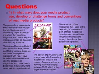
  • 1. Questions 1) In what ways does your media product use, develop or challenge forms and conventions of real media products? These are two of the magazines that I used at the beginning of my research. Both of these magazine’s have inspired me and have influenced my magazine through the colours, fonts, barcode and pictures. The genre of my magazine is Pop and that is clear through the bright colours and it attracts my target audience's eye when they look for a magazine. Also this is a typical media convention as it appeals directly to my audience. The reason I have used bright colours such as Pink, Yellow and Red is because those are the colour's that people represent with Pop. I have included a barcode because you find barcodes on magazines and I have used a barcode as it makes my front cover look more professional. The colours of pink, yellow and orange have all influenced my magazine as they are the colours of pop magazines and a young audience ranging between 13-18 which is the target audience I choice.
  • 2. The image dominates my from cover and by my band using direct address which is another typical convention of a magazine front cover. Also, through this direct address it entices the audience in as the models are looking right at them and the audience are intrigued as to why they are on the front cover. The first part shows that my magazine's genre is Pop and its hybrid genre is Gossip through the second part of the title 'goss'. Also, another typical convention of magazines is the fact that the image on the front cover is the main article inside the magazine. My image on the front cover is the band who has been interviewed in my magazine. I have also used a strap line at the bottom of my front cover to show the extra things that are in my magazine. I am happy I have used this convention as it attracts my audience. I have used a big title on my front cover and it is only one word, I don't think if I called my magazine another name with more words would of worked so well, I am very happy with my title as I think straight away it gives away the genre of my magazine which I wanted it to do. Also my title gives away the second genre of my magazine, as my magazine is called However, I have challenged the media conventions with the type of fonts I have used on my front cover. I think using the many different fonts has helped my front cover appeal more to my audience and I am happy I have challenged this convention as it makes my fonts stand out.
  • 3. On my contents page, I did follow the conventions of a magazine to an extent. I have put pictures on my contents page to go with some of my information that is in my magazine. I have added numbers on my contents page which makes my readers look at what’s in my magazine and so they can flick straight to that page. Also by using pictures on my contents page makes it visually interesting for my audience and makes it look professional. Also, I have used another convention such as subheading on my contents page, by using this conventions, it makes my contents page clearer to read and easier for my audience to find what is included in my magazine. I have used a big picture and two small pictures on my contents page which is breaking the conventions of a magazine as there is usually many small pictures not one big picture but I am glad I have broken this convention as it makes my contents page more exciting to look at and attracts my audience.
  • 4. These are the contents page I used at the beginning of my research. I choice this contents page as I like all the bright colours and the different styles used. The bright colours on this contents page influenced my contents page as I have used bright colours as it encourages the audience to read on to the different stories and by splitting the content page into sections appeals to my audience as they search for what they want to read. This content page shows how the use of direct address appeals to the target audience and how it is used to entice the audience in to read the interviews in the magazine. Also, this contents page influenced me to put more pictures than writing on my contents page as audiences prefer to look at pictures than read lots of information as it is easier to search in magazines.
  • 5. Throughout my double page spread, I have used many conventions. I have used quotes from the interview as my audience will immediately be drawn to it which will make my audience read the full interview to see where they have came from. I have used two big pictures rather than lots of small pictures to add a bit of uniqueness to my article. I have used columns again to make it easy for my audience to read. I have used the name of my band at the top of then article page which is a typical magazine convention as it shows the audience what this double page is about. I haven't broken any convention rules on my feature article and from my audience feedback, I noticed that out of my magazine, my audience likes my feature article better than my front cover and contents page. I have used typical girly colours on my article to continue the genre throughout my magazine which is another typical convention. My article starts with an overview of the artist that I have interviewed and then goes into the questions, I think this is an essential convention as it makes it easy for my audience to read and follow. These double page article’s influenced my double page article in different ways. I was influenced by the Madonna article to put lots of pictures on my article but I was also influenced by the PINK! article to do a interview and put one large picture on.