SlideShare a Scribd company logo
1 of 18
My Evaluation Daniella Laviola
In what way does your magazine use, develop or challenge forms and conventions of real media products? Front cover Catching tagline & masthead I made the masthead of my magazine short and snappy so it was easy to say and not too long. UKC stand for UK CHARTS. This is very easy for my audience to remember. The tagline above the masthead says ‘The UK’s most popular chart magazine’ which shows that it’s a chart magazine and very popular.  Colour scheme I picked the colour scheme red, white and black as I felt these colours were more appropriate for this type of magazine. The colour also had to go with the colour of the dresses the girls were wearing. The main part of the cover line are in red to show this is the most important part.  Layout The layout of my magazine is very similar to magazines that are already out. I researched this and the results showed me that all were nearly the same, containing the same information for example all the magazines I researched had banner and barcode. I also found out that the main image of the magazine was more to the left and the cover lines were on the right which is what I did.  Competitions The main key to your product is to selling and attract your audience so by offering they ticket that needed to be won to see Lady Gaga. This shows you can get more out of a magazine than just reading it.  Audience Language used My target audience are teenage girls so by adding the image on the front as girls would relate to my audience.  The age of my target audience is 13-25  so the language used needs to be suitable for them. The cover lines need to be short  and secretive so that my audience wants to find out more. The language is straight forward and readable for my target audience. Some of the words used suit my genre for example ‘GOSSIP’, HOTTEST’. I also used a rhetorical question so that they have to think about the answer.  Image I used a long shot on the front of my cover so that people could see the whole of them, for example what they are wearing. I researched in magazines that a lot of images of the front of a magazine were long shot types. By the girls looking directly into the camera this makes the audience feel that they are looking at them and make it more personal. The rest of the image was edited so that the background was white and focused more on the girls.  Unique selling point I made sure that the main selling point of my magazine was the main image which should be the first thing you see on the cover and make you want to buy it.
In what way does your magazine use, develop or challenge forms and conventions of real media products? Contents page  Image   The images used on my contents page are different to the front cover as you don’t want it all the same. As you can see the girls are still on there but just a different position and still a long shot. I did two different images on my contents page as it breaks it down. The images have number references on them so show my audience where to find these parts. I used a white background on all the images on my contents page as this looks more affective. I needed to balance out the amount of writing and images so that it didn’t look to over crowed.   Continuity   I made sure that my magazine looked the same throughout my magazine, which was including the masthead and the colour scheme. I made sure everything stayed familiar so my audience could recognize it.  Layout  Advertising  When I researched other magazine there contents page mostly had the writing on the left hand side along with the masthead. I cut the contents into two sections ‘features’ & ‘on the cover’  and only added the pages which were most likely to be read and more interesting. I added a advert on my contents page. Again when I researched contents pages most of the had a advert usually to do with their own magazine. So therefore I did a advert about subscribing to the magazine and getting 30% off. This shows that if people like the magazine they can buy it each month it comes out and get it for a cheaper price.
Article Page In what way does your magazine use, develop or challenge forms and conventions of real media products? Quotes Layout  I used two quotes in on my double page spread. The first on is a caption for my main image. The other quote is in bigger writing down the middle of my article. I used quotes as this looks more affective and also shows my audience a sneak preview of what is going to be in the article, then they may want to read on and find out about what the quote is about.  Looking at other magazines double page spread nearly of them are the same. This is a main image on the left hand side of the page and a caption and on the right the article with small pictures around the article. The colour scheme also continues on this page as the interviews questions are all in red.  Images The image used on my article page are all edited also with a white background to create more affect. All of the images I took are all long shot to show the whole of the girls.
How is your Magazine represent particular social groups? Girls Girls are more likely to listen to these types of bands rather than boys.
My magazine represents lots of different types of social groups. Firstly my magazine Represents girls as a whole. The reason this is, is that the image on the front of the  Magazine are girls. Other groups of girls could be girls that like reading about the latest Things in the music industry even about celebrities that are involved in the music Industry.  Another social group of girls could be the type of music they like. They might  Only be interested in reading about certain bands.  Girls who like to read, would be interested in reading what the girls have to say about where live which might relate  To the girls that read the magazine. Also they might like the fact the article talks about guys which is a popular talk of subject with girls.
The media insinuation  I would choose the IPC to run my magazine as this Company is a very popular company they produce Over 60 media brands. Their figures show that over Two thirds of UK woman read their magazines, which  Fit my target audience, this therefore offers something For everyone. They own famous woman weekly magazines such as LOOK MAGAZINE, CHAT MAGAZINE, NOW MAGAZINE and NME magazine. The  IPC is aimed at both males and females. Also their magazines are all aimed at different audiences. They also sell over 350 million copies of magazines each year. My magazine is suitable to be sold in Tesco, co-op, ASDA or a news agent. This is were most magazines are sold.
What my target audience say I made up eight questions for my target audience and secondary audience to answer And their options and thoughts on my magazine. The questions were: What do you think of the scheme colours? What do you think about the pictures? Do you think they look like look professional? Would you buy this magazine? What do you think of the layout? What could I improve? What do you think overall about my magazine?
Videos of the reviews of my magazine   You can also find more reviews on http://www.youtube.com/watch?v=TJYzAI6M4Xw
How did I attract & address my audience? The masthead of my magazine, is one of the main conventions of my magazines as it the name of the magazine. The masthead is easy and quick because its a acronyms. The word says its for itself really. UK as in England and C for charts.   The colours I used for my colour scheme is bold and attractive which will engage my audience. Also as the main colour was red the dresses the girls wore were red which made the whole magazine look better and connected better instead of it being different colours.  The picture of my magazine is the main convention of my magazine. The picture is the first thing you see on my magazine. The picture attracts girls as they want to be inspired by them, and want to look like them. They want to know the latest news about them.   I used big bold writing to express what I wanted to get across. Showing that they could win tickets to see a show that a lot of people don’t get the experience to do. This attracts my audience because they want to get the chance. The font stands out and large to attract my audience.  By adding a banner at the bottom of magazine, this shows what other bands or soloists that appeal in the magazine. This shows my audience that the music added in my magazine follows my genre.
What have you learnt about technologies from the process of constructing this product?  Publisher I used publisher to create all the parts of my magazine. I found publisher very easy to use and made my magazine look a lot better than a programme like paint or Microsoft word. Publisher enabled me to place things exactly where I wanted them to be placed. I could have make things overlap but I felt that it would have been to over crowed and made the magazine look messy. I used the tools on the side of the programme to make pictures or text bigger or smaller. The outline of the magazine was on the template page which helped me find out where the limit of y magazine could be. I used word art on publisher to create my cover lines and masthead.
Paint I used paint quite a lot of the time to edit my pictures. Make the background white mostly and crop things out. I liked using paint as its easy to use and you can zoom in to get a more accurate cut. I used the rubber to get rid of any background parts that were not white. It not useful to make my actual magazine but defiantly for images.
Picnik website  I love using this website to edit the colour of my image. For example I will edit the background of an image on paint and take it over to picnik.com and edited the actual colour of my image. Picnik  allowed me to add different effect to my images and made them look a lot more professional. By using a image that hadn’t been edited the magazine wouldn’t really look like a magazine or a professional magazine. I could also crop these images. Every image that I edited on this website looked different which is better than looking the same. As you can see on my magazine as a whole the images show the colours different in the images. The article images are much darker than the front cover.
Blogger I used blogger to put all the things I did to make up my whole magazine on here. This website enables me to add all the work I have produced. Sometimes blogger can be a good website and at times it can have its disadvantages. A good thing about using blogger is I could use it at home and edit it at home. Also using blogger I can split my page into three sections which is better than having lots of tabs at the top. I have never used a blog before so having blogger has given me an in site how to use it and now I’m very familiar with it. There can be some issues with using blogger, The text doesn’t always come out how you want it to, the images can also be a problem getting them on the blog, but apart from that blogger.com is a good website to post my media work.
Research I looked at lots of different types of music magazines and compared what they all looked like, with the layout, what type of image they included, the way the text was laid out. As you can see from the image below I show the type of magazines I looked at. I looked at the different type of genres of the magazines to see which ones where popular and not to popular. The reason I didn’t chart music was because there wasn’t really a magazine where it was music that was up to date for this genre the most popular genres I found out were rock and roll,  heavy metal, R’n’B, indie and classical. I also looked at the different colour schemes for my magazine I wanted to choose something that would all fit together and look good. When planning my magazine I had to look at the colour of the girls dresses to match the colour scheme or it wouldn't have looked right.  I also looked the a coast of magazines The most expensive music magazine I saw was around £3.00 and the cheapest music magazine I had seen was is £1.50. I decided my music magazine will cost around £2.00 as this is a fair price which isn’t too expensive or too cheap.  I did a questionnaire for my target audience to see what kind of genre magazine I should do for my final magazine. I asked over 20 people within my niche audience (13-25 mostly girls) the answers were mostly chart music or pop music and some rock, as there is a lot of rock music magazines out at the moment I thought it would be a good idea to produce a chart/pop magazine that was up to date very month with the latest hits and albums.
Planning  The process of planning my magazine was the exciting part, I used different parts of other magazines and placed them all together to create a final product. I found a perfect layout that I was going to use. When it came to the images I had to look at different types of poses the girls could do. When I found the image I was going to put on my front cover I edited it and placed it in the middle but slightly to the left. I made different cover lines to go onto my magazine which I placed around the image but not to close as I didn’t want it looking to over crowed. I planned out the layout of my magazine which you can see below. As you can see I didn’t change a bit of the layout but this was very close to my final product. The only part left to do was actually put everything together and make my final product.
My target audience  My primary audience for my magazine are girls and woman aged 13-25.  This age group is more likely to be listening to this type of genre. This age like to know what’s going on in the world to do with the latest gossip and fashion trends. My magazine is aimed at people who love or enjoy music. I included people or bands on my front cover who are popular which this age group today for example ‘Cheryl Cole’ or ‘Lady Gaga’. The masthead of my magazine is aimed at girls as a lot of my target audience I spoke to go on the internet or listen to the radio on a Sunday evening listing to the official top 40 UK charts to see who is number one so I thought that would be appropriate. The colour scheme also shows that my magazine is aimed at girls as red and white is girly colours especially as the girls are wearing red dresses. On the front cover the words I have used a aimed at my target audience as I used words like ‘x factor gossip’ ‘hottest girlband’ short and snappy words to want to read the magazine. The language I used is appropriate for my target audience. Even the dresses the girls are wearing would make people want to buy my magazine as they might want it as they like it. My secondary audience for my magazine are slightly older generation. I asked a few woman aged 26-35 what they think of the magazine and two out of three said they would buy  it as they like reading about the latest gossip and like to be up to date with recent music.
Looking back at your preliminary task, what do you feel you have learnt in the progression from it to the full product? I have learnt a lot of different techniques making my magazine. I learnt a lot from when I did my preliminary task.  I found that different ways to make my actual magazine look better than my preliminary task for example when I did my preliminary task I used Microsoft work to create it which I could do but I found that it didn’t really look at good as using publisher. I did a lot of research to make sure my second task was perfect which the layout, colours and images I looked more into my main task than my preliminary task. I have also learnt that the other pages I my magazine have to all be the same and continue what my front cover had for example the colour scheme. It must all be attractive not just the front cover. The article need to look just like a article in a magazine which I did but don’t think I made it look 100% like a professional article. I learnt the type of things to add on my magazine to suit my target audience so for example the cover lines what to say to make it more appealing.  What I could have improved  As I was watching my reviews most of my target audience said about the image on the top left of my contents page and how that didn’t really fit in with my genre. I feel that I could have made the whole magazine look that little nit more professional, but I realised that I don’t have all the professional programmes to actually make a professional on at school. I would have like to add different images of other artist from me taking the images but as I took a long time doing the girls I didn’t really have enough time to sort out other things for a different artist.  Overall I am very happy with the comment that came back to me and I am vet happy with myself for achieving a very good magazine.

More Related Content

What's hot (19)

Media studies evaluation
Media studies evaluationMedia studies evaluation
Media studies evaluation
 
Jim Lewis AS Media Evaluation
Jim Lewis AS Media EvaluationJim Lewis AS Media Evaluation
Jim Lewis AS Media Evaluation
 
Evaluationneed to finish
Evaluationneed to finishEvaluationneed to finish
Evaluationneed to finish
 
Evaluation
EvaluationEvaluation
Evaluation
 
Powerpoint evaluation writting
Powerpoint evaluation writtingPowerpoint evaluation writting
Powerpoint evaluation writting
 
Evaluation
EvaluationEvaluation
Evaluation
 
Music magazine evaluation
Music magazine evaluationMusic magazine evaluation
Music magazine evaluation
 
Q1 done
Q1  doneQ1  done
Q1 done
 
Ben mantell
Ben mantellBen mantell
Ben mantell
 
Question 7
Question 7Question 7
Question 7
 
Question 1 - Media Evaluation
Question 1 - Media EvaluationQuestion 1 - Media Evaluation
Question 1 - Media Evaluation
 
AS Media Evaluation
AS Media EvaluationAS Media Evaluation
AS Media Evaluation
 
Question 1
Question 1Question 1
Question 1
 
Magazine analysis
Magazine analysisMagazine analysis
Magazine analysis
 
Evaluation of my final music magazine
Evaluation of my final music magazineEvaluation of my final music magazine
Evaluation of my final music magazine
 
Question 1
Question 1Question 1
Question 1
 
Evaluation of my final music magazine
Evaluation of my final music magazineEvaluation of my final music magazine
Evaluation of my final music magazine
 
Evaluation presentation
Evaluation presentationEvaluation presentation
Evaluation presentation
 
Evaluation 1
Evaluation 1Evaluation 1
Evaluation 1
 

Similar to My Media Evaluation

Gareth tomlins 2
Gareth tomlins 2Gareth tomlins 2
Gareth tomlins 2
afrench14
 
Evaluation of magazine matt waites
Evaluation of magazine   matt waitesEvaluation of magazine   matt waites
Evaluation of magazine matt waites
mightykits
 
Amelia evaluation
Amelia evaluationAmelia evaluation
Amelia evaluation
guestba2a58
 
Amelia evaluation
Amelia evaluationAmelia evaluation
Amelia evaluation
guestba2a58
 
Evaluation of music magazine
Evaluation of music magazineEvaluation of music magazine
Evaluation of music magazine
s0527
 
Music magazine evaluation
Music magazine evaluationMusic magazine evaluation
Music magazine evaluation
Hannah Patrick
 
Introduction
IntroductionIntroduction
Introduction
poppy
 
In what ways does your media product use mr stevens 2
In what ways does your media product use mr stevens 2In what ways does your media product use mr stevens 2
In what ways does your media product use mr stevens 2
edthompson13
 
Rosie's Evaluation 2010
Rosie's Evaluation 2010Rosie's Evaluation 2010
Rosie's Evaluation 2010
Rosie Tully
 
Evaluation
Evaluation Evaluation
Evaluation
bev
 
Presentation1 Evaluation
Presentation1 EvaluationPresentation1 Evaluation
Presentation1 Evaluation
Tcourtney
 
Presentation1 Evaluation
Presentation1 EvaluationPresentation1 Evaluation
Presentation1 Evaluation
Tcourtney
 
Evaluation
EvaluationEvaluation
Evaluation
JK121
 
Evaluation
EvaluationEvaluation
Evaluation
PCaudy
 

Similar to My Media Evaluation (20)

Gareth tomlins 2
Gareth tomlins 2Gareth tomlins 2
Gareth tomlins 2
 
Evaluation of magazine matt waites
Evaluation of magazine   matt waitesEvaluation of magazine   matt waites
Evaluation of magazine matt waites
 
Evaluation
EvaluationEvaluation
Evaluation
 
Amelia evaluation
Amelia evaluationAmelia evaluation
Amelia evaluation
 
Amelia evaluation
Amelia evaluationAmelia evaluation
Amelia evaluation
 
Evaluation
EvaluationEvaluation
Evaluation
 
Evaluation
EvaluationEvaluation
Evaluation
 
Evaluation
EvaluationEvaluation
Evaluation
 
Evaluation of music magazine
Evaluation of music magazineEvaluation of music magazine
Evaluation of music magazine
 
Music magazine evaluation
Music magazine evaluationMusic magazine evaluation
Music magazine evaluation
 
Introduction
IntroductionIntroduction
Introduction
 
In what ways does your media product use mr stevens 2
In what ways does your media product use mr stevens 2In what ways does your media product use mr stevens 2
In what ways does your media product use mr stevens 2
 
My evaluation!
My evaluation!My evaluation!
My evaluation!
 
Rosie's Evaluation 2010
Rosie's Evaluation 2010Rosie's Evaluation 2010
Rosie's Evaluation 2010
 
Evaluation
Evaluation Evaluation
Evaluation
 
Presentation1 Evaluation
Presentation1 EvaluationPresentation1 Evaluation
Presentation1 Evaluation
 
Presentation1 Evaluation
Presentation1 EvaluationPresentation1 Evaluation
Presentation1 Evaluation
 
Evaluation
EvaluationEvaluation
Evaluation
 
Evaluation
EvaluationEvaluation
Evaluation
 
Evaluation
EvaluationEvaluation
Evaluation
 

My Media Evaluation

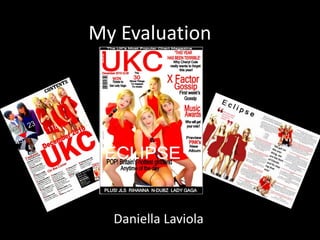
  • 2. In what way does your magazine use, develop or challenge forms and conventions of real media products? Front cover Catching tagline & masthead I made the masthead of my magazine short and snappy so it was easy to say and not too long. UKC stand for UK CHARTS. This is very easy for my audience to remember. The tagline above the masthead says ‘The UK’s most popular chart magazine’ which shows that it’s a chart magazine and very popular. Colour scheme I picked the colour scheme red, white and black as I felt these colours were more appropriate for this type of magazine. The colour also had to go with the colour of the dresses the girls were wearing. The main part of the cover line are in red to show this is the most important part. Layout The layout of my magazine is very similar to magazines that are already out. I researched this and the results showed me that all were nearly the same, containing the same information for example all the magazines I researched had banner and barcode. I also found out that the main image of the magazine was more to the left and the cover lines were on the right which is what I did. Competitions The main key to your product is to selling and attract your audience so by offering they ticket that needed to be won to see Lady Gaga. This shows you can get more out of a magazine than just reading it. Audience Language used My target audience are teenage girls so by adding the image on the front as girls would relate to my audience. The age of my target audience is 13-25 so the language used needs to be suitable for them. The cover lines need to be short and secretive so that my audience wants to find out more. The language is straight forward and readable for my target audience. Some of the words used suit my genre for example ‘GOSSIP’, HOTTEST’. I also used a rhetorical question so that they have to think about the answer. Image I used a long shot on the front of my cover so that people could see the whole of them, for example what they are wearing. I researched in magazines that a lot of images of the front of a magazine were long shot types. By the girls looking directly into the camera this makes the audience feel that they are looking at them and make it more personal. The rest of the image was edited so that the background was white and focused more on the girls. Unique selling point I made sure that the main selling point of my magazine was the main image which should be the first thing you see on the cover and make you want to buy it.
  • 3. In what way does your magazine use, develop or challenge forms and conventions of real media products? Contents page Image The images used on my contents page are different to the front cover as you don’t want it all the same. As you can see the girls are still on there but just a different position and still a long shot. I did two different images on my contents page as it breaks it down. The images have number references on them so show my audience where to find these parts. I used a white background on all the images on my contents page as this looks more affective. I needed to balance out the amount of writing and images so that it didn’t look to over crowed. Continuity I made sure that my magazine looked the same throughout my magazine, which was including the masthead and the colour scheme. I made sure everything stayed familiar so my audience could recognize it. Layout Advertising When I researched other magazine there contents page mostly had the writing on the left hand side along with the masthead. I cut the contents into two sections ‘features’ & ‘on the cover’ and only added the pages which were most likely to be read and more interesting. I added a advert on my contents page. Again when I researched contents pages most of the had a advert usually to do with their own magazine. So therefore I did a advert about subscribing to the magazine and getting 30% off. This shows that if people like the magazine they can buy it each month it comes out and get it for a cheaper price.
  • 4. Article Page In what way does your magazine use, develop or challenge forms and conventions of real media products? Quotes Layout I used two quotes in on my double page spread. The first on is a caption for my main image. The other quote is in bigger writing down the middle of my article. I used quotes as this looks more affective and also shows my audience a sneak preview of what is going to be in the article, then they may want to read on and find out about what the quote is about. Looking at other magazines double page spread nearly of them are the same. This is a main image on the left hand side of the page and a caption and on the right the article with small pictures around the article. The colour scheme also continues on this page as the interviews questions are all in red. Images The image used on my article page are all edited also with a white background to create more affect. All of the images I took are all long shot to show the whole of the girls.
  • 5. How is your Magazine represent particular social groups? Girls Girls are more likely to listen to these types of bands rather than boys.
  • 6. My magazine represents lots of different types of social groups. Firstly my magazine Represents girls as a whole. The reason this is, is that the image on the front of the Magazine are girls. Other groups of girls could be girls that like reading about the latest Things in the music industry even about celebrities that are involved in the music Industry. Another social group of girls could be the type of music they like. They might Only be interested in reading about certain bands. Girls who like to read, would be interested in reading what the girls have to say about where live which might relate To the girls that read the magazine. Also they might like the fact the article talks about guys which is a popular talk of subject with girls.
  • 7. The media insinuation I would choose the IPC to run my magazine as this Company is a very popular company they produce Over 60 media brands. Their figures show that over Two thirds of UK woman read their magazines, which Fit my target audience, this therefore offers something For everyone. They own famous woman weekly magazines such as LOOK MAGAZINE, CHAT MAGAZINE, NOW MAGAZINE and NME magazine. The IPC is aimed at both males and females. Also their magazines are all aimed at different audiences. They also sell over 350 million copies of magazines each year. My magazine is suitable to be sold in Tesco, co-op, ASDA or a news agent. This is were most magazines are sold.
  • 8. What my target audience say I made up eight questions for my target audience and secondary audience to answer And their options and thoughts on my magazine. The questions were: What do you think of the scheme colours? What do you think about the pictures? Do you think they look like look professional? Would you buy this magazine? What do you think of the layout? What could I improve? What do you think overall about my magazine?
  • 9. Videos of the reviews of my magazine You can also find more reviews on http://www.youtube.com/watch?v=TJYzAI6M4Xw
  • 10. How did I attract & address my audience? The masthead of my magazine, is one of the main conventions of my magazines as it the name of the magazine. The masthead is easy and quick because its a acronyms. The word says its for itself really. UK as in England and C for charts. The colours I used for my colour scheme is bold and attractive which will engage my audience. Also as the main colour was red the dresses the girls wore were red which made the whole magazine look better and connected better instead of it being different colours. The picture of my magazine is the main convention of my magazine. The picture is the first thing you see on my magazine. The picture attracts girls as they want to be inspired by them, and want to look like them. They want to know the latest news about them. I used big bold writing to express what I wanted to get across. Showing that they could win tickets to see a show that a lot of people don’t get the experience to do. This attracts my audience because they want to get the chance. The font stands out and large to attract my audience. By adding a banner at the bottom of magazine, this shows what other bands or soloists that appeal in the magazine. This shows my audience that the music added in my magazine follows my genre.
  • 11. What have you learnt about technologies from the process of constructing this product? Publisher I used publisher to create all the parts of my magazine. I found publisher very easy to use and made my magazine look a lot better than a programme like paint or Microsoft word. Publisher enabled me to place things exactly where I wanted them to be placed. I could have make things overlap but I felt that it would have been to over crowed and made the magazine look messy. I used the tools on the side of the programme to make pictures or text bigger or smaller. The outline of the magazine was on the template page which helped me find out where the limit of y magazine could be. I used word art on publisher to create my cover lines and masthead.
  • 12. Paint I used paint quite a lot of the time to edit my pictures. Make the background white mostly and crop things out. I liked using paint as its easy to use and you can zoom in to get a more accurate cut. I used the rubber to get rid of any background parts that were not white. It not useful to make my actual magazine but defiantly for images.
  • 13. Picnik website I love using this website to edit the colour of my image. For example I will edit the background of an image on paint and take it over to picnik.com and edited the actual colour of my image. Picnik allowed me to add different effect to my images and made them look a lot more professional. By using a image that hadn’t been edited the magazine wouldn’t really look like a magazine or a professional magazine. I could also crop these images. Every image that I edited on this website looked different which is better than looking the same. As you can see on my magazine as a whole the images show the colours different in the images. The article images are much darker than the front cover.
  • 14. Blogger I used blogger to put all the things I did to make up my whole magazine on here. This website enables me to add all the work I have produced. Sometimes blogger can be a good website and at times it can have its disadvantages. A good thing about using blogger is I could use it at home and edit it at home. Also using blogger I can split my page into three sections which is better than having lots of tabs at the top. I have never used a blog before so having blogger has given me an in site how to use it and now I’m very familiar with it. There can be some issues with using blogger, The text doesn’t always come out how you want it to, the images can also be a problem getting them on the blog, but apart from that blogger.com is a good website to post my media work.
  • 15. Research I looked at lots of different types of music magazines and compared what they all looked like, with the layout, what type of image they included, the way the text was laid out. As you can see from the image below I show the type of magazines I looked at. I looked at the different type of genres of the magazines to see which ones where popular and not to popular. The reason I didn’t chart music was because there wasn’t really a magazine where it was music that was up to date for this genre the most popular genres I found out were rock and roll, heavy metal, R’n’B, indie and classical. I also looked at the different colour schemes for my magazine I wanted to choose something that would all fit together and look good. When planning my magazine I had to look at the colour of the girls dresses to match the colour scheme or it wouldn't have looked right. I also looked the a coast of magazines The most expensive music magazine I saw was around £3.00 and the cheapest music magazine I had seen was is £1.50. I decided my music magazine will cost around £2.00 as this is a fair price which isn’t too expensive or too cheap. I did a questionnaire for my target audience to see what kind of genre magazine I should do for my final magazine. I asked over 20 people within my niche audience (13-25 mostly girls) the answers were mostly chart music or pop music and some rock, as there is a lot of rock music magazines out at the moment I thought it would be a good idea to produce a chart/pop magazine that was up to date very month with the latest hits and albums.
  • 16. Planning The process of planning my magazine was the exciting part, I used different parts of other magazines and placed them all together to create a final product. I found a perfect layout that I was going to use. When it came to the images I had to look at different types of poses the girls could do. When I found the image I was going to put on my front cover I edited it and placed it in the middle but slightly to the left. I made different cover lines to go onto my magazine which I placed around the image but not to close as I didn’t want it looking to over crowed. I planned out the layout of my magazine which you can see below. As you can see I didn’t change a bit of the layout but this was very close to my final product. The only part left to do was actually put everything together and make my final product.
  • 17. My target audience My primary audience for my magazine are girls and woman aged 13-25. This age group is more likely to be listening to this type of genre. This age like to know what’s going on in the world to do with the latest gossip and fashion trends. My magazine is aimed at people who love or enjoy music. I included people or bands on my front cover who are popular which this age group today for example ‘Cheryl Cole’ or ‘Lady Gaga’. The masthead of my magazine is aimed at girls as a lot of my target audience I spoke to go on the internet or listen to the radio on a Sunday evening listing to the official top 40 UK charts to see who is number one so I thought that would be appropriate. The colour scheme also shows that my magazine is aimed at girls as red and white is girly colours especially as the girls are wearing red dresses. On the front cover the words I have used a aimed at my target audience as I used words like ‘x factor gossip’ ‘hottest girlband’ short and snappy words to want to read the magazine. The language I used is appropriate for my target audience. Even the dresses the girls are wearing would make people want to buy my magazine as they might want it as they like it. My secondary audience for my magazine are slightly older generation. I asked a few woman aged 26-35 what they think of the magazine and two out of three said they would buy it as they like reading about the latest gossip and like to be up to date with recent music.
  • 18. Looking back at your preliminary task, what do you feel you have learnt in the progression from it to the full product? I have learnt a lot of different techniques making my magazine. I learnt a lot from when I did my preliminary task. I found that different ways to make my actual magazine look better than my preliminary task for example when I did my preliminary task I used Microsoft work to create it which I could do but I found that it didn’t really look at good as using publisher. I did a lot of research to make sure my second task was perfect which the layout, colours and images I looked more into my main task than my preliminary task. I have also learnt that the other pages I my magazine have to all be the same and continue what my front cover had for example the colour scheme. It must all be attractive not just the front cover. The article need to look just like a article in a magazine which I did but don’t think I made it look 100% like a professional article. I learnt the type of things to add on my magazine to suit my target audience so for example the cover lines what to say to make it more appealing. What I could have improved As I was watching my reviews most of my target audience said about the image on the top left of my contents page and how that didn’t really fit in with my genre. I feel that I could have made the whole magazine look that little nit more professional, but I realised that I don’t have all the professional programmes to actually make a professional on at school. I would have like to add different images of other artist from me taking the images but as I took a long time doing the girls I didn’t really have enough time to sort out other things for a different artist. Overall I am very happy with the comment that came back to me and I am vet happy with myself for achieving a very good magazine.