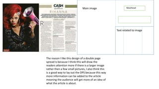
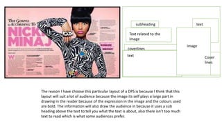
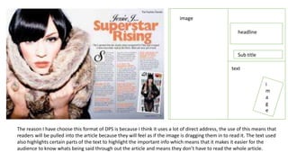
The document discusses three different layout designs for a double page spread (DPS). The first uses a large central image to draw readers' attention, allowing more information to be included. The second features a bold image and subheading to tell readers what the text is about while keeping the amount of text low. The third uses direct address through an image that seems to pull readers in, along with highlighted text to easily convey important information without reading everything.