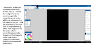
1. I started with an A4 sized
blank canvas this time I
made it black as I wanted
the background for my
contents page to be
conventional and for the
additional colours used on
my page to stand out. I took
my inspiration for this from
both Dj Mag and Mixmag
where both magazines use
this colour scheme
convention sporadically
throughout their issues. By
conforming to genre
conventions means the
production appears more
professional.
2. Like most magazines I
needed to start with putting
my masthead at the top
within the first third
according to the Rule of
Thirds. This is conventional
format layout conventions.
The typography for this was
smaller in order to conform
to genre format conventions
and also repeat the
masthead to make the
magazine more memorable
for the audience. It looks
visually interesting in my
magazine and fits the style
and conventions I am going
for. The repetition of the
masthead also help to create
and reiterate brand identity.
3. I put a thin line to separate the
section off including the
masthead and my contents page
title when I have added this. At
this point I still haven’t found a
font that jumps out at me and
that I want to use for my contents
title. The line helps to make the
layout and information clear for
the audience in order to view and
navigate their way around the
page and the rest of the
narratives clearly. Under the title I
have decided to put a main image
of my main character in order to
build the text around it. This is
conventional of the genre too and
draws an audience in to the
magazine and its articles further.
4. I researched existing media texts to
find out what subtitles are often
used. I decided to these conventions
within my own page along with the
language to generate high
production values. I decided to use
these conventions and wanted to set
them apart from the other narratives
by spacing them out and using a
bigger bright yellow bigger box
around the subtitles which also
helped inform my audience and their
navigation around the page. I
developed my other subheading
ideas from various magazines such as
Mix Mag and NME. I feel the yellow
bars are fitting and suitable for my
magazine contents page format. The
colour is also suitable as it
conventional for house music
magazines to use bright colours
against a dark background to
connote an electric feel.
5. I then began piecing in the articles and
giving the articles some information
and as well as putting in my page
numbers. I made my first section under
features look good and get the idea I
am going to follow the design for the
rest of my article subheadings. The font
I chose makes the text very clear. The
columns that hold the text is clearly
shown and makes it easier to navigate
for the reader. I didn't’t follow anything
from specific magazines for my text. I
tended to just choose what looked best.
The white colour on the black
background is fitting and makes the text
clear and readable.
6. I gave myself guidelines so I can create
symmetrical columns and even spacing
between numbers and letters. This
made putting the rest of the text in
pretty straight forward. When the text
was in I could just remove the lines
and the text will fit in and look
uniform. I chose to do it this was as
having guidelines helped me a lot. It
makes the text more pleasing to the
eye and for the audience to read and
understand.
7. I removed the lines and the text
matched up perfectly. It looks
symmetrical and clean just how I
planned it from the beginning. I had
some space at the bottom for another
image and so put in a picture clubbing
as it is very appropriate for this style of
magazine. The colours of the clubbing
picture do not contrast my colour
scheme too much. The picture does
not draw attention away from the
contents page but it does compliment
the page well. The images on the
contents page contrast as they show
two different sides of what I am aiming
to show with my magazine. The images
also have contrasting colours and
narratives as it shows depth within my
magazine.
8. I found a font I like and put it for my
contents at the top right corner I also
added the date to it as it is
conventional. It is not only
conventional for house music
magazines but for
The font I chose resembled that of a
computer front it is digital and goes
with the electric music theme.
9. I saw Mixmag put page numbers on
the big featured images on the
contents page. I really liked the look
of it. I chose to do the same I made
the box that the numbers are on
transparent. That way it doesn’t
draw too much attention away from
the image. I didn’t over use this
idea by only putting it on two
images. This helps the audience see
clearly what page the article is on.
Making my magazine easy to
navigate means that people will be
more willing to read more and
discover more content within the
magazine. This could also create a
repeat buy.
10. I forgot the most basic thing, the page
numbers and web address. I popped
them at the bottom coroners. I had to
be careful to put the right page
number on the right side. Having the
web address on the bottom of the
page is an idea I have used from the
magazines that I have analysed.
Over all I am very happy with my
contents page. It came out really
professional looking.