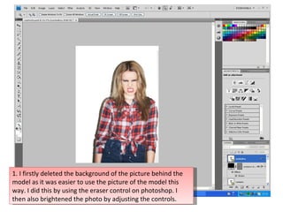
1. 1. I firstly deleted the background of the picture behind the model as it was easier to use the picture of the model this way. I did this by using the eraser control on photoshop. I then also brightened the photo by adjusting the controls.
2. 3. I then entered the word contents into a text layer on top of the shape I created. I used the same font as I did for the title of the magazine as I thought keeping the same fonts would make the magazine look consistent and professional. 2. I then created the shape to go In the top left corner. I wanted a shape which gave the effect of paint being splattered, so I used the shape tool on Photoshop and created this shape.
3. 4. I then added a number of headings down the left side of the page. I kept the style consistent by using a black box shape, with the layer of text on top of it using the same font (Destroyed License Plate) as I had used for the title on the front cover and the title of the contents. 5. I then began to add the page numbers under each heading. I used a mini version of the splattered shape at the top of the page for each page number, as I thought that added an interesting effect to the page. I also used the font I had used for the name of the band on the cover, as I liked the way the numbers were presented when using this font.
4. 7. I then added a photo from the Photoshoot of the boy band I did. I chose this picture as I thought the way the lads were stood was professional, and using a boy band made sure my magazine looked like it appealed to both sexes. Before using this picture, I also erased the background behind the lads using the CONTROL. I thought this made the picture stand out more on the page. 6. I then added titles of what will be included in my magazine underneath each heading.
5. Final additions to the contents page. I added this as it gave some information about the artist, and clearly shows what page to find her on. I edited the levels of depth of the name ‘Nancy Jett’ as this helped it stand out more and gave it more an edgy look. I also used the eraser tool and erased some parts of the shape behind this text as it gave it a distressed look so fitted in well with the fonts used and the style of magazine.
6. Final additions to the contents page. I added this ‘exclusive’ circle here as it stands out and would appeal to the reader as something they must read. I did this by creating a circle with the shape tool, then adding a text layer over the top, still using the same font I had used with the other headings. Finally, I added this message from the editor. I thought this added a professional look to the contents page, and the informal language used relates to my young target audience.