
Recommended
More Related Content
What's hot
What's hot (17)
Similar to The Duality of Katy Perry: Pastel Pop Star's Secretive Side
Similar to The Duality of Katy Perry: Pastel Pop Star's Secretive Side (20)
More from cansu12
More from cansu12 (20)
Recently uploaded
Recently uploaded (20)
The Duality of Katy Perry: Pastel Pop Star's Secretive Side
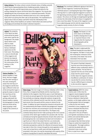
- 1. Layout: The simplicity of the layout has been enhanced by the pastel pink colour used for the background. The simple layout seems to be done to create emphasizes on the famous individuals appearance on the front cover. The writing is more to the left side of the magazine and become less towards the right showing that the continuation of the writing is in the magazine. Main Image: The main image is of a famous individual, which is Katy Perry, that is recognized worldwide and this may bring more attention to the magazine. Katy Perry's pose is much held back as her hands are pressed against her chest and mainly the side of her face and body are showing, making the audience recognize the restriction of the individual and this may infer that she is holding back secrets from the world and this causes an interest for the viewer. In addition her pose may portray innocence and purity and this emphasized by the flowers and the pink background. However her black hair and dress are contrasting as it can be inferring the secretive and mysterious side of Katy Perry. The flowers may symbolize being natural but her make up bring out the more covered up version of her which again emphasis her secretive side. Her face and body are facing the opposite direction of each other which may be showing how she is torn between her heart and mind which is significant as it infers to the viewer that she is an emotionally sensitive person which many of the viewers could relate to. An alternative perspective could be the reflection of everyone having two sides to them this is shown through the many opposites on the cover such as Katy Perry's outfit, pose and how she generally presented in the cover, this may be interesting to the majority of the audience causing them to want to read about the article. Colour Scheme: The colour scheme consists of pastel colours of yellow and pink which may be representing Katy Perry's bubbly personality. However the magazine has also used the typical bold colours of black and white for the writing, showing the mature and formal side of the magazine. This may be also highlighting the idea of having two sides to a individuals personality. The pink background makes the famous individual stand out as she is wearing darker tones which can portray the other side to the personality. The masthead has its typical colours that are always used which show the individuality of the magazine. Many of the headlines are written in black whom also stand out from the background and draws the viewers’ attention towards it. Masthead: The masthead is Billboards signature look that is used in all their magazines. Furthermore the famous individuals picture is overlapping the logo of the magazine inferring that it is a well-recognized magazine so section of the logo being covered up weren't make the magazine less popular. The colours on the logo are targeting both genders and also the informality of the font shows it’s targeted for teens more than adults. The name of the magazine is used for an advertising sign and this tells the viewer that the magazine mainly consists of a form of media. Feature Headline: The feature headline is 'Katy Perry', the font is bigger than the other writing on the cover showing the viewer the main focus of the magazine and the font type is different to the rest of the writing which again is giving the viewer an idea of the main focus of the magazine. The smaller writing underneath the feature headline is giving the demographic an idea of what the article will be about by giving a small insight of the contents of the article. Date: The date is underneath the masthead showing the issue date of the magazine. The date is in very small font showing the irrelevance of the issue date as the viewer may not be interested in the issue date. Header: The header is in the same colours as the feature headline showing that it’s also an important feature in the magazine that the majority of the demographic will be interested in. Target Audience: With the colour scheme used, it infers that the magazine may be targeted towards the female gender however the famous individual is liked by both genders, so the target audience may be both genders that are teenagers as they are the ones mainly interested in music magazines and famous individuals like Katy Perry. Also in today's day and age the colour pink or the use of flowers aren't gender orientated as much as before and could be liked by both genders even though the stereotypical idea that these certain things are suited more towards the female gender. The target audience could also be people who are interested in pop music as Katy Perry is a pop music singer. This section of writing is separate from the rest of the writing and in a different colour combination which is yellow and white. The fact that it’s separate from the rest of the writing shows that this section may be further down the magazine and also the different combination of colours may be that this section of writing may be a different genre compared to the rest of the magazine.