
Recommended
More Related Content
What's hot
What's hot (20)
Viewers also liked
Viewers also liked (15)
Similar to Magazine research
Similar to Magazine research (20)
Magazine research
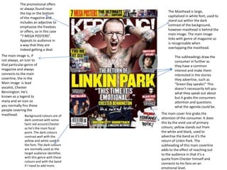
- 1. The Masthead is large, capitalised in white font, used to stand out within the dark contrast of the background, however masthead is behind the main image. The main image links with genre of magazine so is recognisable when overlapping the masthead. The subheadings draw the consumer in further as they have a common interest and make them interested in the stories they advertise, such as “Green Day speaks!” This doesn’t necessarily tell you what they speak out about but it grabs the consumers attention and questions what the agenda could be. The main cover line grabs the attention of the consumer. It does this by the vivid use of primary colours; yellow stands out from the white and black, used to advertise the band as it’s the return of Linkin Park. The subheading of this main coverline adds to the effect of reaching out to the audience in that it’s a quote from Chester himself and connects to his fans on an emotional level. The promotional offers or always found near the top or the bottom of the magazine and includes an adjective to emphasise the freebies or offers, so in this case “7 MEGA POSTERS”. Appeals to audience in a way that they are indeed getting a deal. The main image is, if not always, an icon to that particular genre of magazine and always connects to the main coverline, the in the Main image is lead vocalist, Chester Bennington. He’s known as a legend to many and an icon so you normally fins these people covering the masthead. Background colours are of dark contrast with some faint red around Chester as he’s the main focal point. The dark colours contrast well with the yellow and white used in the font. The dark colours are normally used as the target audience identifies with this genre with these colours and with the band if I need to add more.
- 2. The Masthead is large, capitalised in white font, used to stand out within the bright red contrast of the background, however masthead is behind the main image. The main image links with genre of magazine so is recognisable when overlapping the masthead. The subheadings draw the consumer in further as they have a common interest and make them interested in the stories they advertise, such as “100 most shocking moments in music”. This doesn’t necessarily tell you what they speak out about but it grabs the consumers attention and questions what the agenda could be. The main cover line grabs the attention of the consumer. It does this by the vivid use of white font used to advertise the artist as it’s the rising of Gaga. The subheading of this main coverline adds to the effect of reaching out to the audience in that she’s made a comeback in a different image as she changes all the time but with the word ‘risen’ it’s like she’s taken on a darker side. The main image is, if not always, an icon to that particular genre of magazine and always connects to the main coverline, the in the Main image is the artist Lady Gaga. She’s known as a legend and an inspiration to many and an icon so you normally finds these people covering the masthead. This main image could signify how she’s ‘risen’ by being half naked and wearing clothes that can signify a demon. Background colours are of dark contrast with some faint grey behind Gaga with her black clothes and bare skin stand out as she’s the main focal point. The dark colours contrast well with the white used in the font. The dark colours are normally used as the target audience identifies with this genre with these colours and with the band if I need to add more. Use of red could signify that passion that Gaga had for music and consumers.
- 3. The Masthead is large, capitalised in red font borderd with white as this makes it stand out with use of main primary colour, used to stand out within the contrast of the background; blue, however masthead is behind the main image. The main image links with genre of magazine so is recognisable when overlapping the masthead. The subheadings draw the consumer in further as they have a common interest and make them interested in the stories they advertise,, for example, revealing Muse has gig dates revealed. It grabs the consumers attention and questions what the agenda could be. Or interest them further to know certain information and further grab their attention. The main image is, if not always, an icon to that particular genre of magazine and always connects to the main coverline, the in the Main image is lead vocalist, of Green Day, Billie Joe Armstrong. He’s known as a legend to many and an icon so you normally fins these people covering the masthead. The image normally connects to the subheading of the main coverline as his lyrics are on an emotional level you see him holding his head as if he can take anymore crap, linking to his lyrics ‘coming from a dark place. Background colours are of dark contrast with some faint red around Chester as he’s the main focal point. The dark colours contrast well with the yellow and white used in the font. The dark colours are normally used as the target audience identifies with this genre with these colours and with the band if I need to add more The main cover line grabs the attention of the consumer. It does this by the use of bold white font, used to advertise inspiration of Billie’s lyrics. The subheading of this main coverline adds to the effect of reaching out to the audience in that the quote’s from Billie himself and draws the consumer in by the emotional level of being ‘inside his mind’.