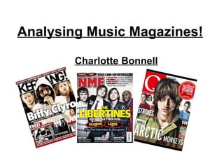
2. The masthead is bold, and uses 3 colours which relates to the house style which is followed throughout the magazine. The use of a flasher gives something more to the target audience, especially as the language fits the age range it is going to appeal more to them. The main coverline is an instant giveaway to who it is, and attracts the target audience. Also, a pull quote is used to show what the celebrity is talking about, and pulls in another range of audience who are interested in the celebrity. The main image is dominant on the front cover, his facial expression and pose makes him look like he is having fun and it catches the eye. The background of the front cover relates to the celebrity’s style of music and his type of personality. The use of a footer also gives more of an insight to the audience about who is going to be included in the magazine and that they are guaranteed to be in it. The front cover is separated into the rule of thirds, this makes it easier to read for the audience and makes it neater. Cover lines are used to give the reader another insight of what will be read in the magazine, the language used is also persuasive and interesting, to pull in the reader to buy the magazine.
3. The title of the magazine is used, and the same house colours and fonts are used to keep it more simple for the audience. There is a main image which dominates the page, this is relating to the article which is written beneath, and can also attract the target audience as the woman is of a younger age. The language of the article is informal which is appropriate for the target audience. This enables the audience who want to read more issues of the magazine to subscribe. Contact details are available to the reader. Banner at the top of the page The headings are bold and stand out, to separate the contents into sections, which makes it easier for the reader to find particular articles. An index is used, still using the house colours. Page numbers are highlighted in black to simplify it for the audience. They also have a separate section for more articles. This is in red to make it stand out and seem important. Date of issue
4. Main image takes up half of the double page spread, is instantly dominant and catches the eye Mise-en-scene: Same background as front cover, relates to his personality and style of music His facial expression shows that he looks rebellious and trying not to be caught. The headline is bold, and takes up a lot of the page. It also links to the idea of how the celebrity has changed. May interest an audience who enjoy his music. Use of standfirst to introduce the article. There is use of a drop capital, this is used in many magazines and catches the eye. There are smaller images that may relate to the article and his style. It seems quite informal to interest the target audience. There are lots of bright colours and patterns which is quite overpowering By-line and picture credits
5.
6. Identify the elements that connect the 3 different parts of the magazine. The 3 elements that connect the magazine: House style is used to keep the magazine simple and not become too overpowering with too many fonts or colours. NME uses red, white and black which stands out well together. Also, they use minimum amounts of fonts on the front cover and contents, so that they can relate back to each other. The use of images is also very minimal. They use Dizzee Rascal on the front cover and the double page spread as there is an article written about him. The photographs are different, yet they have the same background to show it was in the same time. This then connects to the magazine. Also, the use of language is informal and in the same style throughout. This can be aimed at the target audience and they can relate to the style of language for a younger age range. The language is more modernised so it can be easily noticed who it is written for, and who it will attract.