
Recommended
More Related Content
What's hot
What's hot (18)
Viewers also liked
Viewers also liked (20)
Similar to Katie Small
Similar to Katie Small (20)
More from bir
More from bir (20)
Katie Small
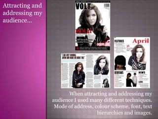
- 1. Attracting and addressing my audience... When attracting and addressing my audience I used many different techniques. Mode of address, colour scheme, font, text hierarchies and images.
- 2. Mode of address... In terms of mode of address, I chose to address the reader in a way that would make the magazine feel personal to them. I used personal pronouns such as ‘your’ to create a rapport between the producer and receiver of the magazine. The use of the exclamatives, ‘FREE INSIDE!’ and ‘WIN!’ both show excitement and indicated the idea of fun, helping to put this feeling across to the audience. I think that the mode of address I have used is friendly and casual ensuring that the reader does not feel over whelmed or insuperior. On the contents page, there are a lot of uses of the word, ‘we’, giving the idea of a united bond between the producer and receiver and making the reader feel involved and connected to the producer. There is a friendly tenor created between the reader and the producer which helps the receiver to read with ease. When writing the double page spread article, I wrote in a light-hearted and casual tone to ensure that the reader is engaged and wanting to carry on reading.
- 3. Image... Image is a crucial component to the authenticity of a magazine. The images have to be relative to the content, audience and ideology behind the magazine. On the front cover, I used a single medium close up image of a young female, dressed in leather and lots of jewellery, with messed up hair and lots of eye makeup. I chose for her to wear pale makeup, and all of these mise-en-scene values contribute towards the overall image stereotype of a rock artist. I chose this particular person to model because she has the generic look of a rock artist and she is versatile in her looks, this worked to my advantage because I could do whatever I saw fit and change anything if necessary. For the contents page, I used three images, one of my front cover artist, one of a duet rock band and one of a solo artist. Each image differentiates from the others, the dynamics and colours are all unique in order to create an eclectic page so that there is a lot to look at and a varied content in the magazine. The image of the front cover artist gives a different side of her, to make the reader inquisitive and want to read the article. The solo artist image is strong and very stereotypical of rock. This close up is a bold statement and gives an insight into the life of this artist, urging the reader to have interest in reading into her. The medium shot of the duet is dynamic, I placed the female in front to the left and the male at the back to the right to show the band relationship and the differences between them. The female has a rock image and I ensured they were both dressed in this genre. This image attracts the eye as there is a lot of background, which is why I positioned them in that way. On the double page spread, I used a long to medium shot of the artist, which I emerged in the text so that it breaks it up and so that the text to image ratio is lowered. This is good for the audience because they will not get bored and give up reading, as happens with so many text-heavy articles. I used two other images on the other page of the spread, one taking up the top half of the page. This image was for eye connection between the producer and the receiver, and this is why Imade the image black and white and brightened the eyes with the blue from the text. The strong eye connection is aimed to catch the attention of a potential reader who may be flicking through the magazine, in order to capture their minds and make them stop and read.
- 4. Design... Design is crucial to attraction of the audience, and attraction of the intended audience, colour scheme is a main design component to this. For my front cover and contents, I chose a red, black and white colour scheme, and this would be consistent throughout every edition of the magazine. The white and black clash as they are bold extremely bold contrasting colours. This is harsh to the eye but it does attract your attention. I have incorporated some minor splashes of bright red to add vibrancy and make the magazine look more fun and inviting. I did add a small splash of blue for the eyes of the front cover artist so that the magazine was not to dark in colour, this was followed through to the double page spread, the colour of the text and other splashes in various places to add further consistency. The colour clashes between black, white and red indicate a conventional audience. On the double page spread I went for an individual colour scheme, because it therefore looks realistic, magazines do not tend to have the same colour scheme throughout the whole magazine. I used the brown from her hair and the blue from her eyes, along with black text. These colours together give the idea of rock, and are very popular amongst rock magazines. In terms of general design, my front cover has a clear hierarchy of text in that the masthead is the biggest, followed by the head of the key coverline and then the secondary coverlines. This shows the most importance of each, and where a readers attention needs to be drawn to first. I used the same font style throughout each page which was a serif typeface. I used this because it adds sophistication and a sense of formality amongst an informal context. For the masthead, I used a font of ‘www.dafont.com’ which was under the heading of ‘eroded’ because it gives a sense of the rock genre. Another design element I implemented deliberately was that of the house style. The page number are the same size and style, and all three pages have the magazine’s website, on the contents and double page spread they are in the same position. This adds more consistency, making sure that that the magazine looks authentic.