
Recommended
More Related Content
What's hot
What's hot (18)
Viewers also liked
Similar to Evaluation Question 5
Similar to Evaluation Question 5 (20)
More from Molly Turner
More from Molly Turner (15)
Recently uploaded
Recently uploaded (20)
Evaluation Question 5
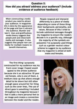
- 1. Question 5: How did you attract/ address your audience? (Include evidence of audience feedback) When constructing a media product you need to attract your audience. In magazines this is done by the appearance of the page and how it attracts the audience. Blumler and katz’s Uses and gratifications media theory suggests that people pick and chose both media and messages. It also suggests that people now use media for multiple reasons to benefit themselves. People respond and interpret differently to a piece of media depending on some of these thing: their background, personality, and values. Because of this I tried to include subliminal messages thought my magazine to ensure the readers decode it in a specific way. Although the majority of the symbols are polysemic I've purposely used things such as a gender neutral colour scheme to suggest to my audience that my magazine is aimed at both males and females. The first thing I purposely constructed for my audience was my front cover image I hoped would appeal to the artiste audience because she is an attractive 18 year old female, who is one of them. A medium close up shot allows enough detail to be shown but still allow enough space around her for thing such as the cover lines. The use of direct gaze is something I included throughout my magazine because I feel it adds a more personal feel to an image and creates a connection between the model and the reader.
- 2. The second thing I purposely constructed was the colour scheme, I used a a gender neutral colour scheme with some pastel shades and also one dark colour. Because my chosen genre is Indie music I feel using both dark and light colours will cater for both the more relaxing side of Indie music and the more rock side, magazines such as NME and Kerrang also add a dark more bold colour to their colour scheme for the same reason. Pastel colours suggest a more chilled vibe but at the same time the main colour purple, includes the calm from the blue and the fierce from the red. Purple is often associated with peace and also wealth, it is also a gender neutral colour and appeals to both male and female. I also included a dark red/purple colour relates to the more rock and grunge side of Indie music and is also a gender neutral colour that will appeal to both males and females.From my initial survey I know that a bright colour scheme would appeal to my target audience and also the Indie genre because each colour has different connotations and meanings and therefore suggests a variety in the magazine and audience. A bright, vibrant colour scheme would be most visually appealing and eye-catching however because my target audience is of the older teens and younger adults I wanted to give it a more sophisticated feel which is why I didn't include too many colours because I feel it could have been too over powering.
- 3. Cover lines are also another thing I hoped would catch the eye of my target audience. I purposely used shorter snappier cover lines that include well known artists to engage the reader. I chose suitable artists that would appeal to my target audience both from the rock Indie side and the relaxed side of Indie music. I purposely used stroke on the cover lines to make them stand out more against the background on the front cover image. The masthead and typeface throughout the magazine is another thing I focused on a lot. I chose to use serif fonts on the cover lines and main body text elsewhere because it gave it a more sophisticated and minimal look. However on things such as the main cover line of the artists name I chose to use a sans serif font as I felt it was slightly more informal and allowed the reader to connect on a more personal level with the artist. For the masthead I stuck to convention and placed it in the top third of the magazine cover because then it is visible on the shelves when being sold. I chose a very simple and bold serif font so that it is very strait forward and easy to read. I decided that white or black was too plain therefore I chose to use the same purple as on the models lips in the front cover image, I just adjusted the opacity of it so that it was not too bold and overpowering on the page.
- 4. Audience Feedback From my audience feedback I know that everyone I asked really liked the overall colour scheme. They particularly liked the link between the purple lips on the model and the purple masthead as they felt it was impressive and eye-catching. Also from the feedback I knew that i needed to change the cover lines to make them more legible, because they didn't stand out against the background when they did not have the smoke and drop shadow on them. Because the background is quite busy on the cover photo it was quite difficult to get the cover lines to catch the eye, however as I feel the image is quite dark, using white for the cover lines made them noticeable on the page.