Call Girls Bhandara Just Call 8617697112 Top Class Call Girl Service Available
Lauren uk film
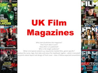
1. UK Film
Magazines
Who owns/publishes the magazine?
How much does it cost?
How often is it published?
Who is the target audience?
What is its typical content e.g. mass/niche market films, genre specific?
Analyse the name, logo, font style and colour for masthead, tagline – what is connoted?
Key points about layout and design of front cover – does it follow expected conventions?
2. Total Film
Total Film is published by ‘Future Publishing’ once a month
costing £3.99. This high price suggests its target audience
must have a real interest in up and coming movies and actors
to be willing to pay the price.
The typical layout of the magazine is that there will be a ‘Total
Film’ interview with the newest movie and focus of the
magazine- often on the front cover. The interview would
consist of a six-page-spread with the actor or director.
I like how the magazine name is always put behind the character
of the film, also the colour theme always matches the
characters, fore example the avatar magazine has a blue
background and other complimentary colours that don’t take
the attention away from the picture.
Often aimed at males but not exclusively so.
3. Empire
Empire magazine is Published by Bauer Consumer Media
monthly And being sold for £3.99. This price also suggests
that the target audience has to have a large desire and
interest for the magazine to pay £3.99- Young adults.
The main features of Empire are: news, previews, reviews,
classic scenes, top ten list, celebrity answers, at home
sections and many more.
The colour schemes of the magazine also match or co-ordinate
with the main star of the issue. For example the Man of steel
issue has a red theme that matches his costume. However
the brand identity of the magazine s the red ‘Empire’ text,
and will only change when it really doesn’t co-ordinate with
the film colour scheme at all.
Mass market- its not genre specific- covers Hollywood movies
and usually popular releases
4. Sight & Sound
Sight and Sound is a magazine published monthly by the British
film institute- more serious- monthly and being sold for £3.95
The market of the magazine is niche because it focuses on a more
mature audience because its more of a theory and academic
view.
Main elements that the magazine includes is film reviews
throughout and also asks an international group of film
professionals to give their greatest film of all time every ten
years.
The magazine always keeps the brand identity- the yellow
magazine name as a sign of maturity and that the audience
goes to them, the magazine doesn't have to change how it
looks to attract their niche market
It is also governed by the royal charter as its a charity.
5. Little White Lies
Little White Lies is published bi-monthly for £6 and is
published by the British independent movie magazine
which is a small company.
The magazine is very design driven and looks very
sophisticated but would be more attractive to a younger
generation- therefore it is a niche audience
The magazine features the main cover film as well as
reviews for other movies.
The cover is very stylised and doesn’t follow typical
magazine conventions that others have.
6. SFX
SFX is published by future who also publish total film. Its a
fantasy and horror magazine and has a specialist
audience.
SFX is £4.50 and published monthly.
It is none age/gender specific but targeted at the people
who like the genre of movie.
SFX often associated with special effects.
The font is none conventional but suits the style of the
genre and comes across futuristic.
Blues and neon colours/ bolts of electricity- powerful and
dramatic.
7. Uncut
Uncut is edited by Allan Jones and is published monthly by
IPC media for £4.80 an issue.
It is aimed at a more mature audience of 25 to 45 year old
men. The magazine focuses on music and movies and
used to look at books.
Main elements within this magazine are the interviews
with film directors, music and film news and reviews on
new major film, music and album releases.
The title font is quite old fashioned however depending on
the article it does compliment the subject. Unlike other
music magazines the font is serif.
8. Summary
For example this SFX magazine cover includes the
typical conventions of a blue haze, cold
temperature and shocking tone yet the font of
‘SFX’ is completely different to any other magazine
cover yet completely suits this magazine because
of the Sci-fi genre.
The angle of the cover lines are also very related to
the front cover picture and placed at an obscure
quirky angle.
I’ve learnt that following key conventions isn't always
what makes a magazine successful but changing
them to match the genre/audience can be really
effective.