
Recommended
More Related Content
What's hot
What's hot (20)
Viewers also liked
Similar to Task 2b
Similar to Task 2b (20)
Recently uploaded
Recently uploaded (20)
Task 2b
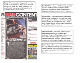
- 1. Fonts – The fonts used on this page all vary in size to indicate the importance of the articles included. For instance, bigger texts draws attention to the specific article as they may want the audience to read it first, helping to entice them. Main Image – The largest image on the page and used to attract the audience. Here, the main image shows a girl in front of a tour bus. This is anchored to the sub-heading of ‘Touring Special’- she is using direct mode of address to connect with the audience as this article would interest them. Mise-en-scene – The clothes that the model is wearing are typical festival attire and helps emphasise the genre of the magazine. Furthermore, the fact that she is pointing at the tour bus, highlights the subject of touring and helps give an indication of what the article is going to be about. House Style – The house style is continued on this page to help build a trade mark/enfore branding for the magazine. The continuation of the black and red colour scheme helps to further build these features. Sub-headings – the use of sub-headings gives the audience insight into other articles that will be featured in the magazine. Some of them include buzz words to help entice and attract the audience.