2. 1) IN WHAT WAYS DOES YOUR MEDIA
PRODUCT USE, DEVELOP OR CHALLENGE
FORMS AND CONVENTIONS OF REAL
MEDIA PRODUCTS?
3. CODES AND CONVENTIONS OF A FRONT
COVER OF A MUSIC MAGAZINE….
The main images is usually a mid-shot which uses direct
address
The person on the main image is usually shot at a
slightly low angle to convey confidence and the mise-en-
scene of the shot fits in well with the genre of the
magazine.
There is a large masthead, this normally at the top of the
magazine and its often brightly coloured and in a colour
to fit the scheme of the magazine
There is also a hook to catch the audiences eye and
attention, this can be through the use of cover lines, a
celebrity model and they often include lures too
There are also other details such as; barcode, date of
release, issue number and price.
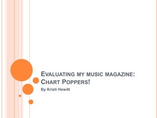
5. MY MAGAZINE…
The front cover of any magazine has a main
masthead which is the title of the magazine, it is
often distinctive, unique and recognisable. This can
be seen in ‘Chart Poppers!’ also. A typical magazine
convention is also to have a main image on the cover
which tends to be the focus for that particular
issue, tis helps to convince the audience to buy the
magazine. There are also cover lines which are the
main features seen inside the magazine and the
other details which a potential buyer would look for
such as date, price, issue number etc. are also
included on the cover. I have included all of these on
the cover of my music magazine, this helps to make
it as real and authentic as possible. I kept it similar to
other magazine to help this and I played with colours
which are typical to a pop magazine which is
therefore a convention, I also followed the codes
which are typical to the genre of a pop magazine in
terms of the layout and the use of bright colours and
this helps to appeal to the target audience.
6. THE CODES AND CONVENTIONS OF A
CONTENTS PAGE OF A MUSIC MAGAZINE…
Contents title (however this is often varied
depending on the type of magazine and it’s target
audience)
Rule of three
Page numbers linked to the corresponding articles
and features
Sometimes there is a picture of the front cover to
link articles to page numbers
Limited colour scheme (usually 2-3 colours linked in
with the rest of the magazine)
8. MY MAGAZINE…
A typical contents page of a music magazine will
usually consist of a letter from the editor and a
few small images to do with magazine
possibly, the main part will consist of page
numbers and the feature which match it. My
magazine just has a plain background but some
magazine so use images for their backgrounds on
their contents pages. It may not be as affective as
other contents pages with an image for the
background but it does keep with the genre of the
magazine and makes the writing easier to read. In
my magazine I kept to the typical codes of
conventions I did this by using the rule of three
and included an editors letter and extra photos. I
based my features and articles on topics which I
thought would interest my target audience- young
girls. To add an element of uniqueness to my
contents page I called it ‘in this mag…’ as
something a little different.
9. CODES AND CONVENTIONS OF A DOUBLE
PAGE SPREAD OF A MUSIC MAGAZINE…
One page is one large photo of the artist (s) who
are the focus of the feature and the other page is
the interview or article.
The article is usually split in to columns of 3 or 4
There is often lures which are in larger fonts or in
bubbles to help attract readers
The can also be one or two additional photos as a
visual attempt to draw readers to the article.
10. MAGAZINE DOUBLE PAGE SPREADS
My Double Page Spread of Another publication’s
Chart Poppers! Double Page Spread
11. MY MAGAZINE…
A double page spread is traditionally used as an
exclusive interview or article with a popular celebrity of
the time, in the case of my magazine, Emily Pope,
winner of the X-Factor. There is often a main picture of
them on side of the double page spread and they often
are on the cover also. I used an outdoors setting for the
picture of Emily to tie in with the idea in the article of
her remaining a ‘regular’ girl. For the article I used a
white background as this allowed the writing to be read
easily. I have also used the colour pink throughout out
the page to keep in with the girly theme and keep the
consistency throughout my three pages. To keep in with
the typical codes and conventions of a magazine I also
used page numbers which can been seen at the bottom
of the pages and in the contents page for easy
navigation for my readers. Like many magazines I also
used a lure which helps to attract the readers attention,
I also put them on the picture of Emily as I know that
the picture will capture more attention as the reader will
pay more attention to the picture's when just flicking
through the magazine. I used colloquial language
typical to the language used by my target audience and
this makes it not only like other magazines but easier
for the target audience to relate to.
12. CONCLUSION…
Hopefully I have been successful in including all the
typical codes and conventions of a magazine in my
own magazine. On all of the three pages I have put
quite a lot of emphasis on Emily as she is the
celebrity endorsement and the main exclusive
interview. It is key that I have stuck to the key codes
and conventions as this is what the audience of
potential buyer will be used to and be looking for in
new magazines, this ultimately helps it to sell and as
a result be successful. Although I have stuck to the
codes and conventions I have hopefully made it
unique and individual which gives it a refreshing new
look on a well known and popular genre of magazine.