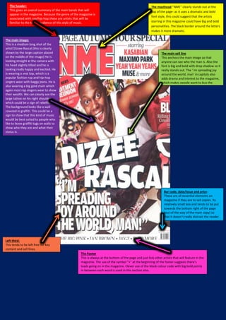
1. The header:
This gives an overall summary of the main bands that will
appear in the magazine. Because the genre of the magazine is
associated with rap/hip-hop these are artists that will be
familiar to the target audience of this style of music.
The masthead “NME” clearly stands out at the
top of the page- as it uses a dramatic and bold
font style, this could suggest that the artists
starring in this magazine could have big and bold
personalities. The black border around the letters
makes it more dramatic.
The main image:
This is a medium long shot of the
artist Dizzee Rascal (this is clearly
shown by the large caption placed
on the middle of the image) He is
looking straight at the camera with
his head slightly tilted and he is
looking really happy and excited. He
is wearing a vest top, which is a
popular fashion rap and hip-hop
singers wear with baggy jeans. He is
also wearing a big gold chain which
again most rap singers wear to show
their wealth. We can clearly see the
large tattoo on his right shoulder
which could be a sign of rebellion.
The background looks like a wall
covered in graffiti. This could be a
sign to show that this kind of music
would be best suited to people who
like to leave graffiti tags on walls to
show who they are and what their
status is.
The main sell line
This anchors the main image so that
anyone can see who the man is. Also the
font is big and bold with drop shadow so it
really stands out. The ‘ Im spreading joy
around the world, man’ in capitals also
adds drama and interest to the magazine,
which makes people want to buy the
magazine and find out more.
Bar code, date/issue and price:
These are all essential elements on
magazine if they are to sell copies. Its
relatively small box and tends to be put
towards the bottom right of the page
(out of the way of the main copy) so
that it doesn’t really distract the reader.
The Footer
This is always at the bottom of the page and just lists other artists that will feature in the
magazine. The use of the symbol “+” at the beginning of the footer suggests there’s
loads going on in the magazine. Clever use of the black colour code with big bold points
in between each word is used in this section also.
Left third:
This tends to be left free for key
content and sell lines.