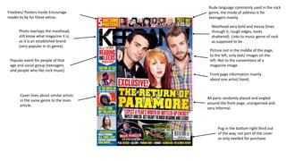
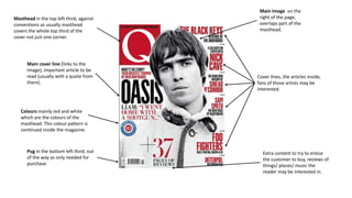
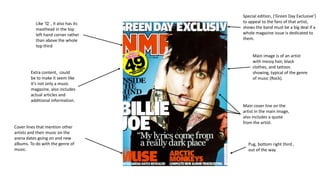
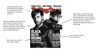
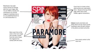
Front page information mainly 
about one artist/ band, 
All parts randomly placed and angled 
around the front page, unorganised and 
very Informal. 
Freebies/ Posters inside Encourage 
reader to by for these extras. 
Masthead very bold and messy (lines 
through it, rough edges, looks 
shattered). Links to music genre of rock 
as supposed to be . 
Picture not in the middle of the page, 
to the left, only text/ images on the 
left. Not to the conventions of a 
magazine image. 
Pug in the bottom right third out 
of the way, not part of the cover 
as only needed for purchase. 
Photo overlaps the masthead, 
still know what magazine it is, 
as it is an established brand 
(very popular in its genre). 
Popular event for people of that 
age and social group (teenagers 
and people who like rock music) 
Cover lines about similar artists 
in the same genre to the main 
article. 
Rude language commonly used in the rock 
genre, the mode of address is for 
teenagers mainly
Masthead in the top left third, against 
conventions as usually masthead 
covers the whole top third of the 
cover not just one corner. 
Main Image on the 
right of the page, 
overlaps part of the 
masthead. 
Extra content to try to entice 
the customer to buy, reviews of 
things/ places/ music the 
reader may be interested in. 
Main cover line (links to the 
image), important article to be 
read (usually with a quote from 
them). 
Coloursmainly red and white 
which are the colours of the 
masthead. This colour pattern is 
continued inside the magazine. 
Pug in the bottom left third, out 
of the way as only needed for 
purchase. 
Cover lines, the articles inside, 
fans of those artists may be 
interested.
Like ‘Q’ , it also has its 
masthead in the top 
left hand corner rather 
than above the whole 
top third 
Extra content, could 
be to make it seem like 
it’s not only a music 
magazine, also includes 
actual articles and 
additional information. 
Cover lines that mention other 
artists and their music on the 
arena dates going on and new 
albums. To do with the genre of 
music. 
Special edition, (‘Green Day Exclusive’) 
to appeal to the fans of that artist, 
shows the band must be a big deal if a 
whole magazine issue is dedicated to 
them. 
Main image is of an artist 
with messy hair, black 
clothes, and tattoos 
showing, typical of the genre 
of music (Rock). 
Main cover line on the 
artist in the main image, 
also includes a quote 
from the artist. 
Pug, bottom right third , 
out of the way
Main image is a band in black and 
white, no expression on their face, 
just looking at the camera. Typical of 
the genre of music magazine (Rock), 
might show their music is not 
particularly upbeat but heavy and 
hard hitting. 
Masthead covers the top 
third, typical of a magazine, 
in a very bold font and in 
bright colour to stand out 
the name. 
Only the masthead and one line have 
colour (red), all of the rest of the 
cover is in black and white, brings 
attention to theses as they stand out 
from the page. May be because the 
band is called ‘Black Keys’. 
Main cover line, what the 
main image is about. 
Cover lines about similar 
artists of the genre.
Masthead in top right 
corner and has an overlap 
with the main image, (like 
‘Q’ and ‘NME’) it breaks the 
conventions of a normal 
magazine masthead, but as 
it is an established brand as 
it is still know what it is. 
Cover lines on similar artists, 
what articles are inside about 
them. Placed at the top of the 
page rather than at the 
middle, against conventions. 
Main cover line on the 
artist in the main image, 
also includes a quote 
from the artist, shows 
the magazine has 
contact with the artist. 
Coloursmainly red, black and 
white which are the colours of the 
masthead, event the girls clothes 
in the photo are black and white. 
Extra artists similar to the 
main one.

Magazine Front Cover Analysis

  • 1.
    Front page informationmainly about one artist/ band, All parts randomly placed and angled around the front page, unorganised and very Informal. Freebies/ Posters inside Encourage reader to by for these extras. Masthead very bold and messy (lines through it, rough edges, looks shattered). Links to music genre of rock as supposed to be . Picture not in the middle of the page, to the left, only text/ images on the left. Not to the conventions of a magazine image. Pug in the bottom right third out of the way, not part of the cover as only needed for purchase. Photo overlaps the masthead, still know what magazine it is, as it is an established brand (very popular in its genre). Popular event for people of that age and social group (teenagers and people who like rock music) Cover lines about similar artists in the same genre to the main article. Rude language commonly used in the rock genre, the mode of address is for teenagers mainly
  • 2.
    Masthead in thetop left third, against conventions as usually masthead covers the whole top third of the cover not just one corner. Main Image on the right of the page, overlaps part of the masthead. Extra content to try to entice the customer to buy, reviews of things/ places/ music the reader may be interested in. Main cover line (links to the image), important article to be read (usually with a quote from them). Coloursmainly red and white which are the colours of the masthead. This colour pattern is continued inside the magazine. Pug in the bottom left third, out of the way as only needed for purchase. Cover lines, the articles inside, fans of those artists may be interested.
  • 3.
    Like ‘Q’ ,it also has its masthead in the top left hand corner rather than above the whole top third Extra content, could be to make it seem like it’s not only a music magazine, also includes actual articles and additional information. Cover lines that mention other artists and their music on the arena dates going on and new albums. To do with the genre of music. Special edition, (‘Green Day Exclusive’) to appeal to the fans of that artist, shows the band must be a big deal if a whole magazine issue is dedicated to them. Main image is of an artist with messy hair, black clothes, and tattoos showing, typical of the genre of music (Rock). Main cover line on the artist in the main image, also includes a quote from the artist. Pug, bottom right third , out of the way
  • 4.
    Main image isa band in black and white, no expression on their face, just looking at the camera. Typical of the genre of music magazine (Rock), might show their music is not particularly upbeat but heavy and hard hitting. Masthead covers the top third, typical of a magazine, in a very bold font and in bright colour to stand out the name. Only the masthead and one line have colour (red), all of the rest of the cover is in black and white, brings attention to theses as they stand out from the page. May be because the band is called ‘Black Keys’. Main cover line, what the main image is about. Cover lines about similar artists of the genre.
  • 5.
    Masthead in topright corner and has an overlap with the main image, (like ‘Q’ and ‘NME’) it breaks the conventions of a normal magazine masthead, but as it is an established brand as it is still know what it is. Cover lines on similar artists, what articles are inside about them. Placed at the top of the page rather than at the middle, against conventions. Main cover line on the artist in the main image, also includes a quote from the artist, shows the magazine has contact with the artist. Coloursmainly red, black and white which are the colours of the masthead, event the girls clothes in the photo are black and white. Extra artists similar to the main one.