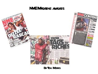
2. Header Listing key features in the magazine Masthead - in left third to attract reader due to the way magazines are stacked . Memorable name short. Main cover line big bold font the name of the artist has shadow effect to draw attention to readers. Footer Summary of music artists that are going to be in the magazine. Sans serif font – approachable to the target audience. Flash- In bright red to draw readers attention. And offers something extra to the target audience Quote Thirds Rule Of Main Image- Medium long shot of DIZZEE RASCAL- his face clearly seen eye contact. Cover lines Colour scheme of magazine red white and black – red and black are associated with daring connotations of rock colours and well contrasted onto white to make the dark colours look effective. Barcode
3. The NME is the longest published and most respected music weekly in the world. Every week it gives its readers the most exciting, most authoritative coverage of the very best in contemporary music. The award-winning www.nme.com, launched in 1996, has grown to be the biggest commercial music news site in Europe. Price of Magazine: £2.20 The frequency that it is issued is on a weekly basis. Circulation: 56,264 Readership: 411,000 Launch date 1952 Male: 73% Female: 27% Average age of readers :25 ABC1: 73% Target Market Men: 17- 30 FACTS & Figures of NME MAGAZINE
4. CONTENTS PAGE ANALYSIS REPITITION OF MASTHEAD To constantly remind readers of the magazine. IMAGE Picture of a female on tour which is quite pretty and rock and roll sheik eye candy for male predominant audience. The background of the picture which is a instrument case which is an icon of being on tour Sub headings With black sub sections contrasting with the white backgrounds Previous NME magazines A start of an article to intrigue the reader whilst on the contents page . Date of issue Band index For readers convenience to find a specific band page. Page numbers and titles for pages are alternating colours never the same. Website & other forms of contact Various language techniques
5. Analysis Of Double Page Spread Credits to author and photographer Dizzee’s name in bold font. Main Headline Main Image Mid shot of Dizzee Rascal holding a spray can graffiti can quite juvenile to show he still has a youthful and rebellious side to him. Copyright on the photo. Use of columns 4 columns easy to read clean layout. Smaller image Iconic of a rap artist ‘boom box’. Juxtaposed images to show the growth of Dizzee i.e the alcohol and dated technology. A continuous colour scheme over writings kept black because of the injection of colour in the image. Introduction to article. Quotes