
Recommended
More Related Content
What's hot
What's hot (19)
Similar to The Source Magazine Layout Design
Similar to The Source Magazine Layout Design (20)
More from zjhamilton
More from zjhamilton (20)
Recently uploaded
Recently uploaded (20)
The Source Magazine Layout Design
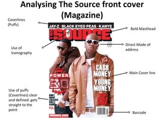
- 1. Analysing The Source front cover (Magazine) Bold Masthead Use of Iconography Use of puffs (Coverlines) clear and defined: gets straight to the point Direct Mode of address Main Cover line Barcode Coverlines (Puffs)
- 2. Language The language used on the Front Cover is not particularly personal, you could say the language used gets straight to the point suggesting the style of the magazine. Design The house style is clearly defined in Red: Black and white. The bold fonts used suggest importance and really stand out the font used on “CASH MONEY, YOUNG MONEY” looks slightly distorted signifying a gritty urban feel to the magazine. The mast head uses a heavy shadow making the text stand out, the red and black also complement each other well, the use of iconography (Microphone) in the mast head displays an image often associated with music of this genre. The puffs are well placed and are very much minimal and not busy. Image The image used on this front cover contains two well known artists “Birdman” and “Mack Maine”, who are hip hop artists. By being featured on the magazine they gain more popularity not only for themselves but also influencing people in particular fans to but the magazine. “Birdman” is in direct mode of address, the direct gaze helps to shown individual interaction with each reader. “Mack Maine” is also is direct mode of address but his body language seems less apparent than “Birdman” suggesting him to be inferior. Their heads are also overlapping the masthead an effective convention of magazines.
- 3. Analysing Contents page Use of magazine logo (masthead) Image of popular entertainer Information neatly organised and put into columns House style is carried through to contents page Puff anchoring image
- 4. The contents page is from the magazine “The Source” the information is clear and simple to read being organised into columns. The contents page carries through the simple house style of Red: Black and on this page an off shade of white showing continuity. Each cover line is defined by a small masthead in bold red with additional information underneath a general convention in music magazines. The main image shows rapper “Lil Wayne” in his signature pose, this image stands out amongst the page as its bright and clear defining the artists image, the shot used is a mid shot and is placed well on the contents page. He has the typical image of a hip hop artists with “bling” and “new era” hats whilst striking a sometimes controversial pose (illuminati) he has numerous tattoos and sunglasses on suggesting the whole genre of the magazine. The text anchoring the image also suggests something controversial or interesting as he is highly profiled artist. The whole look of the contents page shows a structured and defined house style, with organised text (columns) with an image that will grab readers attention.
- 5. Bold masthead Continuity of house style apparent Strapline telling audience more information Bold masthead Image spread across both pages is effective Text in columns presents a professional look Additional information
- 6. This article taken from “The Source” magazine is well laid out in the essence that it covers the double page spread effectively, it also leave plenty of space for the article to be well placed. The image features well known artists most importantly American artist Wale in poses which reflect their “rapper image”. The mast head is effective as the style of text complements the image a racing car well. The mast head is bold in the color white with emphasis on the word “Ride” the shadow effect used on the text also helps it to stand out amongst the commanding image. The defined house style of Red, Black and white is once again seen as shown on the front cover and the contents page. The use of the checked black and white squares also reflect the theme of the article based around racing cars, as the iconography of the checked square is used a lot in car racing .
- 7. This article taken from “The Source” magazine is well laid out in the essence that it covers the double page spread effectively, it also leave plenty of space for the article to be well placed. The image features well known artists most importantly American artist Wale in poses which reflect their “rapper image”. The mast head is effective as the style of text complements the image a racing car well. The mast head is bold in the color white with emphasis on the word “Ride” the shadow effect used on the text also helps it to stand out amongst the commanding image. The defined house style of Red, Black and white is once again seen as shown on the front cover and the contents page. The use of the checked black and white squares also reflect the theme of the article based around racing cars, as the iconography of the checked square is used a lot in car racing .