Transcript: #StandardsGoals for 2024: What’s new for BISAC - Tech Forum 2024
Analysed Articles
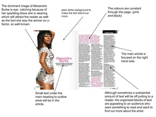
1. The colours are constant
through the page. (pink
and black)
The main article is
focused on the right
hand side.
Small text under the
main heading to outline
what will be in the
article.
The dominant image of Alexandra
Burke is eye catching because of
her sparkling dress she is wearing
which will attract the reader as well
as the fact she was the winner on x-
factor, so well known.
Although sometimes a substantial
amount of text will be off putting to a
reader, the organised blocks of text
are appealing to an audience who
want something to read and want to
find out more about the artist.
plain white background to
make the text stand out
more.
2. The main focus of this double spread is the
image of lily Allen and the large font quote,
this attracts the reader as not only is lily
Allen popular and therefore people would
like to know more about her but also the
quote is topical and this encourages the
audience to read on.
the white background is common among
double page spread as this makes the text
and image stand out to the reader.
The layout of this spread is also very
effective as the reader is not overwhelmed
by the text or bright colours which would
put them off reading it.
The colour scheme of black, white and
red which is not only visible on the text
but also on the image of Lilly Allen, this
keeps a simple but eye catching colour
scheme which will draw the reader in
more.
3. The title introduces the
artist and I would want
my title to be big and
bold covering a mass
amount of the page.
The type of text and
structure is used is
what I would used in
my magazine
article. Straight
forward font nothing
to fancy.
I like the fact that this
particular quote is
highlighted, I would like
to use this convention in
mine.