JAPAN: ORGANISATION OF PMDA, PHARMACEUTICAL LAWS & REGULATIONS, TYPES OF REGI...
Q contents page
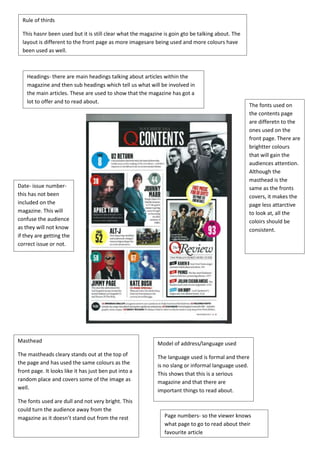
1. This hasnr been used but it is still clear what the magazine is goin gto be talking about. The
layout is different to the front page as more imagesare being used and more colours have
been used as well.
Headings- there are main headings talking about articles within the
magazine and then sub headings which tell us what will be involved in
the main articles. These are used to show that the magazine has got a
lot to offer and to read about.
Model of address/language used
The language used is formal and there
is no slang or informal language used.
This shows that this is a serious
magazine and that there are
important things to read about.
Page numbers- so the viewer knows
what page to go to read about their
favourite article
Rule of thirds
Date- issue number-this
has not been
included on the
magazine. This will
confuse the audience
as they will not know
if they are getting the
correct issue or not.
The fonts used on
the contents page
are differetn to the
ones used on the
front page. There are
brightter colours
that will gain the
audiences attention.
Although the
masthead is the
same as the fronts
covers, it makes the
page less attarctive
to look at, all the
coloirs should be
consistent.
Masthead
The mastheads cleary stands out at the top of
the page and has used the same colours as the
front page. It looks like it has just ben put into a
random place and covers some of the image as
well.
The fonts used are dull and not very bright. This
could turn the audience away from the
magazine as it doesn’t stand out from the rest