Artificial Intelligence in Philippine Local Governance: Challenges and Opport...
Lesson 1_Website production 1_Research
1.
2.
3.
4. Common features
• All websites have:
• A menu bar, with the magazine name on the far left
• A large image in the middle of the screen
• Several feature articles on the left of the screen, with pictures
• At least 7 options in the menu
• The menu bar is in a contrasting colour to the background, such as pink or
red.
5. Bella
This is the subscription page for Bella Magazine.
The menu bar stands out against the rest of the
website, allowing it to be used for navigation
from any page on the site, as well as providing a
reference point for other elements on the page.
There is a large title and image section for the
featured article on the “latest issue” page; this
grabs the attention of the reader, directing them
toward the article that Bella placed there. This
takes up a lot of space on the page and is clearly
the main focus of the page.
Below the latest article, there are previous
articles. They are smaller, as to take up less
space on the page and attention of the reader;
and they are represented by thumbnails and a
title. This is to give the reader a choice between
which article they want to click on, without
visually overwhelming them.
6. Closer
Closer’s soaps page has a very similar layout to Bella’s
magazine page. It has a large image with a title on the
left, taking up a lot of the page real estate. This is the
same template as Bella's page. They use similar layouts in
order to make navigation of the sites easier for users.
Below the featured article, there are other articles. They
are smaller, as to take up less space on the page and
attention of the reader; and they are represented by
thumbnails and a title. This is to give the reader a choice
between which image they want to click on, without
overwhelming them.
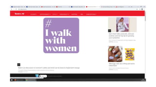
7. Heatworld also has essentially an identical layout
to Bella and Closer. This is because keeping
templates standard across the websites of
different magazines is useful for both ease of
development, and ease of use, as users will be
familiar with each element of the website.
The only thing that’s different from the previous
two websites is a button at the bottom that allows
you to listen to heat’s radio hitlist, a playlist of
music compiled by heat. This is useful, as it allows
users to quickly access music recommended by
heat.