1. The page has been laid out in a basic
grid style design with columns and the
use of space between each of the
columns in order to make each column
clear to the reader.
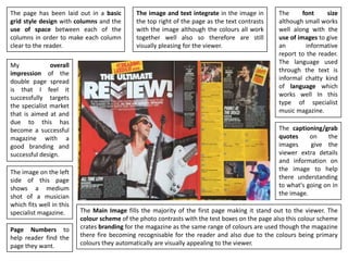
The Main Image fills the majority of the first page making it stand out to the viewer. The
colour scheme of the photo contrasts with the test boxes on the page also this colour scheme
crates branding for the magazine as the same range of colours are used though the magazine
there fire becoming recognisable for the reader and also due to the colours being primary
colours they automatically are visually appealing to the viewer.
The image and text integrate in the image in
the top right of the page as the text contrasts
with the image although the colours all work
together well also so therefore are still
visually pleasing for the viewer.
The font size
although small works
well along with the
use of images to give
an informative
report to the reader.
The language used
through the text is
informal chatty kind
of language which
works well In this
type of specialist
music magazine.
The captioning/grab
quotes on the
images give the
viewer extra details
and information on
the image to help
there understanding
to what's going on in
the image.
My overall
impression of the
double page spread
is that I feel it
successfully targets
the specialist market
that is aimed at and
due to this has
become a successful
magazine with a
good branding and
successful design.
Page Numbers to
help reader find the
page they want.
The image on the left
side of this page
shows a medium
shot of a musician
which fits well in this
specialist magazine.