
Recommended
More Related Content
What's hot
What's hot (19)
Similar to Music Magazine Contents Page Codes
Similar to Music Magazine Contents Page Codes (20)
More from Katielewis98
More from Katielewis98 (15)
Recently uploaded
Recently uploaded (20)
Music Magazine Contents Page Codes
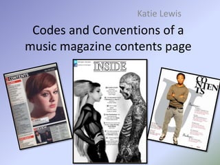
- 1. Codes and Conventions of a music magazine contents page Katie Lewis
- 2. The Main Image On a contents page, there is a main image which is linked to the front cover image. The image is big and stands out from the rest of the page because it gives the impression the artist is going to be the main feature of the magazine.
- 3. Page Numbers All content pages include page number because it enables viewers to easily jump to a certain section of the magazine instantly without looking through the whole magazine for it. The numbers are generally bold or blocked off to standout and make it clear for the viewer and the colour of them will reflect the colour scheme. All the numbers are in chronological order per section.
- 4. Cover lines The cover lines in the contents page are always different to the ones on the front page and it allows the audience to further know what the magazine is about.
- 5. Subsidiary Images In a contents page these images are normally at the bottom of the page and they are always small so they don’t take all the attention of the main image. These also show what else will be featured in the magazine.
- 6. Date The date on a magazine contents page is usually at the top of the page. It’s also shown on the front page because they want readers to exactly know when it was published as they may be looking for a specific one.
- 7. Heading The word contents is always big and bold and is separated from the rest of the text and is always at the top of the page. It will always fit in with the colour scheme and it will always have a specific font.
- 8. Columns Columns are placed for the structure of the text and images. There are generally two/three column's. The layout is always very clear and always the reader to navigate through the magazine easily by using line gaps between sections. As shown in both images, everything is laid out perfectly as they both look neat and it doesn’t look messy. Even though you can’t see the columns it’s shown they have been used due to the layout looking perfect.
- 9. Editors letter Some magazine contents pages have an editors letter and these are added to establish a connection between the editor and reader. It is always clear and takes a bit of room up generally in the top corner. Also the letter is generally signed at the end which makes it more personal.
- 10. Mini version Sometimes magazine contents pages have an image of the front cover but it’s always very small and generally in the corner.
- 11. Subheadings Subheadings are used to show what is in the magazine. This also makes it easier and quicker if the reader wanted to find a specific topic or artist as they can just find there name and go straight to that page without flicking through the whole magazine to find what it’s about.
- 12. Adverts Adverts are known as subscription details and are usually placed at the bottom of the page but they usually stand out due to the colours that have been used in it. It catches the audiences attention as its generally large and eye catching.
- 13. Social media pages On a contents page, this allows the magazine to be a cross-media product, and allows the audience to find out about the magazine through social media.
- 14. Font Size The heading generally has a font size of 12/13pt and is in capitals or bold which makes it really stand out to the reader. Sublines generally have a font size of 11pt so there just a bit smaller than the heading. There is generally a gap between the title ‘contents and the page numbers so it doesn’t look squished.