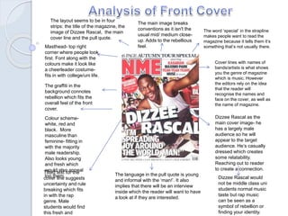
1. The word ‘special’ in the strapline
makes people want to read the
magazine because it tells them it’s
something that’s not usually there.
Cover lines with names of
bands/artists is what shows
you the genre of magazine
which is music. However
the editors rely on the idea
that the reader will
recognise the names and
face on the cover, as well as
the name of magazine.
Masthead- top right
corner where people look
first. Font along with the
colours make it look like
a cheerleader costume-
fits in with college/uni life.
Colour scheme-
white, red and
black. More
masculine than
feminine- fitting in
with the majority
male readership.
Also looks young
and fresh which
would also appeal
top them.
Dizzee Rascal as the
main cover image- he
has a largely male
audience so he will
appear to the target
audience. He’s casually
dressed which creates
some relatability.
Reaching out to reader
to create a connection.
Dizzee Rascal would
not be middle class uni
students normal music
taste but rap music
can be seen as a
symbol of rebellion or
finding your identity.
Tilted text for the
cover line suggests
uncertainty and rule
breaking which fits
in with the rap
genre. Male
students would find
this fresh and
The layout seems to be in four
strips: the title of the magazine, the
image of Dizzee Rascal, the main
cover line and the pull quote.
The language in the pull quote is young
and informal with the ‘man!’. It also
implies that there will be an interview
inside which the reader will want to have
a look at if they are interested.
The graffiti in the
background connotes
rebellion which fits the
overall feel of the front
cover.
The main image breaks
conventions as it isn't the
usual mid/ medium close-
up. Adds to the rebellious
feel.
2. Headings- sans serif font makes it
look bold and plain, giving it a
modern feel. This fits with the young
readership.
Language:
• Use of verbs- ‘pick
out’ and ‘play’ give a
sense of happening.
You get a feel of
energy and action
fitting the lifestyle of
the target audience.
• Use of sarcasm/ironic
humour in the first
line. Makes it seem
laid back and friendly.
• Collective pronoun
‘we’ adds to the
personal and friendly
feel.
• Alliteration,
‘masterclass in
messiness’ give sit a
playful nature.
All these things make
Borders:
• Around the photo- the thin white
border makes it look like a
polaroid that’s been stuck to
something.
• Around the dark grey box- the
metal edges create the look of
a flight case. This fits in with the
music genre and the target
audience will pick up on this as
it connotes the touring lifestyle.Body text- serif font makes it
look modern and a sophisticated
like a letter. Adds to the
personal message in the text.
Layout in three
columns- band
index, body text
and other
contents. It gives it
an order and
makes it easier for
the reader to find
the section they
want instead of
wasting time when
students already
have a busy
lifestyle.
Repetition of the NME
logo for recognition and
reinforces the brand
identity so the reader will
remember it.
The main image is a mid shot.
The picture is half focused on the
girl, half on the tour bus. This
appeals to the males who read it
because they can look at the girl
as well as get an insight into
touring.
The sub heading repeats the
word ‘special’ which will make
the reader want to read more.
3. The beer bottles and
radio connote parties
and rebellion which is
what the target
audience is going to
want to get out of this
article.
The fact that the editors keep
the swearing in the article adds
to the rule breaking feel and
gives the reader a bit of
humour because it’s
unexpected. It gives off the
overall image that Dizzee
Rascal is a rebellious figure in
the music business.
The heading is a pun of
‘From rags to riches’ which
adds to the humorous tone
of the article. The reader
gets a good idea of Dizzee
Rascals rebellious past and
this makes them want to
read on.
The image of
Dizzee Rascal
spraying graffiti
adds to the whole
rebellious image.
Students who
read the
magazine will
perhaps feel
encouraged to
find new aspects
of themselves.
A larger area of the
double page
spread is given up
to the image and
heading text and
the actual body text
is squashed into a
little grid section.
This puts focus on
the image and is
useful because
most people take in
information visually.
The colours look quite
faded and pastelly
which could be classed
as girly. However this
fits the image of
breaking conventions
and the rules that
Dizzee Rascal seems
to do all the time.
A simple but effective part
of the double page spread
is that the body text is on a
white background so that
it’s easy to read.
4. The rebellious ‘bad boy’ image of Dizzee Rascal
that will appeal to the target audience as they
continue to create their identity.
The NME branding and personality- a friendly and
personal feel to the magazine.
The musical terms that will appeal to music fans.
The fast-paced, upbeat feel to the magazine shown
through informal language and the images.