Dubai Call Girl Number # 00971588312479 # Call Girl Number In Dubai # (UAE)
Evaluation question 1
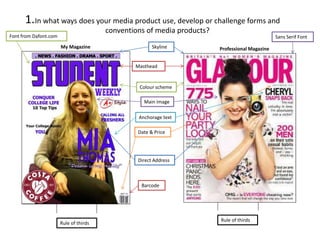
1. In what ways does your media product use, develop or challenge forms and
conventions of media products?
My Magazine Skyline
Professional Magazine
Masthead
Main image
Anchorage text
Date & Price
Direct Address
Barcode
Rule of thirds
Colour scheme
Font from Dafont.com
Rule of thirds
1.
Sans Serif Font
2. In what ways does your media product use, develop or challenge forms and
conventions of media products?
On my magazine front cover I have followed generic codes and conventions. I’ve used a medium shot for my
main image just like the Glamour cover, the image directly addresses the audience because the model is
looking at the camera which attracts individuals. I have applied the rule of thirds by putting key information in
hotspots and my central positioning of the main image was a deliberate choice that I made when creating my
drawn draft. I’ve covered the top row of the rule of thirds grid with my masthead which is in bold capitals and
the model covers one of the masthead letters slightly but the masthead is still clear this is similar to the
Glamour cover, I also made this decision in my drawn draft. I have used a continuous colour scheme of purple,
black and white, as purple is a college colour. This colour scheme will link all of the issues of the magazines
together, this is branding. I cut out the background and stuck to the colour scheme that I decided when
drawing up my draft. Glamour also uses branding through the use of similar colour schemes. The colour pink
is the main colour on the Glamour magazine which connotes femininity, suggesting that the magazine is
targeting women. Whereas the genre of my magazine is ‘College’ so the colour scheme on my magazine is
not gender specific, it will attract a college audience of both boys and girls. I used a mixture of different fonts
including both Serif and Serif Sans however the Glamour magazine cover will have mainly used Serif Sans.
I have followed my drawn draft closely when creating my magazine cover and tried to create a cover that
follows forms an d conventions.
1.
3. In what ways does your media product use, develop or challenge forms and
conventions of media products?
Page title
Masthead
Main features
highlighted
Page
reference
Consistent
Colours
Selection of
photos
1.
Rule of thirds Rule of thirds
4. In what ways does your media product use, develop or challenge forms and
conventions of media products?
I have vaguely used the rule of thirds on my contents page to position the page title and masthead in the
middle at the top of the page. By including the Contents title and date I have applied the use of generic codes
and conventions and stuck to a colour scheme of college colours. The font for the Contents title was taken off
dafont.com and is similar to my masthead but not the same, this is so that there is continuity throughout the
magazine but each page is still unique. My images relate to the articles (similarly to my example Contents
page) and the genre of the magazine, which is College, because they were taken in or around the college
campus. I used page references to link the reader directly to the page that the article is on. I capitalised some
phrases or changed the font colour to purple to highlight specific articles that may be particularly interesting
for the reader. I have used different font styles just like my chosen example of a Contents page.
I developed my drawn draft by including a background picture for my Contents Page which I think works well
because it does not overpower the text.
1.