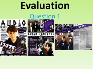
2. 1. In what ways does your media product use, develop or challenge forms and
conventions of real media products?
A typical convention of a
music magazine is for the
main image to cover some of
the masthead. Mine slightly
does, but not enough so you
can’t read it, as this is the
first issue.
Another convention is that the
main cover line is a lot larger
than the rest and so makes it
clear, but I have challenged
conventions by tilting it so that it
looks more unique from other
magazines.
A convention of front
cover pages is usually
other images being
shown to show what
else is inside and to act
as a puff.
Magazines typically also
contain footers and so I
used a footer to show
what else is inside of the
magazine
Encouraging language is
typically used to encourage
the audience to buy it.
I have used the rule of thirds to make my front
page clear as well as aesthetically pleasing. This
is typically used on magazines.
3. 1. In what ways does your media product use, develop or challenge forms
and conventions of real media products?
My masthead challenges
typical conventions as I have
used an image of a guitar as
one of my letters, which is
uncommon in well known
music magazines such as
Kerrang!
I added the date line and
issue number directly
under the masthead which
challenges the conventions
as usually they appear
along with the
barcode, but I wanted to
make sure that it was clear
as it is the first issue.
I have used a number of
different fonts for my cover
lines to make each one stand
out, where as Kerrang! Has
used only one font for their
cover line to keep it
consistent.
I have used a medium shot
of the artiste so that the
expression is clear as well
as natural lighting being
used which is typical of
magazine front covers.
4. 1. In what ways does your media product use, develop or challenge forms
and conventions of real media products?
Typical magazines use puffs to
draw the audience in and
encourage them to buy the
magazine. These usually appear
in coloured boxes so that they
are obvious on the page.
Pull quotes are typically used
to give the audience an
insight into what the article is
going to be about and to
make it sound interesting and
appealing.
I have challenged conventions
as I have not used a header
because I felt like it would take
away the effect of the
masthead.
Typically magazines use a
barcode on the front page so
that it is easy to locate and
scan, as well as the price
usually being found here too.
Throughout my magazine I have used a clear colour scheme of black, white and purple, and so all
pages link together and look aesthetically appealing. This is a typical convention of a magazine.
5. 1. In what ways does your media product use, develop or challenge forms
and conventions of real media products?
My magazine challenges the
convention of the title at the
top of the page as mine
appears in the middle and
therefore makes it unique.
A typical convention is
multiple images being
used to show different
features inside the
magazine.
Features are clearly
labelled along with page
numbers so that the
audience know exactly
where to find the pages.
The name of the magazine
has also been placed on
the contents page. This is
a typical convention of a
magazine.
6. 1. In what ways does your media product use, develop or
challenge forms and conventions of real media products?
A typical convention of a
magazine is for every
image to be present
with a page number, so
that the audience know
exactly where to find
each feature inside.
There are typically
performance images
shown either on the
contents page or double
page spread to show an
artiste when they are on
stage or with a
particular prop to create
a more exciting image.
A letter from the editor is
a typical feature as it
introduces the magazine
and makes a personal
connection with the
audience.
7. 1. In what ways does your media product use, develop or
challenge forms and conventions of real media products?
I have used sub
headings to order the
features as this is a
typical convention of
magazines.
A typical convention
is to also mention
the date on the
contents page.
I used a reference line to
mention the photographer
used as this is a typical
convention on contents
pages.
An offer or competition is
a typical feature on a
magazine contents page.
8. 1. In what ways does your media product use, develop or
challenge forms and conventions of real media products?
I challenged the features of double page spreads by
placing an image behind the text as this isn’t common
in famous magazines. However, I liked the way that Q
Magazine uses a letter behind the article and so I was
influenced by this to add an image of a member of the
main artiste behind my article.
I followed a typical convention by
placing the text mostly on one
page and the main image on the
opposite page so that it looks
organized and the article is easy
to read and the fold in the page
would not affect it.
I used drop capitals which are a typical
convention of magazine articles.
Most magazines use
columns and so I used
this in my own
magazine to make it
easy to read and
aesthetically pleasing.
9. 1. In what ways does your media product use, develop or
challenge forms and conventions of real media products?
A pull quote is typically used to give the
audience an insight into what is inside the
magazine.
My magazine challenges typical
conventions of music magazines as the title
has been tilted to look more interesting
and link with the front cover where it has
also been tilted.
The subheading of articles are typically in bold or in a
separate text box so that they stand out from the rest of
the font on the page.
10. 1. In what ways does your media product use, develop or
challenge forms and conventions of real media products?
The main image is usually a lot bigger than the
other images on the page.
Smaller images have been used to further
make the page look like there is a lot going
on and so that the page is more visually
attractive.
A typical convention of a
magazine is to have the magazine
name on every page and so
therefore I have positioned it so
that the audience is frequently
reminded of what they are
reading.