
Recommended
More Related Content
What's hot
What's hot (19)
Viewers also liked
Viewers also liked (20)
Similar to Nme double page spread
Similar to Nme double page spread (20)
Recently uploaded
Recently uploaded (20)
Nme double page spread
- 1. NME double page spread
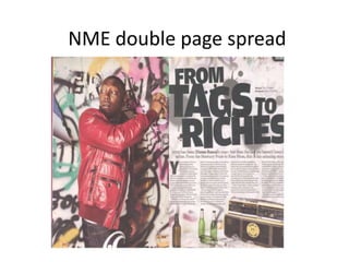
- 2. Main image-the main image covers a whole page. The main image helps show the reader what the contents about more visually. The main image is of Dizze Rascal in a grafted area furthermore some sort of bridge that’s been spray painted. This helps show the sheer contrast in the clothes he’s wearing (Red) highlights the muddle from the background. Mise-en- scene- The clothing that Dizzee is wearing is quite unique and unbranded as he isn’t advertising anything but himself. The background also emphasises what Dizzee Rascal is all about as the spray paint can stereotypically be seen as a rebel thing to do or could also been seen as quite a ‘cool’ thing to do. Denotation- In terms of denotation, the main as a whole is very rebel like and that shows that Dizzee is quite iconic in that sense whilst also being a music artist. In addition to that, because of what Dizzees wearing (Red) could be seen as danger which helps link in to the background and the fact that the image as a whole emphasises rebel like atmosphere. Shot type- The shot type is a slight full shot of Dizzee but the bottom part has been cut-out. By using this shot you can see the fashion sense Dizzee has as well as seeing that it is actually Dizzee Rascal. He has also been added to the centre of the page purely because he is the centre of attention on this page even further the magazine.
- 3. Headline- The headline is very short and brief but tells the reader of what the text will be based on (Dizze Rascals change). By adding this title into the double page spread, it tells the reader quickly of what the article is about. Font- The font for the headline is inconsistently big and small purely to show that sheer contrast whilst adding in something unique into the double page spread. In my opinion, the reason behind the different sizes is because of how Dizze went from small to big in terms of fame. Another reason could be to highlight certain words like “Tage” and “Riches”. The subheading is slightly bigger then the text from the article to simply inform the reader and interest them by telling them small information from the article. Mise-en-scene- At the bottom of the page, a picture of a radio and empty bottles has been added just bellow the text from the article. This has been added onto the page to simply show the two things Dizzee either enjoys or does. Another reason behind this could be that Dizzee went from drinking to music and that links into the article.
- 4. Link with the image and the text-The image is of Dizzee Rascal and the text talks about Dizzee Rascal(in other words they both link). The picture also shows Dizzee Rascal in quite a poor place which links in with the main header “from rages to riches” This helps show the contrast between Dizzee in a poor place despite all of his fame. Colour Scheme- The colour scene is quite bright but with slight elements of darkness on the two pages. This helps to put further emphasis on Dizzee Rascal due to the fact that he’s wearing bright red. The article layout- The text has been laid out into four different columns purely to keep the text organized and also helps show the images at the bottom of the page. Use of space- The spaces of the contents page has been filled up and hasn’t been left blank on any section purely because there is no need to any wasted space. Due to the amount of content that needed to be added onto this page, any wasted space would be uncalled for. Overall impression- in my opinion, the double page spread is a very informal article with some elements of formal as the genre of rap tends to be younger males who are stereotypically seen as less formal people. At a first glance of the page, it looks very colourful and very engaging to the reader/audience.